In this lesson we'll explore the world of type and how it can be used effectively in your own work. We'll start with some details about type that are useful to know – the anatomy of a typeface, typeface classifications and identification. Then we'll explore some strategies for best use of type in visual communication – some of the unwritten rules for effective typographic design. This lesson will wrap up with an introduction to Illustrator's type tools. There's a lot to cover!
Typography is made up of the following components.

| Bar | The horizontal stroke in letters. Also known as a Crossbar. These help to form the main structure of a lot of letters. |
|---|---|
| Open Counter | The partially open space within a character that is open on one end. Also see 'Counter' below. |
| Ear | A small stroke extending from the upper-right side of the bowl of a lowercase g. Can also appear in a curved lowercase r. |
| Teardrop Terminal | The appearance of dropped-ends on the end of some strokes. |
| Ascender | An upward vertical stroke. Found on lowercase letters which extends above the typeface’s x-height. |
| Stem | The vertical, full-length stroke which appears in upright characters. These help to form the main structure of many letters. |
| Counter | The open or negative space in a fully closed area within a character. Spot 5 examples above. |
| Loop | The enclosed/partially enclosed counter below the baseline of a double-story g. |
| Descender | A downward vertical stroke. Found on lowercase letters and extends below the typeface’s baseline. |
| Serif | A stroke/small decorative line added as embellishment to the form of a character. |
| X- Height | The height lowercase letters reach in a typeface. This is always based on the height of lowercase x. |
| Baseline | The invisible base which all characters sit on. Curves characters like o should sit just slightly over the baseline. |
| Ascender/Descender Height | The invisible line marking the height of ascenders / descenders in a font. |
| Cap Height | The height of a capital letter in a typefaces measured from the baseline. |
(Melling 2018)

Font
A font is a set of letterforms that can be used to format text in a particular style. Often a font will belong to a larger family of related fonts with different style variations. For example, regular, italic, and bold.
Typeface
A set of fonts belonging to the same font family is known as a typeface.
Individual font styles should still be referred to as separate fonts as they have individual font files.
Typeface

Fonts

Typefaces can be classified by their visual style and historical influence into several groups and subgroups. The following provides a summary of the most common classifications and some examples of typefaces belonging to each of them.
Serif typefaces
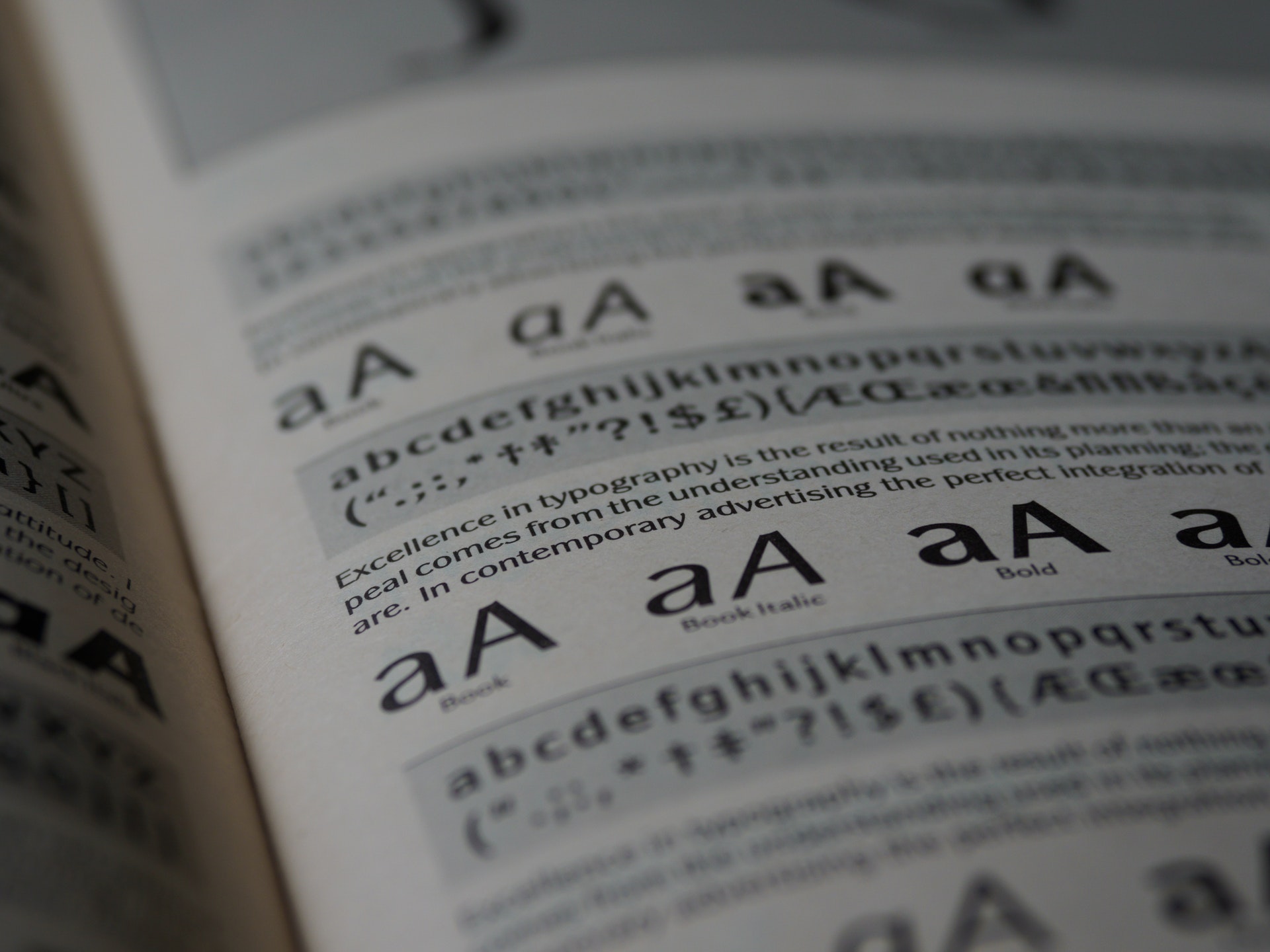
Fine lines, beaks, or spurs at the ends of the letter strokes are known as serifs. In printed documents these help guide the eye between letters and improve readability, especially in longer paragraphs of text. Serif fonts portray a more traditional style which tends to command more authority than typefaces without serifs.

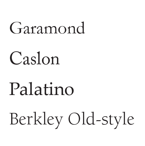
Old Style
Old Style (also known as Venetian) typefaces are influenced by early Italian lettering design. They have only subtle differences between their thick and thin strokes are the most readable of typefaces.
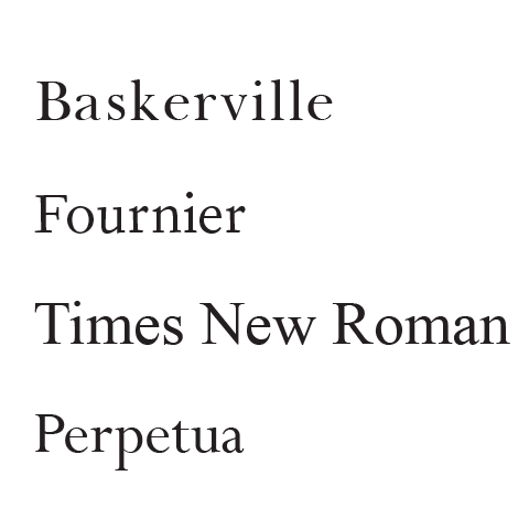
Transitional
Transitional typefaces fall in-between old style and modern categories. The differences between the thick and thin strokes are more pronounced than old style, yet not as dramatic as modern. This neutral style makes them a little bit plain looking, but this also makes them some of the most readable typefaces available.
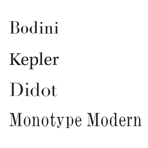
Modern
Modern typefaces (also known as Didone) are a particular style of serif font characterised by high contrasting thick and thin strokes and flat serifs. Modern may sound like a bit of a contradiction as many of these typefaces were developed in the late 18th and 19th centuries. Modern typefaces can be considered more elegant but are less readable, so are better used at larger sizes and for smaller amounts of text.
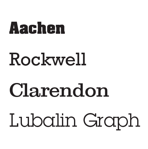
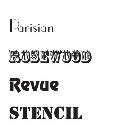
Slab
Slab serif typefaces feature bulky rectangular serifs and thick strokes. They are best used for short pieces of text or headings that need impact.
Sans serif typefaces
‘Sans’ is the French word for ‘without’ — these typefaces are without serifs. They tend to have a cleaner more modern look but they are not as readable as serif typefaces for longer paragraphs of text.
Their clarity makes them perfect for use on-screen or mobile devices, headings, signage, or light-coloured text on a dark coloured background. Sans serif typefaces can still be used for paragraph text if you are aiming for a modern look.
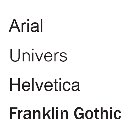
Grotesque and Neo Grotesque
Grotesque might seem an unfortunately strong term (originating from Germany) to describe these typefaces, but in comparison to other typefaces, they are rather plain and lack any character or elegance. Yet they are highly functional and very legible.
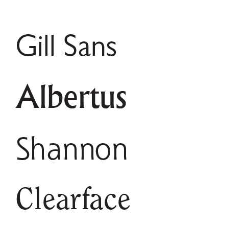
Humanist
Humanist sans typefaces tend to break away from the geometric machine-like rigidity and add a touch of organic or hand-drawn character. Many of these typefaces could be said to sit between serif and sans serif with the slight hint of a serif (but not quite).
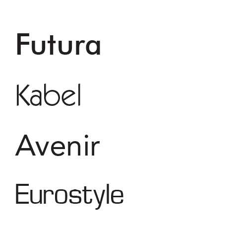
Geometric
Geometric typefaces have strong regular geometry in their letterforms. They tend to have a more modern feel.
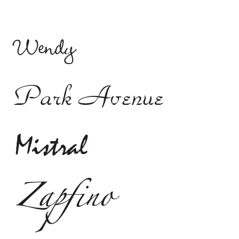
Script
Script typefaces are designed to imitate handwriting. They should only be used for shorter blocks of text and are best kept for special occasions such as a wedding invitation.
Many script typefaces should never be used with all uppercase letters, as their uppercase letters are designed to link to a lowercase letter and look terrible when placed with other capitals. Types of script typefaces include formal, casual, hand, and calligraphic.
Display or Decorative
Display typefaces (also known as decorative typefaces) include those that do not fit in any of the other categories. They come in a huge range, many based around a theme, and some are barely legible. These typefaces are best used for advertising or headings where a unique look is required.
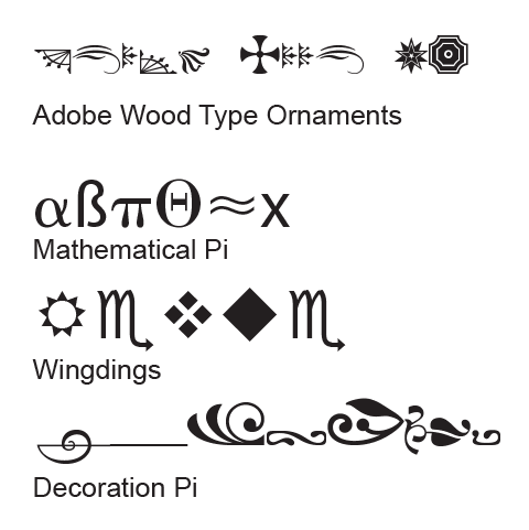
Symbol or Ornamental
Symbol typefaces are not used for formatting lettering. Instead, they provide an easy way to add symbols that may not be available as part of an ordinary font set such as mathematical or Greek letters. They can also be used to add in-line graphics such as alternative bullet point symbols or other functional symbols such as arrowheads. Some symbol typefaces provide a set of border elements or are simply a collection of clip art.
Font styles
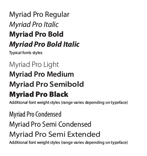
Most serif or sans serif typefaces have a range of style variations such as regular, bold, italic, and bold italic. Higher quality typefaces will often provide additional weight variations such as light, medium, semi bold, and black. Some provide different width styles such as condensed, semi condensed, and extended. Some may even provide fonts that are optimised for different uses such as caption, subhead, and display.
Be cautious of applications that offer a bold or an italic formatting feature. These will often create an artificial thickening or skewing of a font. A true bold or italic font will have been carefully redesigned rather than simply thickened or skewed.
Identifying fonts online
If you have an example of a typeface that you like but are unsure of what the name is, there are websites available where you can upload an image and run a search on their database for the closest recommended typeface. The following websites provide this service.

Two to three typefaces
There are thousands of typefaces available, and it is easy to get carried away and use too many in the same document. You need to consider carefully why you are choosing a typeface and try to limit your choice to using no more than two or three different typefaces per document or image.
Use of font or font combinations need to be consistent and appropriate to the design of the document and message being communicated.

As you use more fonts, your document risks losing consistency and can quickly look like a jumbled mess. For a professional look, choose one typeface for headings and subheadings, and a second typeface for the main content (body text).
Occasionally you will need to use a third typeface to provide contrast for some other additional information, such as side boxes or pull quotes. If you require additional contrast in your type, make use of the various font styles and weights available for each typeface. You can use as many font styles as you require as long as they belong to the same typeface.
Readability and legibility

When designing a document, you should try to maximise the readability and legibility of text.
- Readability refers to how easy it is to read and comprehend words and sentences.
- Legibility refers to how quickly individual letters are recognised.
A typeface used on a billboard needs to be legible to be read easily at a distance, yet the same typeface may not be so suitable for use in a book as the eye tends to catch on the individual letters and tire the eye for extended periods of reading.
Spacing terms
T R A C K I N G
Tracking adjust the space between letters/characters consistently across text.
KERN I N G
Kerning is the space between individual letters/characters.
Serif versus sans serif
When bulk text is printed, serif typefaces are generally more readable.
Tests have revealed that readers prefer serif fonts and find sans serif typefaces more difficult to read, cause more eye tiredness, and are harder to concentrate on.
The theory is that the little tails and dashes at the end of the strokes on the letters (the serifs) help guide the eye easily to the next letter. The slight variations in thickness of the strokes are also believed to be easier on the eye.

But there are exceptions...
The subtleties of serif fonts that make them so readable are most effective when printed at high resolution. When rendered on computer monitors, televisions, fax machines, or mobile devices, these subtleties are lost due to poor resolution.
Even when printed there are situations where the subtleties of serif fonts can be lost. For example, text at a very small size, or white text on a dark colour (where the surrounding ink can spread and contract the thin parts of the letters).
In these situations, the increased legibility of a sans serif typeface can be a better choice. Sans serif typefaces can also be more legible at larger sizes.
Coloured type

Coloured type is becoming commonplace in design so it is important that you are aware of the effects that colour has on type before using it.
Use colour sparingly
Although many readers would be attracted to coloured text, black text on a white background will provide the best readability.
As with bold type, using colour sparingly is a better option. Use colour for the headings or an introductory paragraph to attract the reader, but then have the main content set in black. When you do use colour, choose it carefully.
Be aware that bright light colours such as yellow will be very difficult to read against white. If you are using a light background a darker colour such as blue might be a better option.
Vibrant warm colours such as red, orange, or magenta are known to advance towards the eyes, attracting the eye. However, this can effectively make text appear to vibrate and will quickly tire the eye over long passages of text. Cooler colours such as blue or green are known to recede from the eyes and will make text much more readable than warmer colours.
Typeface design and characteristics

For a typeface to be highly readable the eye should be able to flow across whole sentences without the eye catching on anything interesting.
This includes things such as a unique letter shape or part of a letter, like a fancy tail. Unfortunately, this means that using many of the more unique and elegant typefaces will mean a reduction of readability. If you are printing a novel, stick to a very plain serif typeface. In a newsletter or advertisement with smaller blocks of text you can afford to sacrifice some readability for style.
Maximise readability by checking for consistency of characteristics between all letters rather than typefaces with the odd letter that stands out.
For titles and headings, select a font with some unique characteristics as readability is not so much an issue — watch the legibility though!
Type personality or neutrality
Type has the power to evoke certain human responses or emotions, subtly or strongly. We can go about doing our daily activities without noticing how much of our decision making and thought patterns are influenced by the type choices around us.
Designers can tap into the vault of basic human emotions, such as happiness, sadness, anger, or fear.
Let us match some of the typefaces with an adjective.
For this first one, decide which typeface you would use for a Halloween candy advertisement.

The first typeface evokes the spooky and childlike feeling of Halloween through its use of curvy handwriting typeface. Consumers of Halloween candy are enticed with the promise of a spooky, fun-filled surprise when eating their candies.
How about this one? What typeface will you use for the logo of Bank of Trustworthy?

The second typeface belongs to the serif family. It evokes a sense of stability and longevity. Bank of Trustworthy can convey the message to their current and prospective customers – that they are an established financial institution that can be relied upon.
The two previous examples show how the choice of typefaces can influence the message you are trying to put across.
Comic Sans - type personality

If you love it, you don't know much about typography, [but] if you hate it, you really don't know much about typography either, and you should get another hobby.Comic Sans designer, Vincent Connare
Comic Sans designer, Vincent Connare’s original intention was to create a child-friendly typeface as part of the Microsoft product release. Its simple, child-like handwriting style is proven to be a popular choice not only amongst the intended user of children and young adults, but also grown-ups.
The unique character shapes also make this a preferred typeface for those with dyslexia, as it greatly increases readability. Unfortunately, when documents with important messages are written using Comic Sans they lose credibility and are not taken seriously.
A spin on the negative image of Comic Sans
A Christchurch based designer challenged the criticism given to Comic Sans and put together a campaign to bring awareness and to fundraise for Cancer Research. Here is an excerpt from an interview with Chris Flack from Strategy Design.
‘In 2014, I created Comic Sans for Cancer. It was a campaign and exhibition that used the 20th anniversary of Comic Sans (the font we all love to hate) to raise money for Cancer Research. The campaign had a global online reach of 13 million people, raised over $12,000 for Cancer Research and was featured in a wide range of publications/blogs. We got a mixture of international designers, including Vincent Connare (Comic Sans creator), his nemesis Ban Comic Sans, Hey Studio, Spin, Sawdust, The Partners and many more. Along with getting abusive emails from my design peers (ha!), it proved my long-held conviction that if you have a great idea and make it share-able, anything is possible; even making comic sans popular for a day.’ Chris Flack from Strategy Creative - Design Director

Helvetica - type neutrality

Helvetica is a modern typeface, created by Swiss type designer Max Miedinger.
It belongs to the sans serif family and has been heavily featured in contemporary branding and advertising. Its use is ubiquitous and part of our everyday landscape.
Because of its simplified, no fuss, beautiful design. Designers often end up choosing this typeface and similar modern typefaces to deliver their messages. The type is neutral, and the meaning of the words are formed by the individual meaning it is carrying.
There are also critics of this typeface and questions posed of its safe and comfortable positioning.
The following is a trailer on the documentary made by Gary Hustwit on Helvetica.
Special characters
Where possible you should use special characters, rather than their typewritten equivalent. Many applications have menus or panels that let you insert special characters. For the more common characters, it is sometimes easier to learn the keyboard/code equivalent. The following are some examples:
| Character | Mac (and some PC apps) | PC | HTML |
|---|---|---|---|
| Copyright (©) | Option + G | Alt + 0169 | © |
| Registered Trademark (®) | Option + R | Alt + 0174 | ® |
| Trademark (™) | Option + 2 | Alt + 0153 | ™ |
| Bullet (•) | Option + 8 | Alt + 0149 | • |
| Degree (°) | Option + Shift + 8 | Alt + 0176 | ° |
Typographic composition

Typographic contrast
When deciding on which typefaces to use, try to pick a combination that offers maximum contrast.
Headlines should be set in a bold or decorative style and be much larger, while the body text should generally be set in a lighter, plain style to enhance readability.
Use contrasting font styles to emphasise words or phrases in body text, or links in a web page. This can be done by using bold or italic versions of the same typeface or could be set in a different colour.
Limit your use of emphasis to maximise contrast.
You can make a title, heading, or logotype (logo consisting of only type) more interesting by combining two contrasting styles. For example, using two extremely different weight styles of the same typeface, two completely different typefaces, or create contrast with using size or different cases.
Conflict
Avoid - Avoid - Avoid. The following is an example how two fonts, which are arguably too similar, can look awkward together.

Concord
The presence of the same trait in both typefaces. Perhaps their kerning is similar, their proportions, the form of the characters.

Contrast
It is a classic way of pairing.
- Contrast: Between serif and sans serif fonts.
- Style: Different styles will often contrast.
- Size: Big font, little font. Say no more.
- Weight: Bold, heavy, light, thin.
- Form: Consider the proportions of a typeface.

The following is an example of two typefaces combination.
The New York Times
The New York Times online newspaper webpage uses a contrasting combination of Blackletter (‘The New York Times’ Masthead) and Modern (article headings/bodycopy).
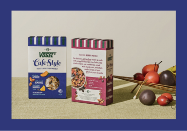
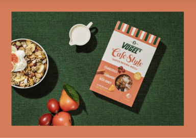
Vogel's
A Vogel’s packaging uses a contrasting combination of script and sans-serif typefaces for their muesli range.
A font is a set of letterforms that can be used to format text in a particular style. A set of fonts belonging to the same font family is known as a typeface.
Typefaces can be either serif or sans serif.
- Serif typefaces include old style, transitional, modern, and slab.
- Sans serif typefaces include grotesque and neo grotesque, humanist, geometric, script, display or decorative, and symbol or ornamental.
For professional looking designs, it is best to use two to three typefaces. Consider readability and legibility when selecting typefaces. The best typeface will depend on the format (print, web, etc.) and messaging you want to convey. Be mindful of how colour affects readability and legibility.
Typefaces may have a personality or could be neutral. Consider Comic Sans and Helvetica and the differing opinions people have of them.
Consider typographic contrast. Contrast can be achieved with contrasting styles, sizes, weights, forms, and between serif and sans serif fonts.
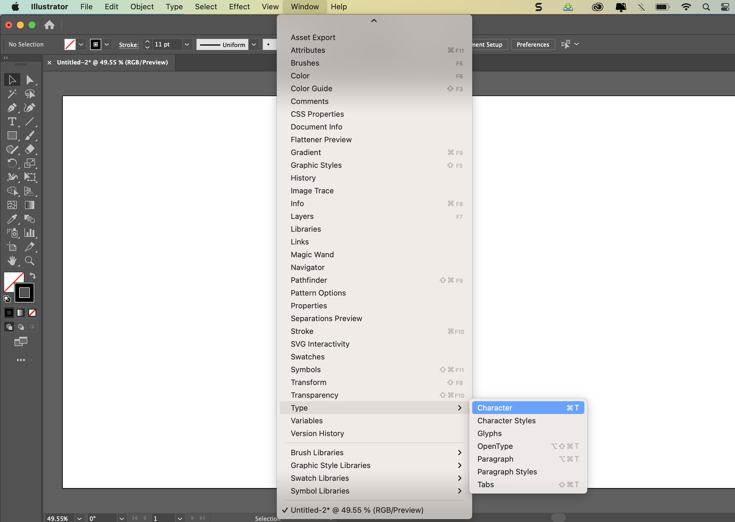
Go to Window - Type - Character (and Paragraph) see below:
Character Panel
To apply options for formatting individual characters in your documents go to Window - Type - Character. Edit type in the Character Panel when type is selected or when the Type Tool is active, you can also use controls in the Option Bar to format characters.
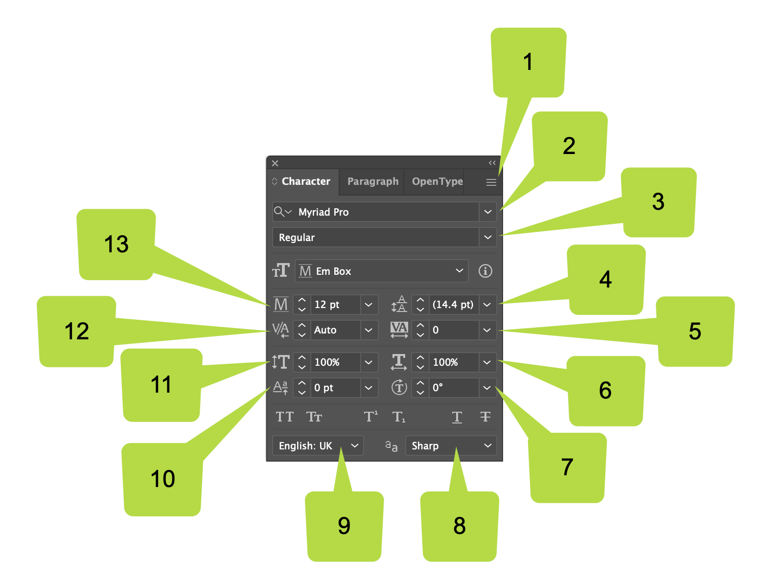
- Panel menu
- Font
- Font Style
- Leading
- Tracking
- Horizontal Scale
- Character Rotation
- Anti-Aliasing Method
- Language
- Font Size
- Kerning
- Vertical Scale
- Baseline Shift
Paragraph Panel
To change the formatting of columns and paragraphs go to Window - Type - Paragraph. Edit type in the Paragraph Panel when type is selected or when the Type tool is active, you can also use controls in the Option Bar to format paragraphs.
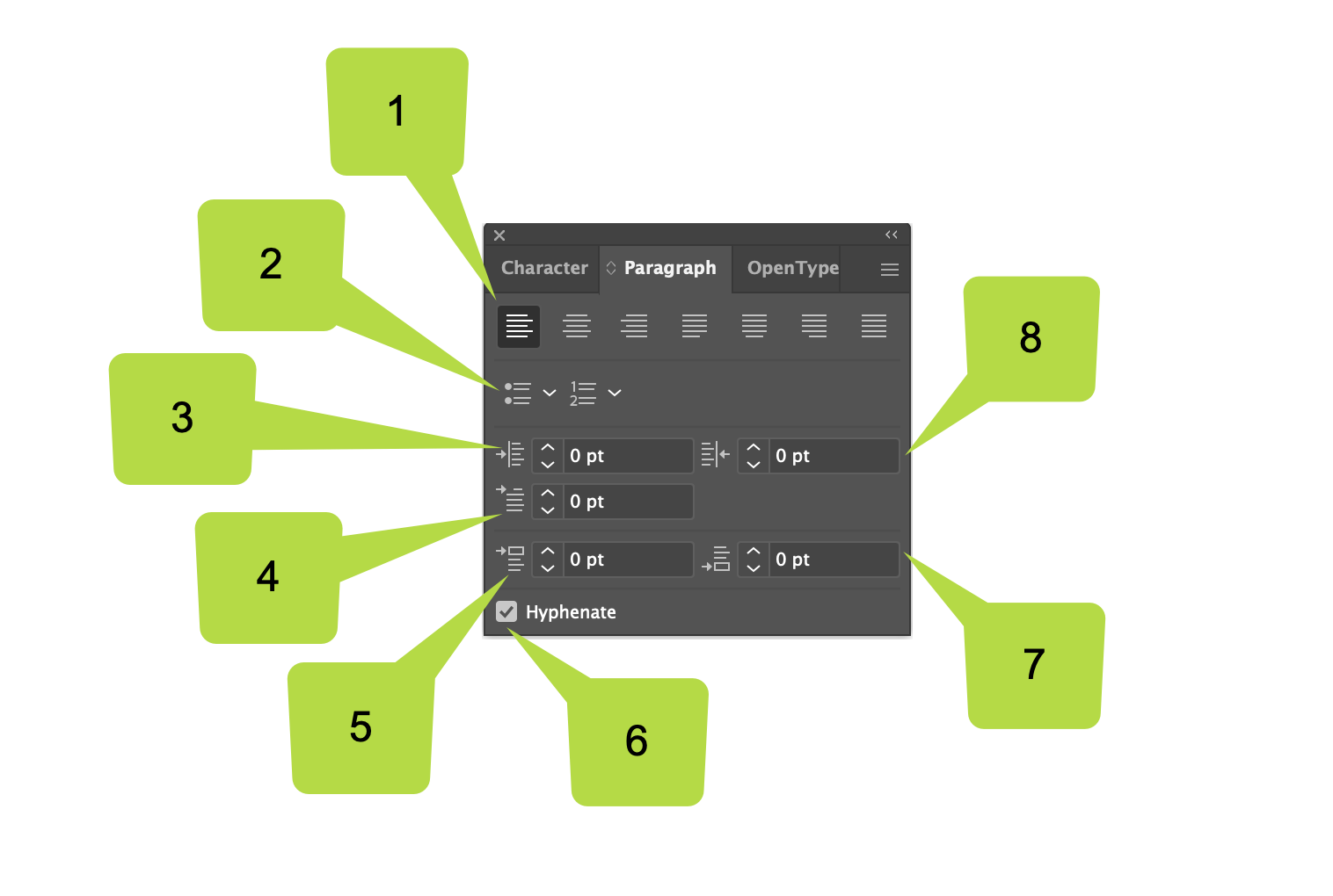
- Alignment and Justification
- Bullets and Numbering
- Left Indent
- First Line Left Indent
- Space Before Paragraph
- Hyphenation
- Space After Paragraph
- Right Indent
![]() Use the skills and techniques that you've learnt throughout this topic to experiment with text in Adobe Illustrator.
Use the skills and techniques that you've learnt throughout this topic to experiment with text in Adobe Illustrator.
Post your activity work to the Vector Graphics Practicals forum for discussion and feedback!