Throughout this topic you'll take a look at some of the similar colour and pathfinder options in Adobe InDesign, the CC Libraries Panel (which links all three applications), and advanced text wrap features.
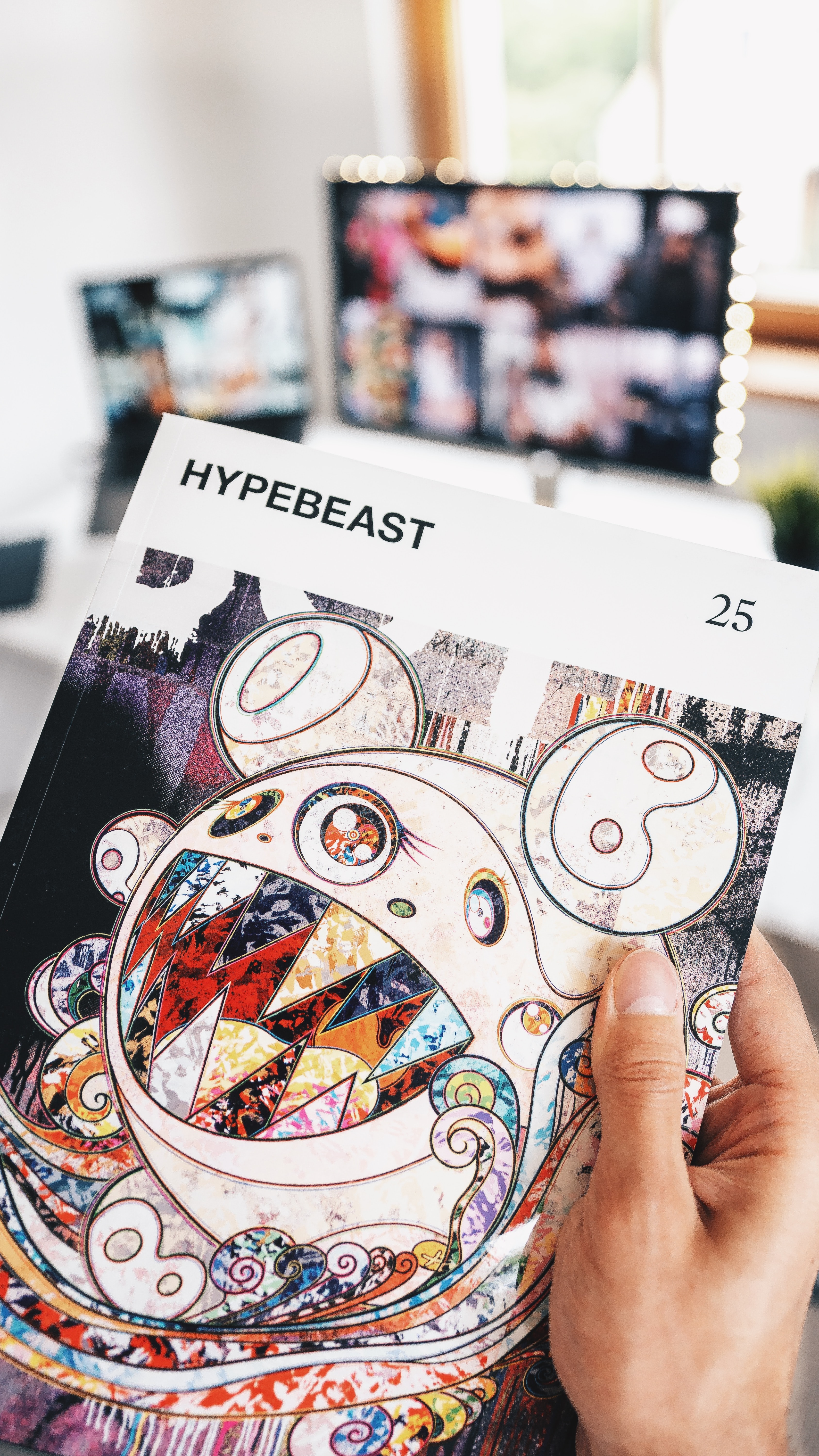
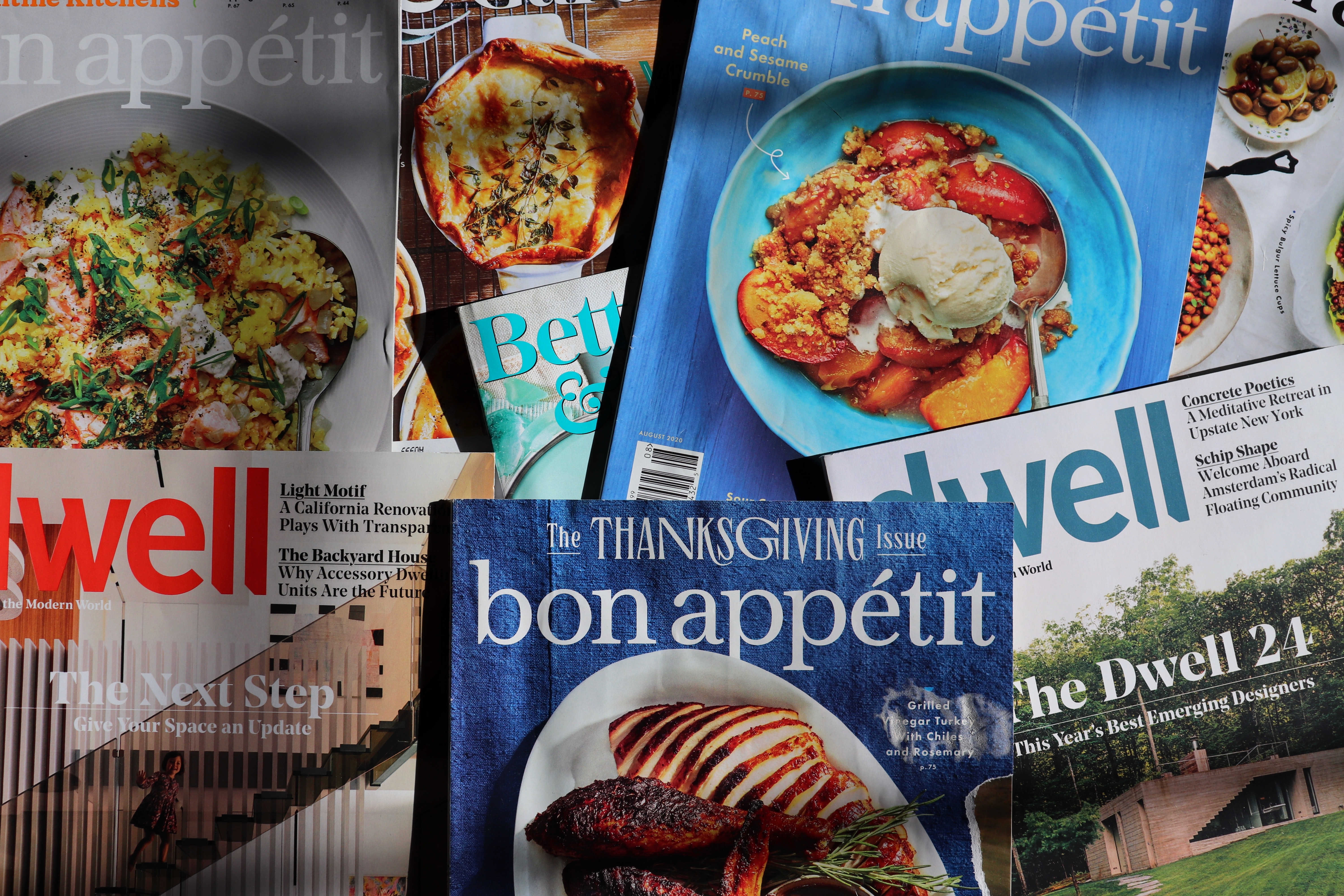
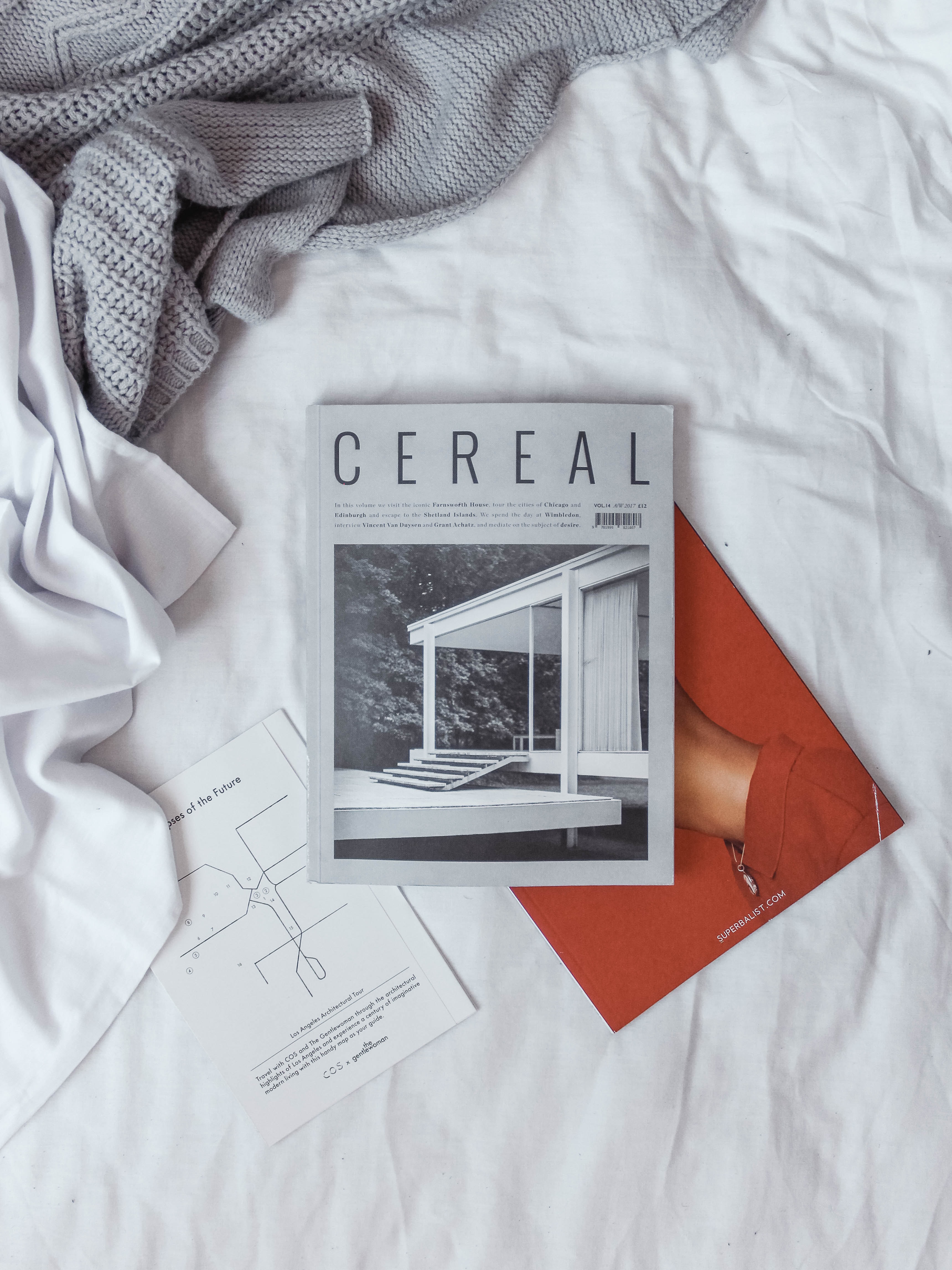
Study the magazine cover examples below to see if you can guess the genre, target audience, and/or find any recurring elements like shapes, colours, imagery and typefaces. Also, see if you can spot the different design principles and elements that are being used in each cover example.
Next, repeat this activity with a selection of magazine covers in the genre of magazine that you are creating for your final assessment. Maybe you can use some of the different design principles and elements that other magazines in the same genre have used. Research can be very valuable throughout the entire design process.
Post your awnsers to the Digital Image Practicals forum for discussion and feedback!
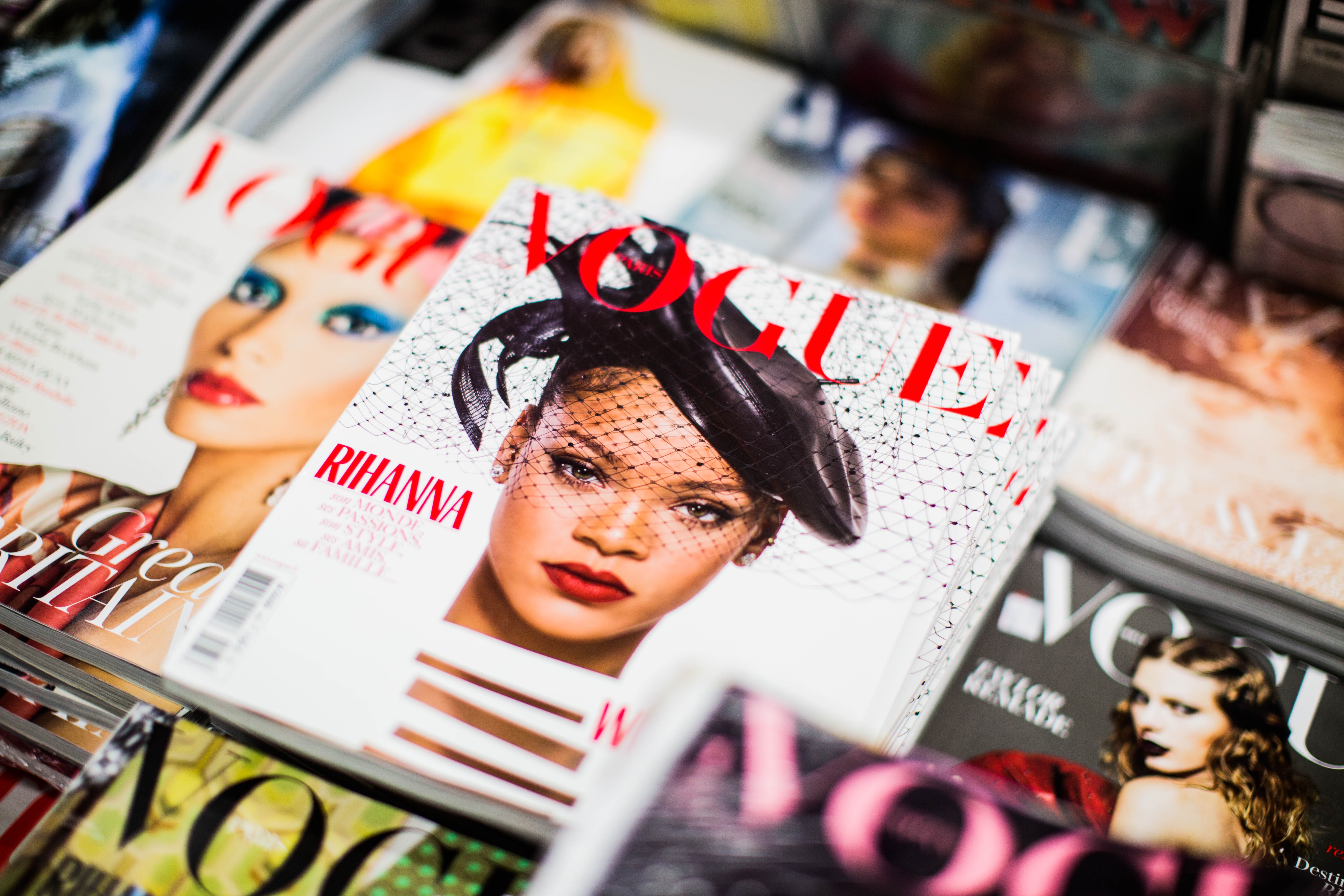 Who is the target market for this magazine?
 Who is the target market for this magazine?
 Who is the target market for this magazine?
 Who is the target market for this magazine?
 Who is the target market for this magazine?
Now that we know how to define and mix colours using colour models and colour harmonies, it’s time to look at some of the methods for selecting colours during the production of a design.
In the printing industry, there are 2 main ways colours are produced on a substrate. Depending on the print run size and the job’s complexity, these methods can be used independently or combined.
Process colours
We looked at CMYK earlier in the topic. These are the subtractive primary colours used in laser and inkjet printers to produce full-colour documents, including the faithful reproduction of photos.

CMYK inks or process colours are also used in offset and screen printing environments for the same reasons, in full-colour documents and photos.
Spot colours
Sometimes in a print job, there is a need for much higher accuracy of a colour’s reproduction, or perhaps you don’t need to print in full colour but want to be able to add an accent colour to an otherwise monochromatic document. These are scenarios where spot colours become particularly useful.
Rather than mixing colour during the design and printing of a document, spot colours are premixed colours that can be included as part of an offset or other traditional commercial printing process.
Pantone
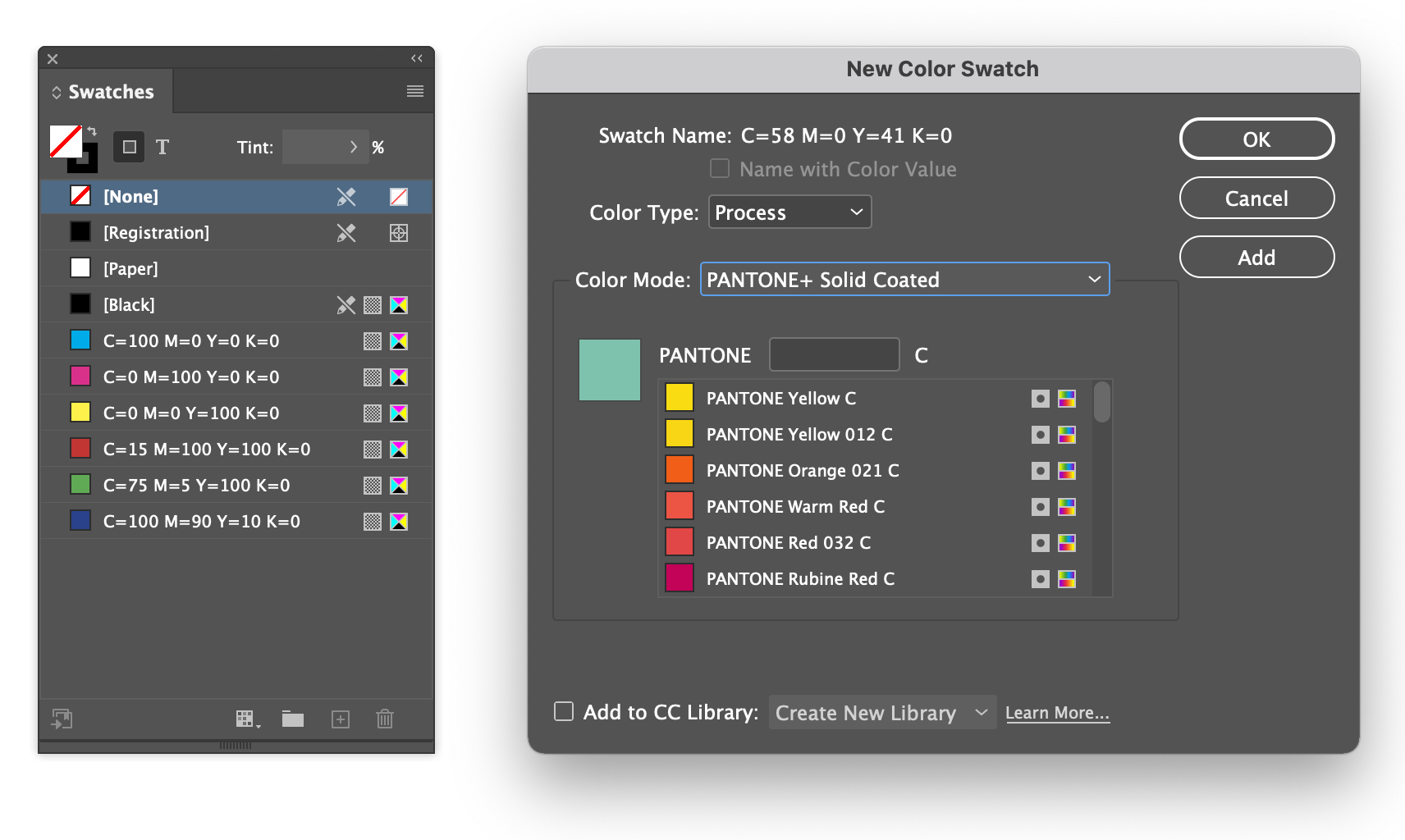
The most common spot colours you are likely to see are part of the Pantone Solid library. Pantone produces a set of swatch books that include all the colours available within the system. Users of the system can reference the colours in the swatch book and select them in software during production.
Because commercial printers know the exact colour and can also reference it in their swatch books, they can ensure much higher accuracy of colour than when working with process inks (CMYK).

In Adobe Indesign, they are available when adding a new swatch.
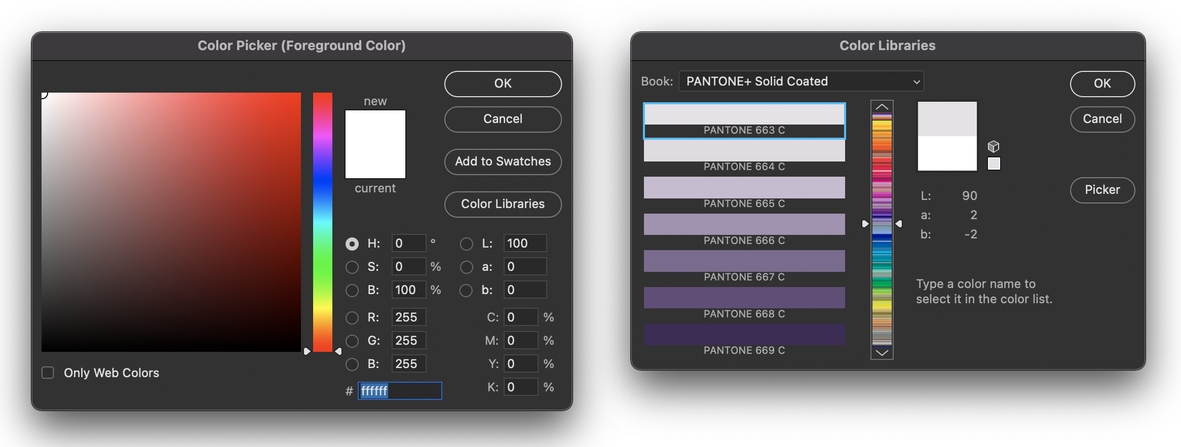
In Adobe Photoshop, they are part of the colour picker by selecting Color Libraries.
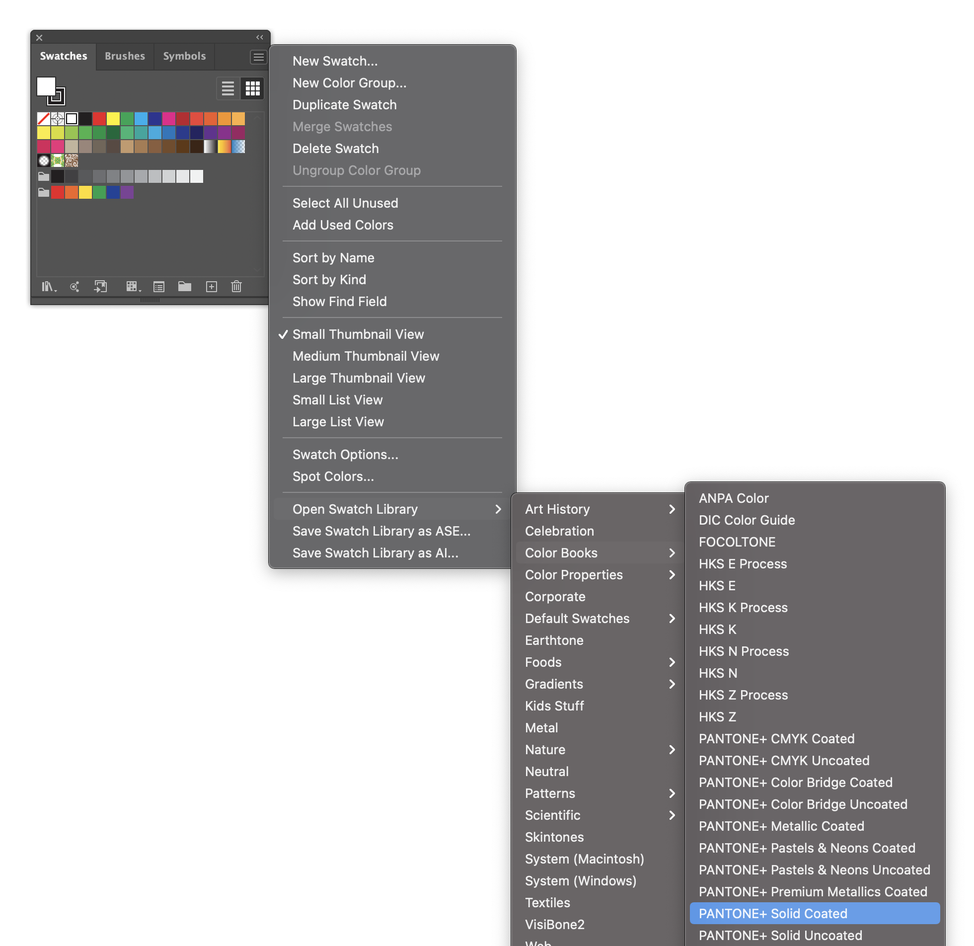
In Adobe Illustrator, they are available by selecting Color Books from the swatches panel menu.
Digital environments
When choosing colours in a digital environment, we usually work with the additive colour model (RGB). The additive RGB colour gamut (range of possible colours) is significantly wider than CMYK and relies on the device’s accuracy to display the colour.

- Visible
- RGB
- CMYK
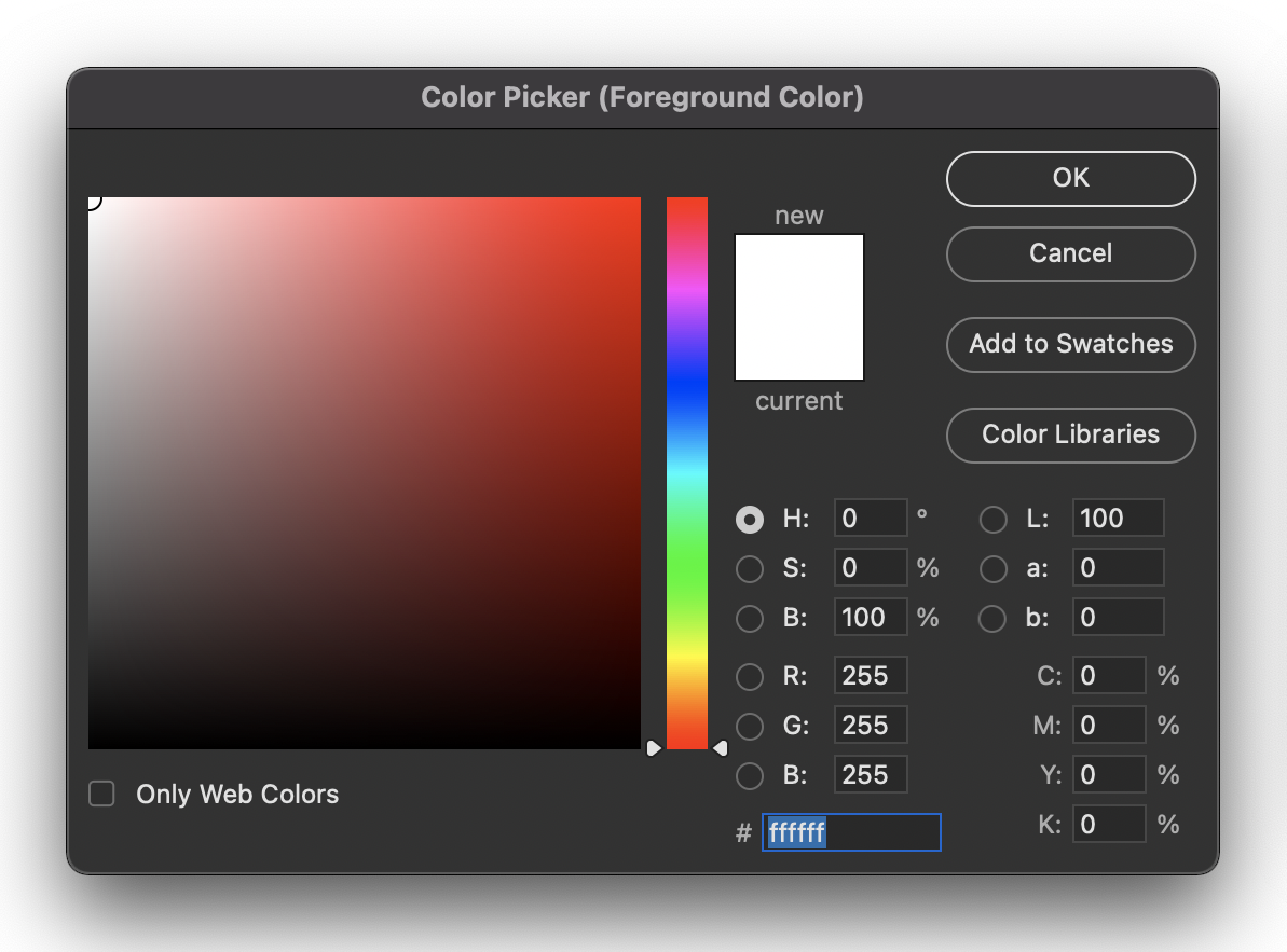
By now, you may be familiar with the Adobe Photoshop colour picker.
This famous colour picker allows you to select a hue using the centre slider then adjust its saturation at brightness by positioning a point within the tone square. Once a colour has been selected, a breakdown of its CMYK, RGB and HEX values can be seen in the window’s lower right corner.
The most common way to define colours on websites has been through HEX codes like the one at the bottom of the example image.
Each HEX code is a way to represent binary bytes in a shorter base 16 format. Each colour code is made up of 6 characters from 0 to 9, and 'a' to 'f' (10-15). The six characters make up three pairs, one for each of the additive primary colours: 00 is no colour, and ff is 255 or 100% colour.
Including a HEX value with relevant property in CSS will assign the selected element the colour value defined.
p { color: #000000; } /* black */
h1 { color: #ffffff; } /* white */
h1 { color: #aaaaaa; } /* medium gray */
ul { color: #8050c8; } /* purple */
RGB values are defined by giving a value to each additive primary colour from 0 (not visible) to 255 (100% visible).
p { color: rgb(0, 0, 0); } /* black */
h1 { color: rgb(255, 255, 255); } /* white */
ul { color: rgb(128, 80, 200); } /* purple */
/* percentages work too */
h1 { color: rgb(100%, 100%, 100%); } /* white */
HEX and RGB can be challenging to visualise in your head while you are working. Most people wouldn’t read #3b5998 and immediately think, 'That’s Facebook blue'. With practice, it can become more manageable, but it will still be tricky.
HSL (hue, saturation and lightness) is another way of defining colours. It is currently one of the least used methods but is increasing in popularity because of its more intuitive description of colours.
Similar to RGB, HSL colours have 3 variables. The first variable defines hue in degrees around the colour wheel, with red at 0 and cyan at 180.

- Red 0°
- Yellow 60°
- Green 120°
- Cyan 180°
- Blue 240°
- Magenta 300°
It can become easy to associate these positions with their hues in memory with a bit of practice.
The following variable is saturation from 0% (grey) to 100% (full saturation).
The last variable is lightness: 50% is where the hue is at its maximum vibrancy, 0% will give you black, and 100% will provide you with white.
This system makes it easy to create colour palettes based on colour harmony rules by spacing hues evenly for analogous colours or selecting hues 180° apart for complementary colours.
h1 {

  background-color: hsla(240, 25%, 50%);

}
![]() Use the skills and techniques that you've learnt throughout this topic to create a new Library in your CC Libraries Panel in Adobe InDesign. Add some content, and then check that you can access it from Adobe Illustrator. Finally, try the exclude overlap features with the same library content in both InDesign and Illustrator. Export both documents.
Use the skills and techniques that you've learnt throughout this topic to create a new Library in your CC Libraries Panel in Adobe InDesign. Add some content, and then check that you can access it from Adobe Illustrator. Finally, try the exclude overlap features with the same library content in both InDesign and Illustrator. Export both documents.
Adobe InDesign: File - Export... - Format - JPEG
Adobe Illustrator: File - Export - Export as... - Format - JPEG
Tip: Don't forget that in some applications the panel is called CC Libraries Panel and in other applications it's just called Libraries.
Post the zipped activity document to the Document Design Practicals forum for discussion and feedback!