Welcome to Topic 2 – Conduct Critical Analysis. The purpose of this topic allows you to identify and evaluate the ways in which meanings and messages are communicated in both a historical and contemporary context. It is designed to allow the process of analysis to be taken in new and potentially unintended directions.
You will be introduced to the following topics:
- Issues and ideas in the development of visual communication
- What are meanings, messages, and symbols?
- Determining the historical and contemporary context
- Critical viewpoints and analysis

Issues that arise in graphic design
The field of graphic design has expanded multifold with the new dimension of digital media added to it in the last few decades. Initially, graphic design was focused more on print media. However, with the advent of social media, the volume of content generated and consumed has increased exponentially. Because of this, the work of graphic designers has not only become highly varied but also its demand has increased.
Visual issues
Learn to recognise visual problems when it comes to graphic design. You will often know it when you see it. Look through the images below and think about how you can recognise the poor design choices:
Clashing colours5
Albinagorta, C. (2019) Clashing colours, Bad Powerpoint Examples You Should Avoid At All Costs. 24 Slides. Available at https://24slides.com/presentbetter/bad-powerpoint-examples-you-should-avoid (Accessed: October 19 2022)
This slide contains colours that clash or make the words hard to read. The image is also low-resolution and blurry.
Incorrect use of space

Albinagorta, C. (2019) Incorrect use of space, Bad Powerpoint Examples You Should Avoid At All Costs. 24 Slides. Available at https://24slides.com/presentbetter/bad-powerpoint-examples-you-should-avoid (Accessed: October 19 2022)
This design is too cluttered.
Unsuitable typography
Gendelman, V. (2013) Unsuitable typography, Worst Fonts Ever! 11 Examples of Bad Typography in Print. Company Folders. Available at https://www.companyfolders.com/blog/worst-fonts-ever-11-examples-of-bad-typography-in-print (Accessed: October 19 2022)
Comic Sans and Curlz look childish and unprofessional.

Gendelman, V. (2013) Brush script looks outdated, Worst Fonts Ever! 11 Examples of Bad Typography in Print. Company Folders. Available at https://www.companyfolders.com/blog/worst-fonts-ever-11-examples-of-bad-typography-in-print (Accessed: October 19 2022)
Brush script looks outdated.
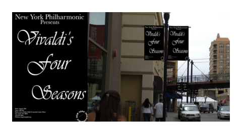
Gendelman, V. (2013) Vivaldi font, Worst Fonts Ever! 11 Examples of Bad Typography in Print. Company Folders. Available at https://www.companyfolders.com/blog/worst-fonts-ever-11-examples-of-bad-typography-in-print (Accessed: October 19 2022)
The Vivaldi font is hard to read on the poster.
Not following the design brief
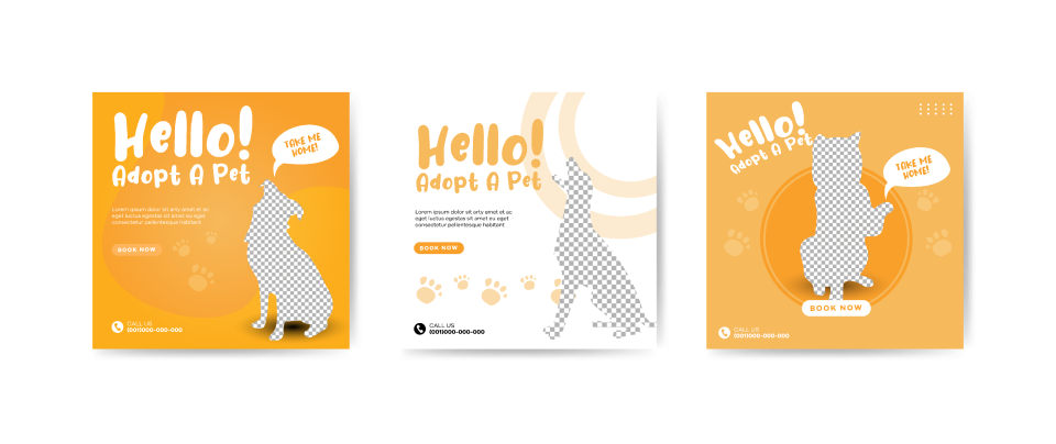
These are well-designed pet adoption posters, but if the company’s branding colours are blue and white, not mustard, then they haven’t met the brief. You can recognise these graphic design issues visually. They are simple to fix. There are other non-visual, more logistical issues you will recognise as well – such as not enough hours or budget, or unrealistic requests.
Finding solutions to graphic design issues
Listed here are some of the common problems graphic designers face.5 Read through them and then decide what you think is a good solution to these issues:

Graphic designers regularly face the problems detailed above, but these strategies should help you overcome them.
Ideas and problem-solving strategies in design
Sometimes, solving a problem or fulfilling a brief is more of a complex process. It can be useful to adopt a methodical approach and work in stages to accomplish what you need to. Here we will look at different strategies to work through issues and generate ideas.
Branching vs linear approach
Four basic problem-solving phases are learning, identifying, generating, and implementing.6

Adapted from Bowers, J., 2011. Introduction to graphic design methodologies and processes. Hoboken, N.J.: Wiley, p.xiii-xix.
Branching approach
- A solution is found by revisiting a problem’s conditions.

Adapted from Bowers, J., 2011. Introduction to graphic design methodologies and processes. Hoboken, N.J.: Wiley, p.xiii-xix.
Linear approach
- A solution is created through sequential development.
These phases can branch in different directions or be linear or branching—or a combination. Most graphic design activity moves in a branching manner; rarely is the path linear. Reflection, analysis, and evaluation occur at every step. The four problem-solving phases overlap and may be repeated. Moving backwards is as common as moving forward. The goal is to carefully consider the problem at hand and not reach a solution prematurely.6
Divergent and convergent thinking and problem solving

Adapted from Bowers, J., 2011. Introduction to graphic design methodologies and processes. Hoboken, N.J.: Wiley, p.xiii-xix.
Divergent thinking (discovering, predicting, identifying, and considering) blends with convergent thinking (prioritising, generating, refining, and making) during the design process.
The problem-solving process diverges and converges, expands, and contracts. Divergence is the process of identifying, creating, and developing multiple ways of solving a problem. Convergence is the process of selecting and developing concepts from the previous step’s multiple pursuits.6

Adapted from Bowers, J., 2011. Introduction to graphic design methodologies and processes. Hoboken, N.J.: Wiley, p.xiii-xix.
In the learning phase, the process diverges and expands as information is gathered, then contracts as information is analysed in the identifying phase. The process then again expands in the generating phase as multiple concepts are developed, and contracts in the evaluating phase, in which a single concept is refined, chosen, and implemented. Although each phase has its unique aspects, they can overlap.
Learning about the conditions that underlie and define a problem is the first step to solving it. This phase is largely conducted with the client and members of a design team.
Activities include the following:
- Talking and listening to the client
- Reading about the subject
- Visiting a physical space
- Talking with others informally
- Assembling a design team
-
Reviewing and presenting information gathered
Identifying the purpose of a project and its different parts, sensibly grouping the parts, and prioritising them constitute the next step. Goals are established and an underlying concept developed.
Activities include the following:
- Interviewing select members of the audience
- Making visual audits of entity and peer groups
- Creating positioning matrices
- Writing a design brief
- Writing, receiving, organising, and prioritising content
- Reviewing and presenting information gathered
Generating ideas that could become possible solutions comes next. The goal at this point is to give form to a concept. Multiple visual ideas (directions) on a single concept are created, from which a single direction is chosen.
Activities include the following:
- Making thinking maps and visualisation matrices
- Generating attribute lists and concept statements
- Creating off-computer sketches, images, and material studies
- Creating on-computer colour, font, grid, and typography studies
- Doing on-computer design iterations
- Reviewing and presenting work
Implementing and evaluating a solution is the final step. While refinement and evaluation of the solution to meet the project’s goals take place throughout the design process, they culminate here and hopefully reinforce earlier decisions. An internal assessment may be done to better understand studio practices.
Activities include the following:
- Conducting focus group testing
- Holding usability testing
- Seeking informal feedback
- Placing work in context
- Doing project assessment
- Reviewing work6
Client questions
Your design brief should contain the information you need to get started on the client solution, however sometimes there might be some extra information you need. If the following points are not covered, make sure you ask your client:
What are some questions you should be asking your client?7
- Is there a brand style guide available?
- Are there any fonts, colours, or styles that we should avoid?
- What previous design or marketing materials can you share?
- How would you describe the style you want?
- Do you want high-end or down-to-earth?
- Do you want to be bold and dominant or easily approachable?
- What styles would you prefer to avoid?
- What is the size of the design?
- Where is the design going to be used; e.g. web, business cards, stationery?
People have been using visual symbols and markings to communicate messages for a long time. Primitive drawings have been found all over the world and have influenced how we communicate visually throughout history up until today.8
Prehistoric visual communications

Meggs, P. and Purvis, A., 2016. Meggs' history of graphic design. 6th ed. Wiley.
Abstract geometric signs, including dots, squares, and other configurations, are intermingled with the animals in many cave paintings. Whether they represent fabricated objects or are protowriting is not known, and never will be, because they were made before the beginning of recorded history.

Meggs, P. and Purvis, A., 2016. Meggs' history of graphic design. 6th ed. Wiley.
The animals painted in the caves are pictographs—elementary pictures or sketches that represent the things depicted. A high level of observation and memory is evidenced in many prehistoric drawings.

Meggs, P. and Purvis, A., 2016. Meggs' history of graphic design. 6th ed. Wiley.
In an engraved reindeer antler found in the cave of Lorthet in southern France, the scratched drawings of deer and salmon are remarkably accurate. Even more important, however, are two diamond-shaped forms with interior marks, which imply an early symbol-making ability. The early pictographs evolved in two ways: first, they were the beginning of pictorial art—the objects and events of the world were recorded with increasing fidelity and exactitude as the centuries passed; second, they formed the basis of writing. The images, regardless of whether the original pictorial form was retained, ultimately became symbols for spoken-language sounds.
Greek symbolism
Greek culture received much of its knowledge from the Egyptians. Our use of visual symbols originated with the Egyptians; from them we inherited the zodiac, the scales of justice, and the use of animals to represent concepts, cities, and people. In Greece, the owl symbolised Athena, and the image of an owl on a Greek coin indicates that it was minted in Athens. Today we have the American eagle, the Atlanta Falcons, the Carolina Gamecocks, and the dove symbolising peace.8

Owl of Athena depicted on a Greek coin
Symbolism in politics
Symbolism can be a very powerful way of communicating messages, often more so than words. One American man found that his talent gave him powerful influence over the public, especially considering most people could not read at this time.
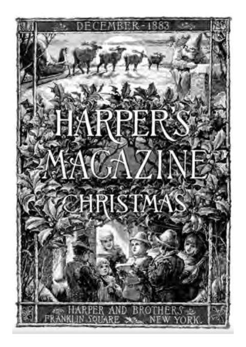
Thomas Nast (1840-1902) was a talented artist, hired by Harper’s Weekly magazine during the Civil War. The power of his work was such that President Abraham Lincoln called Nast “the best recruiting sergeant” and General Ulysses S. Grant declared that Nast had done as much as anyone to bring the conflict to a close.
Public response to Nast’s work was a major factor in propelling Harper’s Weekly’s circulation from one hundred thousand to three hundred thousand copies per issue. After the war, Nast remained with Harper’s Weekly, where he drew his images directly on the woodblock in reverse for the craftsmen to cut.
Meggs, P. and Purvis, A., 2016. Meggs' history of graphic design. 6th ed. Wiley.
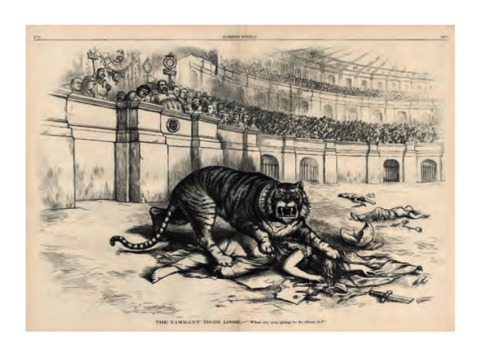
His deep social and political concerns led him to strip away detail and introduce symbols and labels for increased communicative effectiveness in his work. He has been called the father of American political cartooning. The graphic symbols Nast popularised and focused include a number of important images: Santa Claus, John Bull (as a symbol for England), the Democratic donkey, the Republican elephant, Uncle Sam, and Columbia (a symbolic female signifying democracy that became the prototype for the Statue of Liberty).
Nast also took on the governmental corruption of the political boss William Magear Tweed, who controlled New York politics from infamous Tammany Hall. Tweed claimed that he did not care what the papers wrote because voters couldn’t read, but “they could sure see them damn pictures.” Nast’s relentless graphic attack culminated on election day in a double-page cartoon of the “Tammany tiger” loose in the Roman Colosseum, devouring liberty, while Tweed as the Roman emperor surrounded by his elected officials presided over the slaughter. The opposition won the election.8
Meggs, P. and Purvis, A., 2016. Meggs' history of graphic design. 6th ed. Wiley.
Australian Graphic design in the 20th century
During the rise of advertising in the 1950s, then primarily print-based, the creative who visualised ideas to appear as advertisements in newspapers or magazines was called a ‘commercial artist’. This term described individuals with art-based training in drawing and painting who could apply their skills in the commercial service of advertisers and their customers. The commercial artist’s additional graphic design skills included an understanding of typography and lettering, technical print processes and image technologies such as illustration and photography.9
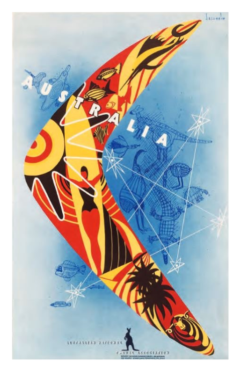
Australia Boomerang. Gert Sellheim was born in Estonia and migrated to Australia in 1926. Sellheim designed the famous flying kangaroo symbol for Qantas, as well as the two-shilling ‘Aboriginal Art’ stamp in 1948. Designer GERT SELLHEIM 1901 1970 Client TOURISM AUSTRALIA
It was during the 1950s that the term ‘graphic designer’ earned currency, as designers began to apply their skills to the new frontiers of ‘corporate identity’. To build such an identity for their client, designers employed symbols and logotypes in a broadly distributed system of colour and typography; continued usage created a memorable signpost to a company’s ‘brand’ values.
The audience of graphic design in the years after World War II was mainly in advertising, corporate identity and packaging. This equated to newspapers and magazines, corporate communications and supermarkets and neighbourhood stores. Companies were creating and marketing products for the growing ‘mass market’ that was a hallmark of advanced consumer societies in the 1950s and 1960s.9
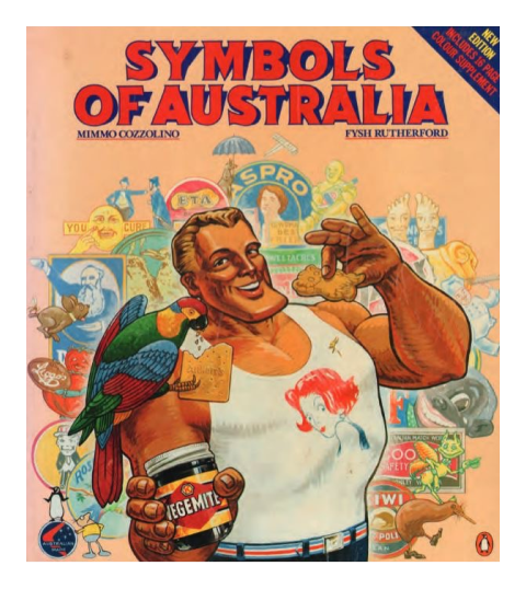
The cover illustration of the book Symbols of Australia, an overview of iconic symbols and images of products from Australia's earliest history. Designer MIMMO COZZOLINO Client PENGUIN BOOKS
In Australia, the late 1970s and early 1980s was a breakthrough period for the recognition of ‘local’ graphic designers in Sydney and Melbourne. The use of symbols and marks to identify leading companies and events became a hallmark of commercial culture in the 1980s and placed Australian design within an international graphic design culture.
‘Australians are more sophisticated than our mass media would have us believe, and they notice and appreciate when anything creative is done well.’9Wayne Thompson, Typographer - See the process spotlight on Wayne Thompson in Chapter 4, pages 122-123
While traditionally, the roots of graphic design were primarily print-based, today the discipline has been radically expanded into a range of digital extensions and expressions. The key elements of graphic design apply as much to animation, video games and numerous digital media applications as they do to the world of print.
Graphic design sectors in the modern world
Take a look at some of the many sectors of graphic design in today’s world:

Adapted from Barnum, A., Haddock, S., Hicks, A. and Oppen, F., 2013. Graphic design: Australian Style Guide. NSW: McGraw-Hill Education Australia, pp.10-40.
A professional shift has taken place in graphic design. With the growth of the creative industries, design practitioners need to broaden and diversify their practice: they are no longer the lone craftsperson working in a production line. Rather, theirs is a networked, collaborative process.
The creative industries idea embodies a shift from a purely crafted, product-driven industry to a knowledge-based economy where the true currency and value is the idea, as well as the product. Ideas and innovation are where the currency lies today. New products and production will only flow out of these innovative approaches and their resulting breakthroughs. As a young designer, it is fundamentally crucial that you are able to respond to these fast-emerging conditions.9
Your audience
The audiences of design exist in traditional markets like neighbourhood shops, supermarkets and shopping malls where people like to interact both socially and as consumers.
Then there are community and political spheres, where communication of policy messages and initiatives are generated and distributed. These communication campaigns tend to be deeply personal and require specific sensitivity and appropriate media choices.
Finally, there is the broad area of arts and entertainment, where design can bridge the gap between consumer audiences and the cultural work of artists.
All these audiences now interact with design work made for:
- Print: advertising, newspapers, magazines, brochures, books, posters, flyers, stationery
- Packaging: packages, labels, containers, display, point-of-sale
- Branded environment: events, signage, way-finding, pop-up stores, retail, exhibition
- Electronic media: radio, television, cable networks
- Internet: websites, email, interactive animation, e-commerce
- Interactive game design: PlayStation, Xbox, Wii.
The designer’s role today is to act as a conduit of ideas and strategies to achieve the objectives of a client; to work closely with a client to speak with imagination to a clearly identified audience.

Adapted from Barnum, A., Haddock, S., Hicks, A. and Oppen, F., 2013. Graphic design: Australian Style Guide. NSW: McGraw-Hill Education Australia, pp.10-40.
The client’s audience might be:
- Commercial (products or services for sale to the public)
- Social (community service, religion, public or personal initiatives)
- Political (government, public health, the environment)
- Arts-related (promotion and awareness of artists and their communities).9
Great Contemporary Graphic Designs
To understand how messages can be communicated visually in a contemporary context, we can learn a lot from looking at examples of meaningful or successful designs.
Graphic design’s purpose is to convey some sort of communication visually and there are many creative and iconic examples of these. You will be able to recognise several characters in these graphic designs that help you understand the context of the design.
Use these images and designers to inspire your own creations to express the messages that you are trying to communicate.10
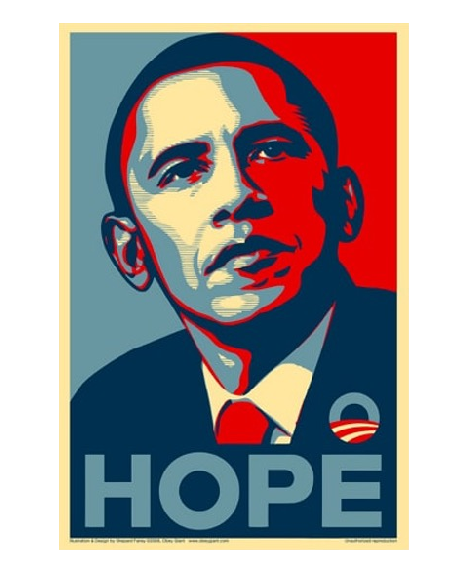
1. Shepard Fairey: Obama-Hope
Fairey, S., 2008. Barack Obama "Hope" Poster | The Art Institute of Chicago. [online] The Art Institute of Chicago. Available at:
Street artist, graphic designer, and activist Shepard Fairey created this visionary portrait of then Senator Barack Obama in 2008 as a form of grassroots activism to support Obama’s first presidential campaign. Fairey based the work on an Associated Press photograph by Mannie Garcia, which he transformed with his signature high-contrast stencil technique, inspired by the political message and bold graphics of Soviet Socialist Realism. First disseminated as a street poster, the image was later used to create thousands of stickers and T-shirts and was widely circulated online.
Emblazoned with the word “Hope” and featuring reds and blues that complement the campaign logo designed by Sol Sender, Fairey’s portrait was quickly adopted as an official image of Obama’s 2008 presidential campaign. New Yorker art critic Peter Schjeldahl called the poster “the most efficacious American political illustration since ‘Uncle Sam Wants You.’”11
2. Milton Glaser
Tenekedjieva, S., 2020. Famous Graphic Designers Who Turned Contemporary Design into Art. [online] Manypixels.co. Available at: https://www.manypixels.co/blog/post/famous-graphic-designers [Accessed 4 October 2022.
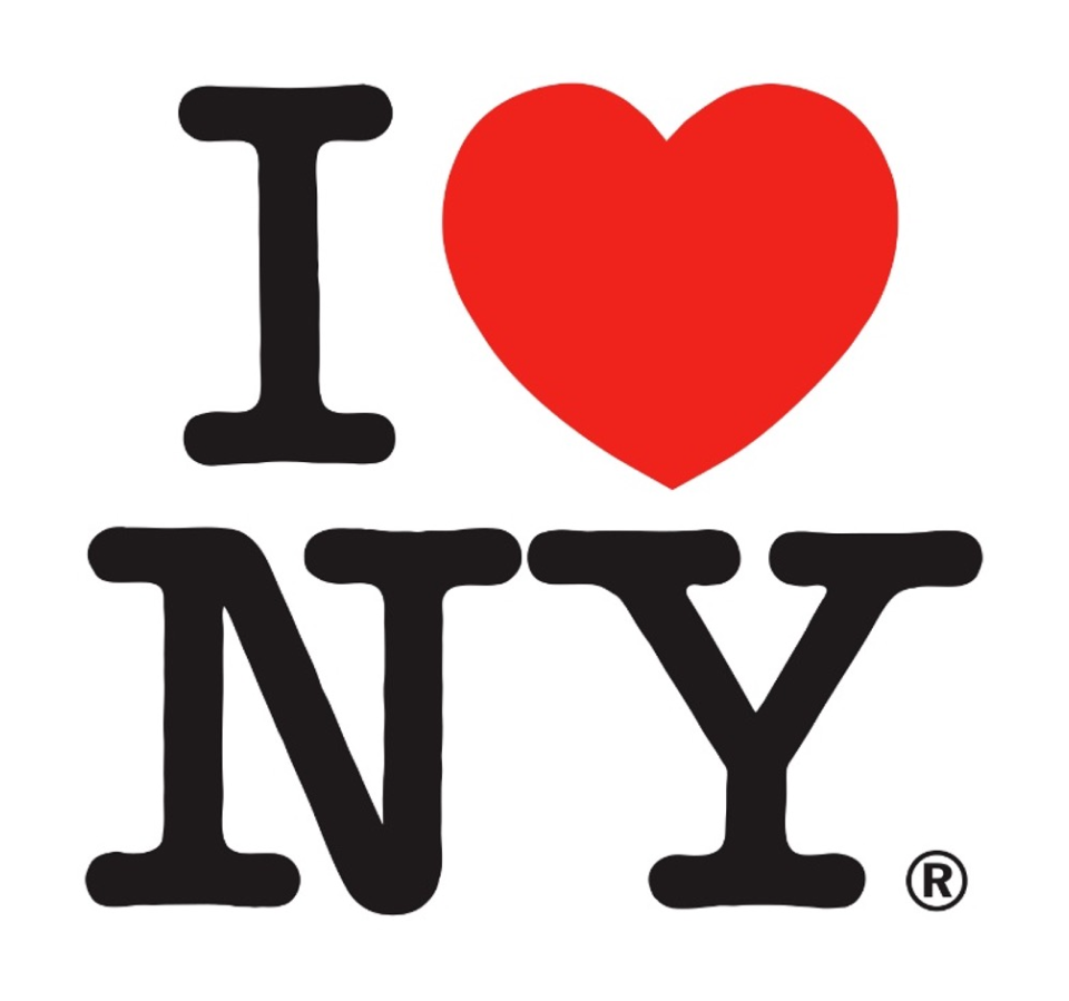
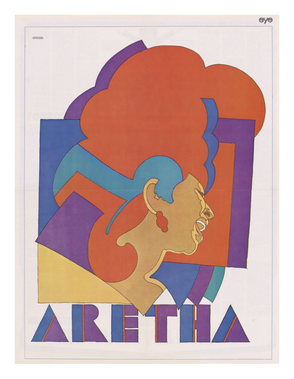
We are all used to using the heart symbol instead of writing “love”, but before Milton Glaser’s “I Love New York” design, that was inconceivable. This legendary graphic designer who passed away earlier this year has made his name designing popular logos, such as the DC Comics and Brooklyn Brewery, as well as creating eye-catching, psychedelic inspired poster designs like the famous ones with Bob Dylan and Aretha Franklin.12
Tenekedjieva, S., 2020. Famous Graphic Designers Who Turned Contemporary Design into Art. [online] Manypixels.co. Available at: https://www.manypixels.co/blog/post/famous-graphic-designers [Accessed 4 October 2022
He co-founded and wrote for the New York magazine in 1968, which still exists and comes out biweekly to this day. Glaser has made some of his typography elements available for free by publishing the Glaser Stencil typeface in 1970.
3. Peter Saville13

The Guardian. 2019. Graphic artist Peter Saville on creating Burberry's new logo. [online] Available at: https://www.theguardian.com/fashion/2019/feb/14/graphic-artist-peter-saville-on-creating-burberrys-new-logo [Accessed 4 October 2022].
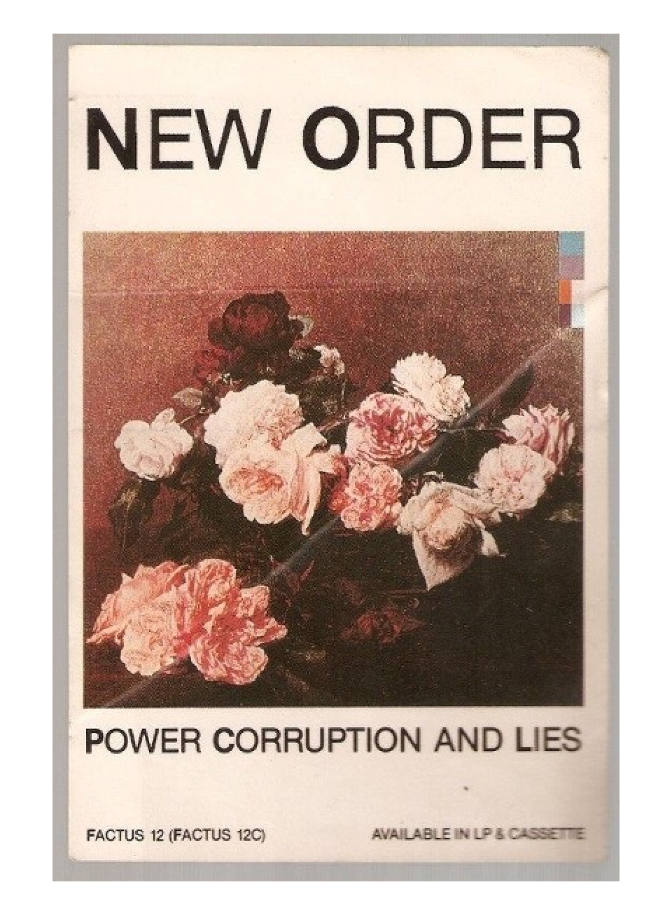
From the Burberry logo to one of the most beautiful album cover designs—Joy Division’s “Unknown Pleasures”, Peter Saville is well known for his role in spreading graphic design across mediums and closer to pop culture. He co-founded Factory Records in 1978 with Alan Erasmus and Tony Wilson, and they went on to create hundreds of album covers. Apart from designing for cult bands like Joy Division and New Order, he has created album covers for David Byrne, Pulp, Brian Eno, King Crimson, Peter Gabriel and many others. 12
Tenekedjieva, S., 2020. Famous Graphic Designers Who Turned Contemporary Design into Art. [online] Manypixels.co. Available at: https://www.manypixels.co/blog/post/famous-graphic-designers [Accessed 4 October 2022
He is also famous for re-contextualising and adapting other visual arts examples into his works, like using “Roses”, a painting by Henri Fantin-Latour combined with a color-coded alphabet to create New Order’s “Power, Corruption and Lies” album cover.
Keeping up to date with industry trends
It is also vitally important to keep well-informed of what is occurring in the industry. Since the 21st century, when technology rapidly advanced, so too did trends and developments, making it difficult to identify specific movements of this era. It is important that you can update and maintain your knowledge of design trends or developments in industry, so they are not left behind. You need to stay relevant, skilful, and knowledgeable.
To stay up to date and maintain knowledge of trends and developments, you must use opportunities such as:
- Collecting sources of information on both historical and current trends and/or movements
- Networking and professional associations
- Using those skills and attributes to during a design process for example.
Researching materials and findings from the past movements and trends is one way to inform the current design being worked on. Another is to consider researching current trends. Researching both past and current movements or trends will also add value in expanding and updating knowledge of how design is being used and developed today, these trends can then be adapted to your design work.
The following video explains how trends can be used in design. The video also indicates sources you in your creative practice.
There are a few tools you can use to keep up to date with design trends and the design industry; such as:
Design blogs
Follow blogs that highlight trends. These can inspire new ideas or inform you on other designers’ opinions.
Some blogs that may be useful are:
- https://creativemarket.com/blog/graphic-design-trends-for-2022
- https://99designs.com.au/blog/trends/graphic-design-trends/
Websites
Follow design websites that create their own collections and trend reports. You can use these for inspiration in your own work:
Trend forecasting sources
While these were previously printed sources, digital trend sources are now available. These will showcase predictions for the design trends that are likely to take off in the near future:
- https://wersm.com/8-graphic-design-trend-predictions-for-2022/
- https://www.thedrum.com/profile/depositphotos/news/what-visual-trends-will-dominate-communication-in-2021
- https://creativemarket.com/blog/graphic-design-trends-for-2022
Community of practice
This is a community of other industry professionals where discussion can take place, ideas can be shared, even job opportunities can be found. Build your own community of practice:

What is design feedback?
Design feedback opens the door for team members, clients, and stakeholders to review and analyze a design idea. It’s a crucial part of the design process because it lets you know what’s working, what’s not working, and how things can be improved.
Good feedback makes you a better creative because it helps you learn from your experiences as you hone your craft. It can also help you identify pitfalls of a design solution and give you a more focused sense of direction. When you’re aware of how to optimize your product early on, it results in a better experience for your users.
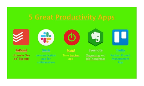
Good design feedback is a product of good collaboration. But it’s not enough to get people together in a room or on a Slack channel and ask for feedback. It’s an intentional and thoughtful process that requires that your team members, clients, and stakeholders have a basic working knowledge of how to review and critique creative solutions.14
Who should you seek feedback from?
There are many stakeholders you should seek feedback from; depending on the project and how far along you are in it.
Colleagues
Colleagues can provide knowledgeable, honest feedback, since they are in the same industry (and perhaps project) as you, and being on the same reporting level as you they might find themselves more comfortable being honest than if they were critiquing their manager. Aim to have a conversation face-to-face as well as a follow up email asking exactly what you are looking for.
Managers/mentors/tutors
Your manager should be in a great position to provide feedback as well. This may be an ongoing process as they coach you through a project, or you may like to ask to set aside some time with them. They likely have many years of experience with design and should be able to provide a broad, well-informed perspective and further suggestions. They will probably really appreciate being asked their opinion on your work.
Clients
Clients should be asked for feedback at certain points of a project. Their feedback is the most important, since they are paying for the product, and if your project goes well this could lead to further future projects with them and recommendations to other potential clients.
At what point in the design process should you gather client feedback?
The process of producing a printed project initially requires a designer to analyse the brief or client’s requirements and research the competitors and environment of the product or service. The designer then uses their imagination to brainstorm as many ideas as possible that relate to their research and analysis. These ideas need to be refined and developed until there are three possibilities that can be presented to a client. The design process includes creating a structure, often a grid, deciding on the format of the publication and selecting the paper and print techniques to be specified for a quote from the printer.9

Adapted from Barnum, A., Haddock, S., Hicks, A. and Oppen, F., 2013. Graphic design: Australian Style Guide. NSW: McGraw-Hill Education Australia, pp.10-40.
Although client presentations can be quite stressful to designers, they are essential in providing the client with the visual, verbal and written results of the designer’s work so far. Once the designer has client approval to proceed, final images and copy needs to be formatted using a style sheet for large documents. The designer sends the final client-approved designs to the printer who will produce a proof which should be checked and signed off by the client. Final printing and finishing can then proceed.9
Why should you seek feedback?
Here are some of the most important ways that you’ll benefit:
- Good feedback can provide you with fresh insights. These ‘ah ha’ moments can reveal performance improvement opportunities that you wouldn’t have realized through self-reflection.
- The simple act of asking for feedback from stakeholders helps to build closer working relationships. Most of your coworkers will appreciate being asked for feedback and if you follow the guidance below they’ll feel positive about the experience of giving you feedback.
- The feedback can accelerate and focus your development. Feedback is a great self-development tool, it provides both quick fixes to improve your performance as well as more profound development opportunities that will take time to work on. Combined with your own career and development planning it will help accelerate your career.
- You’ll feel more satisfied with the work you are doing. Research shows that seeking feedback from coworkers also has an impact on how you feel about your work. It cultivates a sense of satisfaction because you have other people’s perspective on your work too.15
- The best way to improve the effectiveness of your designs is to always be seeking quality design feedback. I say quality design feedback, specifically, because not all feedback is created equal.16
Here are some tips to help you to gather high-quality feedback for your designs:
It’s impossible to give high quality design feedback on something when you don’t know what it is, or what it aims to be. Always begin by stating the goal of your project.
Design project goals can be defined as the purpose you set for your design, that will result in both the activity and feeling needed, in order to help users move towards their goal.
Good design goals are user goals or business goals, communicated as behavioral goals. For example, a business goal might be to “increase the number of subscribers,” leading to the behavioral goal “get more people to submit the signup form”.
Whatever the goals for your project, be sure to state them upfront.
Be sure that your feedback session is centered around the problem your design is trying to solve, rather than the possible solution. This will help to keep the discussion open.
For example, saying “I think this button should be orange” doesn’t offer any information about the problem. Instead, try saying, “We need this button to stand out. What do you think?” This is more likely to lead towards a collaborative conversation about different potential designs.
By focusing on the problem, you’ll likely also get less subjective feedback based on people’s personal preferences. You can also focus on similar questions like, “How will people use this?” or “How will this solve the initial problem?”
After sharing the goal of your project, and the problem you’re solving, it’s also good practice to tell people the goal of your design feedback session.
Just as writers ask for various kinds of feedback (like commenting, editing, and proofreading) designers can request different types of critique too.
For example, depending on the stage of a project and the problems you’re tackling, you could be looking for:
- Suggestions about which visual direction to take
- Another pair of eyes on work to catch mistakes and omissions
- Someone to brainstorm or talk through design decisions with
Usually, of course, all kinds of feedback are welcome. But in some cases, like when you’re stuck on something very specific, it can be frustrating to have to field a much broader set of comments.
You can also avoid this by guiding your feedback session in a very organized way: get feedback piece-by-piece, with each one relating back to your overall goal for the session.
If you’re seeking feedback remotely by sending your mockups to a mentor, team member, or client, using a project management or team collaboration tool can be especially helpful.
My favorite tool for design feedback currently is Miro. The app allows you to easily ideate, organize insights, and create end-to-end design flows. With Miro you can share mockups, get feedback, and gather approvals all in one place and in real-time.
You can also seamlessly add Sketch, InVision, Adobe Creative Cloud and more to your Miro workflow through integrations.
Miro allows you to easily share your work through presentation mode and high resolution exports of board content. By controlling the environment of your designs in an app like this, collecting and tracking feedback becomes 10x more organized, and effective.
A great way to get specific, actionable design feedback is to limit the number of choices available.
For example, if you’re unsure about the color of a button, but know there are only three appropriate colors in your brand’s color palette or design system, display only those three options, and make it clear that other possibilities aren’t available for that project.
Limit the number of designs you ask for feedback on as well. Don’t overload your reviewer with too many items for a single discussion. Instead, focus on quality over quantity. Use approaching deadlines as a guide for deciding which pieces to ask for feedback on.
Referring to data gathered from testing or from a live product is a surefire way to get informed feedback. Data can prove the effectiveness of a design in a way that subjective opinion cannot.
Use quantitative data to define, and qualitative data describe. Both types of data are necessary to paint a complete picture. For example, suppose that you’re redesigning your software company’s free trial experience.
To fully understand the impact of a redesign, highlight quantitative data from before and after the redesign, like action-completion rates, conversions from free to paid accounts, and so on.
If you’ve conducted user research and testing, showcase any qualitative data available when discussing design decisions with your reviewer. Paired with personas, qualitative data will make sure that design feedback stays centered around user stories.
Remember, without supporting data your design might be weak—but without a story, your design could be meaningless.
Don’t fill design “feedback” sessions with your own thoughts or defenses of your design decisions.
Leave space for your reviewer to provide their honest feedback. You must ensure that the reviewer feels both comfortable giving you candid critique, and has multiple opportunities to provide feedback on each topic.
Coming back to a topic later on—after discussing the project in its entirety—can give both you and your reviewer a new outlook. Similarly, offering enough time to pause between topics and allowing for feedback to organically conclude, will help the review process.
Many people want to know specific questions to ask during a design feedback session. Here are some of the things Designlab UX Academy students are encouraged to ask during group critiques:
- What is memorable?
- Where did you become bored?
- What problem is this solving?
- How does this information support this page’s purpose?
- What is confusing?
- Does this design appeal to you as a person?
- What is missing?
- Where would you put this element?
- What could be removed?
- Did I emphasize this enough?
Then, once your reviewer has given you their unique point of view, prompt them to take it a step further by asking, “why?” and if necessary, “why?” a few more times too.
While you should obviously understand what others do like about your design, be sure to also capture what they do not like.
This is kind of like that interview question “How could our company could do better?” This question makes it so that constructive criticism is almost required in order to properly provide an answer—after all, everything can be improved.
Above all else, the best way to get helpful design feedback is to always accept it gracefully—both praise and critique. A guaranteed way to not get helpful feedback in the future is to come off as argumentative or too defensive when offered constructive criticism.
While receiving constructive criticism can be ego-bruising, it’s important to receive it with tact and grace. Here are some tips on handling constructive criticism:
- Try not to react at all—whatever your first reaction is, shut it down.
- Say thank you—and mean it. After all, even negative feedback is usually out of care, not malice.
- Engage your most thoughtful self, and shut down your combative self.
- Seek to fully understand the other person’s feedback and perspective. If you don’t understand, ask further open questions.
- Deconstruct the feedback to get to the root of the issues raised—after the conversation if necessary.
Whether you’re in design school, working on a design team, or design freelancing for clients, asking for design feedback is an integral part of any good design process.
Ensuring that feedback is high quality, through these helpful tips, is what will make your designs truly succeed.
Key Takeouts:
- There are many issues you may encounter as a designer. Build up your skillset and use methodical problem-solving strategies.
- Symbols and markings have conveyed messages for nearly if humans have existed. Over time, they have allowed primitive communication, influenced politics, and put Australia on the map for modern graphic design.
- Use contemporary graphic design to inspire your work and express the messages you are communicating with creativity.
- Build a thorough process for seeking feedback from multiple sources.