Welcome to Topic 3 – Present Ideas about Visual Communication History and Theory. The purpose of this topic is to inform and enrich your practice through your understanding of history and theory. You will develop substantiated opinions and ideas and present your findings with clarity and accuracy.
You will be introduced to the following topics:
- Form valid opinions about visual communication history and theory
- Make informed contributions to professional discussions of your visual communication of practice as a result of research
- Document and present clear and accurate ideas
Design can be largely subjective, however there’s a lot more beneath the surface when it comes to forming your own opinions. To form substantiated opinions, you must base these opinions on evidence.
But how do you know how strong the evidence is?
Validity and Reliability
Before we base our opinions on research or other sources, we must make sure we understand first how reliable and valid they are. Anyone can publish a paper, but you need to look at how data was collected, what constructs were measured, how repeatable the test and results are to affirm that the paper is credible. To do this, we can investigate reliability and validity.
Reliability
Reliability refers to the consistency of a measure. High reliability means that taking the same measurements multiple times produces the same results.
For example, you might find that there is a study that indicates that the colour that reminds people the most of food is red. Asking a single person which colour makes them think of food the most might tell you that they think of red, but until you have asked a large amount of other people, it could be down to random chance. If you ask 100 people which colour makes them think of food the most and 90 of them, say ‘red’, then you can assume these results are more reliable.17

If you measure the same thing many times but get very different values each time, your data is unreliable. This inconsistency hinders your ability to draw conclusions and understand relationships.
The four types of reliability

- Test-retest: The same test over time.
- Interrater: The same test conducted by different people.
- Parallel forms: Different versions of a test which are designed to be equivalent.
- Internal consistency: Consistency between individual items of a test.18
Validity
Validity refers to whether the measurements reflect what they’re supposed to measure. High validity means that you’re measuring what you think you’re measuring.
Returning to our previous example, you might find a study that is trying to find out what colour they associate the most with food, however the question they are asking participants is ‘What is your favourite colour of cake icing?’ This question doesn’t measure what they should be measuring, so it has low validity.

The four types of validity19
- Face validity
-
Face validity is how valid your results seem based on what they look like. We look at how valid a measure appears on the surface and make subjective judgments based off that.
For example, you’re looking to measure participants’ ages in a health study. You have two methods of recording age:
Asking participants to self-report their birthdate and then calculating the age
Counting the number of grey hairs on each participant’s head and guesstimating age on that basis
These two methods have dramatically different levels of face validity: The first method is high in face validity because it directly assesses age. The second method is low in face validity because it’s not a relevant or appropriate measure of age. In research we should not rely on face judgments alone – more quantifiable methods of validity are necessary to draw acceptable conclusions.20
-
- Content validity
- Content validity is whether the measure used in the research covers all of the content in the underlying construct (the thing you are trying to measure). For example, a written exam tests whether individuals have enough theoretical knowledge to acquire a driver’s license. The exam would have high content validity if the questions asked to cover every possible topic in the course related to traffic rules. At the same time, it should also exclude all other questions that aren’t relevant for the driver’s license. This is also a subjective measure, but unlike face validity we ask whether the content of a measure covers the full domain of the content.21
- Criterion validity
-
Criterion-related validity is a measure of the quality of your measurement methods. The accuracy of a measure is demonstrated by comparing it with a measure that is already known to be valid. For example, a researcher wants to know whether a college entrance exam can predict future academic performance. First-semester GPA can serve as the criterion variable, as it is an accepted measure of academic performance.
The researcher can then compare the college entry exam scores of 100 students to their GPA after one semester in college. If the scores of the two tests are close, then the college entry exam has criterion validity. When your test agrees with the criterion variable, it has high criterion validity. However, criterion variables can be difficult to find.22
-
- Construct validity
- A construct represents a collection of behaviours that are associated in a meaningful way to create an image, or an idea invented for a research purpose. Construct validity is the degree to which your research measures the construct (as compared to things outside the construct). Depression is a construct that represents a personality trait which manifests itself in behaviors such as over sleeping, loss of appetite, difficulty concentrating, etc. However, any one of these indicators may be associated with several constructs. A person with difficulty concentrating may have A.D.D. but not depression. So, choosing just one of these signs would give you a low construct validity.19
Reliability versus validity
Take a look at the following table to compare reliability and validity to make sure you remember which is which:23
| Reliability | Validity | |
|---|---|---|
| Importance | Similar measurements for the same person/item under the same conditions. | Measurements reflect what they’re supposed to measure. |
| Assessment | Stability of results across time, between observers, within the test. | Measures have appropriate relationships to theories, similar measures, and different measures. |
| Relationship | Unreliable measurements typically cannot be valid. | Valid measurements are also reliable. |
The graphic below shows a visual representation of validity and reliability. The targets represent what the research is trying to prove, and the markers represent the data. The aim is to have the markers all hitting the centre of the target. If they are spread out then they are unreliable, and if they are not on the centre of the target then they are invalid.

Wagle, K. (2018) Reliability and validity, 17 Differences between Validity and Reliability. Public Health Notes. Available at: https://www.publichealthnotes.com/17-differences-between-validity-and-reliability/ Accessed: October 19 2022)
When you are deciding what research you should base your own opinions on, you should at least be informed as to how valid and reliable that source is. The difficulty is that graphic design, compared to scientific fields, is subjective by nature, and there is a lack of readily available studies on every construct. Therefore, you need to be able to learn how to search for reputable sources and decide for yourself if they are high quality and why. Some clues to whether you have a good source or not can be things such as being published in a well-known textbook, or a study published in a reputable journal. Museums also serve as excellent and trusted resources with qualified experts curating the artefacts and information

Clues that may show you that a source isn’t as reliable or valid might be that they are the opinions of someone writing a blog, without credentials or their own sources listed.
Let’s take a look at some graphic design examples:
For each of these sources, take a look, click on the links and have a think about what clues there are to tell you whether or not each one is a reliable source:
- https://en.wikipedia.org/wiki/Art_Nouveau
- This is NOT a reputable source. Wikipedia is edited by the public and it is easy for mistakes to appear here.
- Peter Saville : Design Is History
- This IS a high quality source. ‘Design is history’ is a great website to use for research as it uses credible references and exhibits many influential graphic design artists and works from the Art Nouveau movement.
- The Art Story: Visual Art Movements, Artists, Ideas and Topics
- It is not a reliable academic source. Although it looks on the surface to be ok, there is quite a lot of bibliographical information in there and there is a lack of referencing in the site.
- Description of Liderezas (Indigenous Women Leaders), 2022 | The Guggenheim Museums and Foundation
- This is an art description from the Guggenheim Museum website, including an audio description. This is a well-referenced and trusted source.
- https://pubmed.ncbi.nlm.nih.gov/36118965/
- This is from a reputable online journal (PubMed) and contains an extensive list of high quality references.

Now that you have some knowledge of forming opinions when it comes to visual communication, it is vital that you are able to communicate these in a professional setting. Here is a video showing an example of discussion around visual communication by Darcy Nicholas; leading Maori artist.24
Though you are completing your education in an online, asynchronous manner, there will still be times when you will need to be able to have oral discussions with others in your field, tutors, future colleagues, managers, and clients around your professional opinion when it comes to graphic design. Professional discussion is a structured, two-way conversation between two people. It provides a flexible way to gain a deeper understanding of how much a learner knows about their field. These types of discussions can be used in assessments as a means of measurement to track learners’ performance and address any gaps in knowledge, skills and behaviours. Discussions are a more informal way of communicating your ideas, however you should still take them seriously and they can still be nerve wracking.25
Discussion tips
Set the scene
Set clear expectations up front on what you will be discussing and why. It may be that you would like a discussion with a colleague to bounce an idea off them and you’d like their feedback. It may be that you would like to persuade a client to have a simpler design than what they have asked for. When setting a meeting, book in a realistic amount of time and send them a brief, allowing them time to prepare their own thoughts.
Listen
Ensure that you properly listen to the other person. Show this with your body language: Engage in eye contact, encourage them by nodding. Also show you are listening by responding to what they say, and consider their viewpoint before just rattling off your own thoughts in response. Tell them what you agree with, and why, and also what you don’t agree with.
Learn
A professional discussion is an excellent learning opportunity, use it wisely. Enter into it with an open mind; you may learn something valuable that influences your work in the future. The other person may be an expert in a particular topic, or have many years of experience so you should always respect that and be aware that they may have learnt lessons that you haven’t come across yet.
Stay polite
Professional discussions should be just that – professional. Be courteous to the other person and don’t dismiss their views just because you don’t agree with them. Try not to interrupt or let the discussion become heated. Keep a friendly disposition and always thanks them for their time.
What if you don’t agree?
Some of the best and most interesting discussions arise as a result of disagreements. It could be that they suggest a point that you haven’t considered properly. Maybe they agree with you, but just have a different priority to you so make sure you get to the bottom of the reasoning and make the discussion constructive rather than defensive.
As a good rule of thumb, if both parties have said their piece and can’t agree, you have 3 options:
- You could defer to whoever has both experience and knowledge in that topic
- You could try to reach a compromise that meets in the middle and satisfies both parties somewhat
- You could ask an appropriate third party to weigh in and help you both decide

Documenting your ideas
You many need to create presentations or reports and present these to your team, manager or client. When you document your work or ideas it’s important to be clear, professional and to fulfill your brief.
You may be asked to present designs, presentations, or reports as a graphic design professional.
You do some research on other environmentally friendly brands, and other homeware brands.
Design brief
Let’s say that you are asked by your manager to create a visual identity for a new client; from colour scheme to logo and to present your ideas.
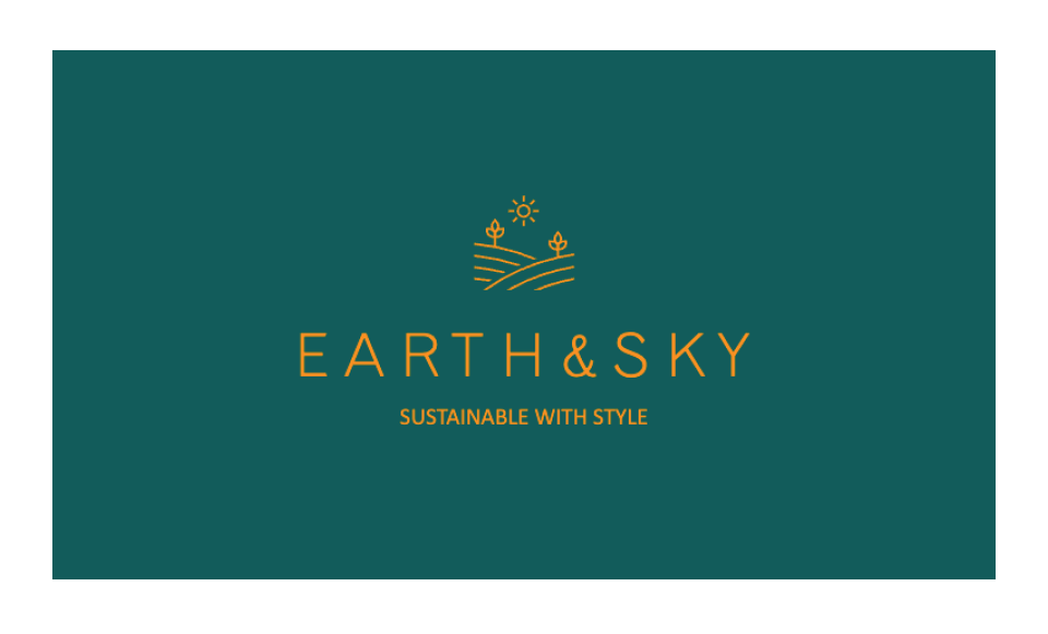
The company is called Earth & Sky, an Australian business that produces environmentally sustainable homewares. They are looking for a simple, earth-tones visual identity, colour palette and logo.
A logo
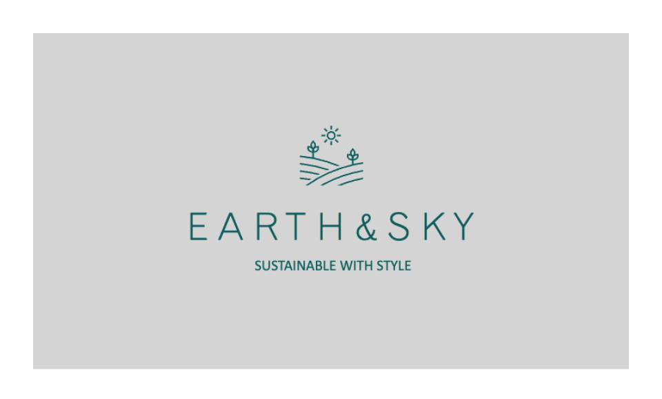
An alternate logo
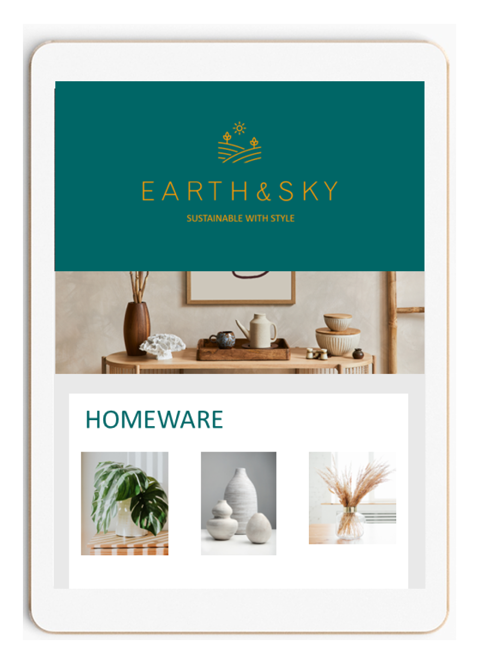
A mockup for their webpage
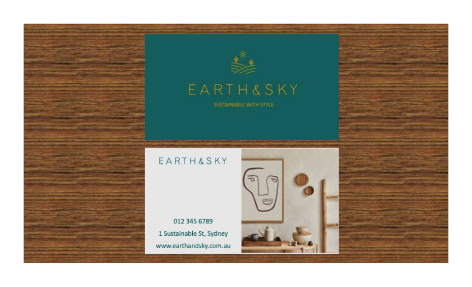
A business card
And a colour scheme.
Your manager also wants a report on your research for this visual identity.
Here are some things that are useful to write in your report:
- What research did you do to find a colour palette?
- Attach websites or textbook names that you used to understand which colours were representative of company values such as environmental, Australian-owned, rustic, natural tones and textures.
- You could attach a ‘mood board’ or collage of inspiration you found
- Talk about other brands that have similar styling and why you think that their colour schemes are successful
“I understood that Earth & Sky were looking for a visual identity that has a natural, sustainable focus to represent their products and mission.
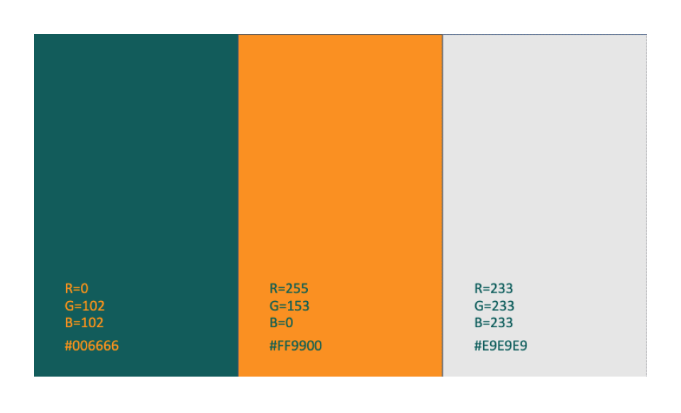
I drew upon the colour associations and cultural meaning guide found in Graphic design: Australian Style Guide (Barnum, A. et al., 2013) to establish a colour palette based in natural tones. I used a darker forest green which is accented by a golden yellow-brown shade to evoke the spirit of autumn, leaves, nature, trees, sunlight. I have used natural textures such as wood within the branding such as the website.
The brands that inspired me were ‘XYZ’ because….”
- What research did you do before creating a logo?
- Attach websites or textbook names that you used to understand which symbols, styling, lines, complexity etc. were representative of company values such as environmental, Australian-owned, rustic, natural tones and textures.
- You could attach a ‘mood board’ or collage of inspiration you found
- Talk about other brands that have similar premise to Earth & Sky and why you think that their logos are successful
- Discuss the symbolism you used, what messages are in the branding and what design movements inspired your choices and why
“I understood that Earth & Sky were looking for simplicity in their brand, which from a design perspective is known to increase trust in the brand (include a reference).
I used clean, curved lines lines to create a simple logo depicting hills, plants and the sun to create a strong association not only with the brand’s environmental-based values but also with the name; Earth & Sky.
The logos and companies that inspired me were ‘XYZ’ because….”
- What feedback did you seek and what changes did it prompt you to make?
- Detail who you sought feedback from and why them
- State what feedback you asked them to provide, and their responses
- Explain which changes, if any, you made and why
“I sought feedback from 3 of my colleagues on the branding. I chose them because I value their opinions as designers, and they have some experience working with brands similar to Earth & Sky. One of them suggested that I look more into texture, so I looked into adding the wood texture that is present within the brand identity. This was beneficial because it added an extra dimension and tactile feel to the brand…”
Ensure that you include a bibliography at the bottom with all of your references in it.
Now you can present your ideas to your manager, talking through your choices, the designs you have created and your report.
If you are presenting your ideas to a few more people, it can feel daunting. But if you are able to take on board some of the following tips and tricks you should be able to present more confidently.
Proper planning and preparation prevents poor performance.Stephen Keague, the little red handbook of public speaking and presenting
Glossophobia
Symptoms include:
- Intense anxiety prior to speaking, or simply at the thought of having to verbally communicate with any group
- Avoidance of events which focus the group’s attention on individuals in attendance
- Physical distress, nausea, or feelings of panic in such circumstances.
Why are we afraid of public speaking?

One study indicates that up to 75% of people experience feelings of stress or anxiety when faced with public speaking.
Reasons for this may include:
- Fear of rejection.
- Fear of being judged or evaluated.
- Fear of being ostracised.
According to most studies, people’s number one fear is public speaking. Number two is death. Death is number two. Does that sound right? This means to the average person, if you go to a funeral, you’re better off in the casket than doing the eulogy.Jerry Seinfeld
-
Understand your topic
- If you know what you are talking about, you will feel more confident.
-
Allow for questions at the conclusion of your presentation
- By anticipating possible questions, you can have pre-prepared answers or solutions.
-
Speak slowly
- Really slowly. When your heartrate quickens, so will your speech.
-
Your audience wants you to do well
- They will be rooting for you and want you to feel at ease.
-
Say thank you
- Your audience will thank you back.
-
Focus
- Focusing on friendly, attentive people in the audience has been found to help.
-
Do not take yourself too seriously
- Mistakes are often unnoticed by audiences.
-
Rely on visuals during your presentation.
Well-designed visuals do more than provide information; they bring order to the conversation.”Dale Ludwig
How can you be a better audience member?

Show interest in their presentation, this includes body language. Give the speaker your full attention. Show respect by not speaking with other audience members during the presentation. Eye contact is important, make eye contact with the presenter.
Creating your own presentation
Consider the following pointers on presentation skills and check each one off when the time comes to create your own presentation.
Visual communication
Visual information is the first thing that forms the audience’s impression. Good presentations include effective and influential slides. Your presentation should not contain more than 100-word text slides.
Interpersonal communication
Giving a good presentation is unimaginable without building a rapport with the audience. Effective interpersonal communication means convincing each member of the audience that you’re speaking directly to them.
Verbal communication
Speaking in a clear and confident way is key to delivering your message to the audience. Verbal communication is the most obvious part of our communication and plays a major role in presentation as well.
Humour
Using humour is an effective way to engage the audience during a presentation. Including a few light-hearted slides can be a great idea to increase your audience’s mood.
Storytelling
Storytelling means the ability to tell an inspiring story, which is important presentation skill.
Attracting the audience
To inspire your audience, you need to attract them in the first place. A great balance between verbal and non-verbal communication, as well as engaging visual materials, lead presenters to attract the audience.
Keeping things simple
Sometimes you give presentations about topics that are unfamiliar to the audience. Considering this, there’s no need to make things complicated. By keeping things simple, you’ll avoid confusing your audience.
Using body language
Body language accounts for as much as 55% of our communication. Effective presenters try to control their bodies, gestures, and pose in order to make an impact on the audience.
Managing emotions
Sometimes people don’t like the way you present things or are not interested in the topic. However, rejection shouldn’t affect your self-image. Effective presenters know how to deal with the stress of public speaking and manage their emotions.
Self-awareness
Being self-aware means knowing your strengths and weaknesses. And this, in turn, helps you to use your strengths and work on improving your weaknesses.
Leadership
A presenter plays the role of leader for the audience. Even if leadership isn’t natural to your personality, acting as a leader will help you to manage the audience.
Focus on the audience
Your presentation should be centered on the audience, not on yourself. The main purpose of the presentation is to engage the audience. So, good presenters pay attention to the needs and preferences of the people listening to them.
Active listening
Ending your speech doesn’t mean that the presentation is also finished. The presentation is a bilateral process between the presenter and the audience. Therefore, you should listen actively to the audience in order to find out their reactions and opinions.
Time organisation
No one listens to your presentation for hours. Studies show that the optimal length of a presentation is 20 minutes. While a 10-minute presentation might be too short to deeply understand a topic, giving a speech for more than 20 minutes is too much as people lose interest and find it difficult to concentrate.
Doing research
A good presenter is an expert on the topic he or she’s speaking about. Doing deep research and finding statistics, facts, or examples about the main topic is important presentation skill.
How should you begin your presentation?
Take a look at the following video and take note of what works:26

-
Opening hook
- Did you see how powerful the opening hook is?
-
Transition to topic
- Bridge the gap between the hook, and what you are going to talk about in your presentation.
-
Self-intro and preview
- Once the audience is drawn in;
- introduce yourself briefly (keep it brief – no need for a full bio)
- give a preview of what your presentation will entail.
- Once the audience is drawn in;
-
Audience benefit
- Tell the audience what they will gain from listening to your talk – you should be specific.
- These tips and tricks should have given you some pointers for preparing your own presentation for your design.
Key Takeouts:
- Determine if a source is valid and reliable before you use it as evidence and learn to search for high-quality sources to help you form opinions on visual communication history and theory
- Discuss your opinions with others in a productive way that allows you to learn while expressing your views
- Write reports and presentations displaying your ideas that are clear and concise, and present them to others