Welcome to topic 4 – Develop and Evaluate Your Work. The purpose of this topic is to experiment with new ideas using appropriate tools and technology. You will also seek feedback from others and use reflection and evaluation techniques to improve your work.
You will be introduced to the following topics:
- Exploration and experimentation
- Develop your own ‘design voice’
- Evaluate your own work against specific criteria
- Adjust your work processes and practice
How to come up with creative ideas
An idea is nothing more nor less than a new combination of old elements.Pareto
For creatives, our ideas are our business. A question we often need to address to ensure career success is: how do we make sure we continually and reliably come up with the goods?19
Scenario

A client has just emailed you with their brief. They would like you to come up with some beautiful, bold promotional images for their new ad campaign that fits within their brand image, yet is different to their previous materials.
Design
Do you launch straight into Photoshop and start bashing out ideas, or do you wait patiently for that perfect idea to appear out of nowhere? It is usually not that easy: you can't come up with the best ideas unless you put in the work.
As a starting point, it's imperative that you know your design brief inside and out. Ask questions so you have as much detail about the requirements of the design as possible. Then read this brief over and over, highlighting the most important part.
But there's more to it than just understanding the brief.
The greatest creatives all have such a file of 'cool stuff' that they save for the right brief. They truly live and breathe design and trends, and always have an eye open for a new font, colour palette, artwork, photo, joke or copy line. This toolbox is useful when that "I've seen something that would be perfect for this brief!" moment comes along. In his book ‘A technique for producing ideas’, James Webb Young divides the ideas process into five 'controlled' stages:
5 Step Process to Producing Creative Ideas

1. Gather raw material
Doing research and understanding your topic is the starting point. You need to understand the brand, the audience you are marketing to, the industry, relevant information about competitors and what to say about your products as well as the relevant marketing channels.
You can use tools such as index cards; writing down each idea that springs to mind and keeping them filed. This could be in a PowerPoint slide deck or any other way you find useful.
Another good way to gather raw ideas is to start scrapbooking without concern for formatting, structure, or organisation – either on paper or digitally with sites or apps such as Moodboard.20
2. Digest the material mentally
Once you’ve done your due diligence with the first step, the second step involves mentally digesting the raw materials you have gathered. During this step, you’re looking to synthesise the seemingly unrelated and random bits of information in order to find a meaning of some sort. However, you don’t have to get too intense during this step. In fact, doing so will often work against you. You take one fact, turn it this way and that, look at it in different lights, and feel for the meaning of it. You bring two facts together and see how they fit.
You don’t have to use index cards to pull different thoughts together; you can write things down to see if you can somehow build the relationships among them. At this stage, ideas aren’t fully formulated, and you won’t necessarily find your ‘Eureka!’ moment, but documenting them is absolutely essential to the overall process of ideation.
In this stage ask these questions and brainstorm from them:
What would this brand never do? Think cute kittens on a Harley Club logo.19
What is an exaggerated consequence of using this brand or product? Check out this Wonderbra ad for an example of that thinking:

Could the name of the product or service become the visual idea? That's the approach taken by Fork & Knife's logo:

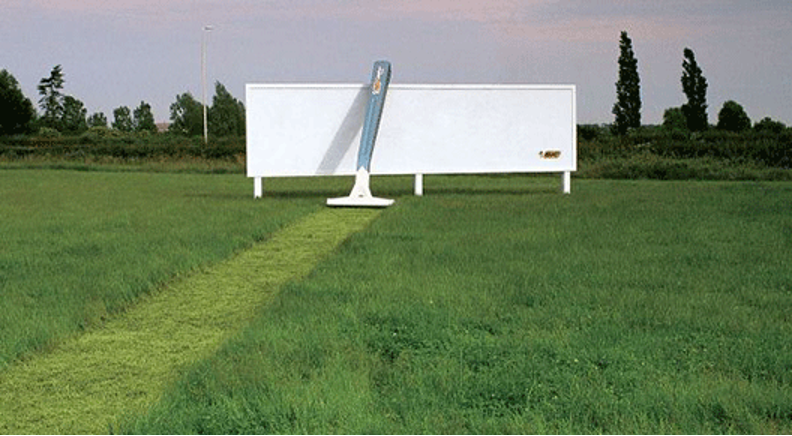
What benefits come with using the product? This Bic razor ad is a perfect example:
3. Unconscious processing
This stage comes when you’ve exhausted your brain trying to come up with different ideas and combinations and may leave you feeling lost or frustrated. This just means it’s time to take some time out and know that you’ve done all that you can do with the raw information.
This stage of the ideation process is about taking time to internalise the material.
4. The Eureka Moment
This is the moment that you get your big idea, and maybe more than one. The dots will have connected and you’ll have the first rendition of your idea take form.
5. The Morning After
You have a great idea, but it’s not fully ready yet. In this stage you must critique your ideas, refine them and make them better.20
Gaining confidence in design ideas
Not everyone begins their work very confident in their ideas or creations. But the best, most creative ideas come from those who are not afraid to consider every and all ideas that occur to them in the ideation process. Writing down all ideas, even the bad ones is actually a great strategy within your creative process, but it might be difficult to push past the self-doubt mindset.
Here are some reasons why you should celebrate all idea; the good and the bad:
Provoke new ideas
Bad ideas may help spark a new thought or idea.21
Clear your mind
Writing down all of your ideas may help you to clear your mind of everything so that you can focus properly.
Now/later
While some ideas might not work for the issue you are working on, they may be valuable for future projects so it is useful to document them.
Further tips for generating ideas
- Be unselfconscious: Throw all of your ideas on a page without holding back.
- Find your most productive time. For most people this is mid-morning.
- Look outside of your current scope for inspiration.
- Question the brief!
- Go back to basics; pen and paper can help you express your ideas more freely.
- Take regular breaks; this can help you see the problem with fresh eyes afterwards.22
Tools for creativity
Creative inspiration and pinboard apps are perfect for organising and initiating brainstorming sessions. Here are five of the best.
MindNode
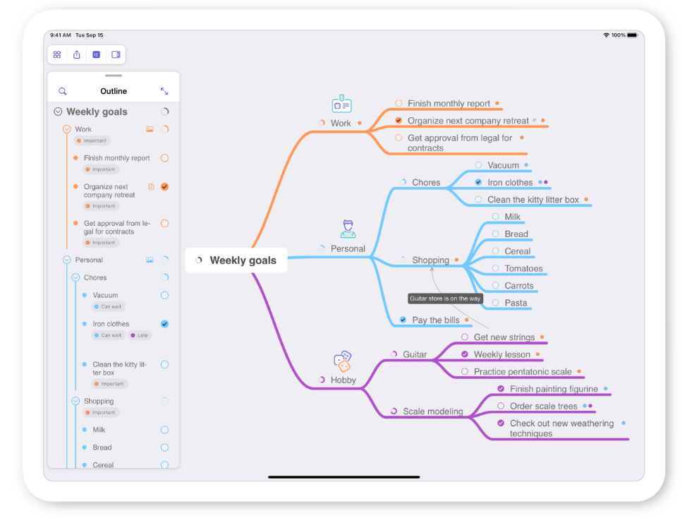
The MindNode mindmapping app is the perfect tool for brainstorming and organising your creative thoughts
MindNode is an intuitive and easy-to-use mindmapping application that will help you generate new ideas and organise your thoughts. iCloud & Dropbox support means you always have your mindmaps with you.22
Miro
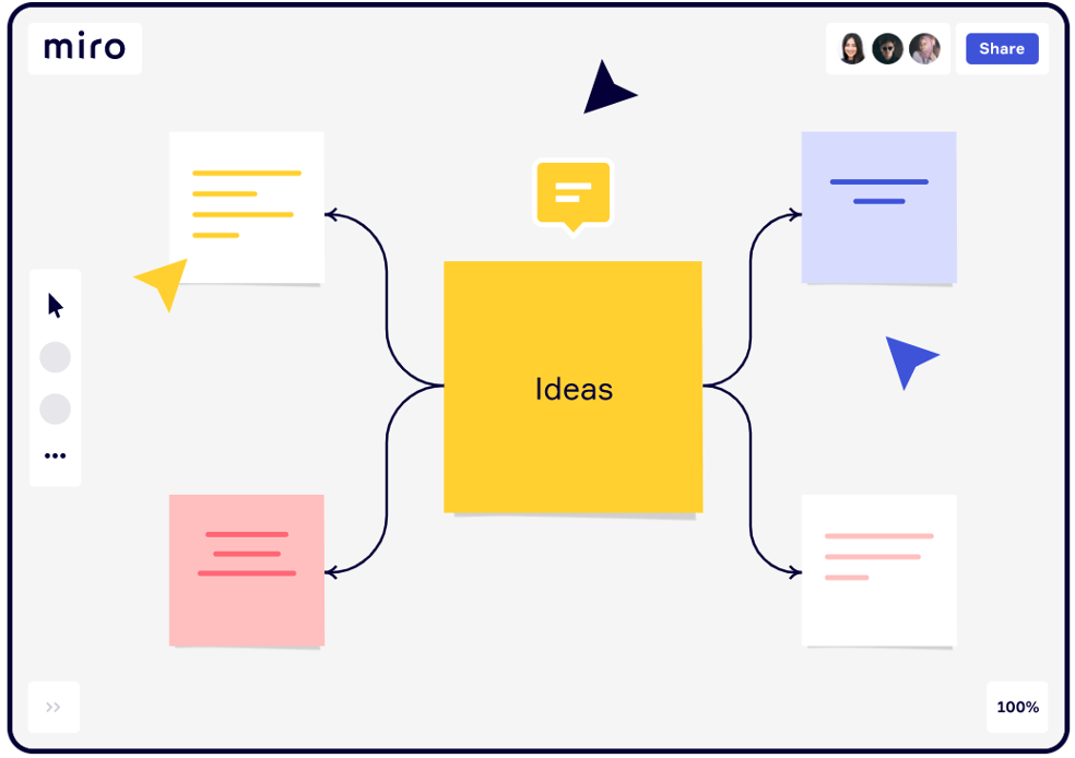
In the office, remote, or a mix of the two, with Miro, your team can connect, collaborate, and co-create in one space no matter where you are.
Miro is a digital whiteboard that makes it easy to collaborate with others. The software allows you to create notes and designs, move things around, and communicate through embedded video calls or online chats. The tool also comes with a series of pre-built templates that can inspire or serve as a starting place for your own project work.23
OmniGraffle
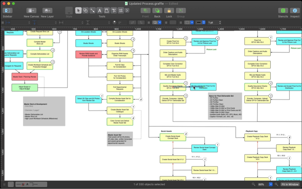
OmniGraffle has an extensive toolset and is a very flexible canvas for designing With the awesome OmniGraffle app you can create diagrams, flow charts, org charts, and illustrations. Last month the app had a major update that added new drawing tools interface as well as better support for iPads with retina displays. At just under $50, it's pricey for an app but it's extensive toolset makes it worth every penny.22
myPANTONE
Choose a colour, any colour with Pantone's mobile app myPANTONE
Colour giant Pantone's mobile app myPANTONE is a must-have for every designer. Clever software allows users to capture over 13,000 pantone colours by selecting specific part of a digital image. And not only that, it also creates colour palettes for you and then stores them in its 'portable colour memory' section for future use.
iDesign
iDesign has a unique drawing tool, which allows users to sketch accurately without fingers getting in the way
iDesign(opens in new tab) allows you to 'make professional quality designs, illustrations and technical drawings on the move using your fingers'. The 2D vector drawing and design app for the iPhone and iPad has a unique offset drawing tool, which allows you to draw accurately without your finger getting in the way. A great tool to quickly sketch down new ideas on the move.22
Creating a moodboard
We have already discussed the concept and process involved in the generation of mood boards earlier, and it would be useful to revisit this again. So . . . you are sitting in front of a blank computer screen.. You just can’t seem to get started. You’re creatively blocked. Now what? You need some inspiration—you need to create a mood board.24
What is a mood board? A mood board is a collection of colours, textures, images, and words or inspirational phrases related to a possible design theme. Mood boards (or inspiration boards) can help you work out some of the design ideas before you get too far into the creative process. Mood boards are lot like rapid visual prototyping and collaging all rolled up into one.
What do you want your site to look like? Grungy? Whimsical? Dark? Since the Web site is for your art, open your own projects up. This is a great way to begin to process. Arrange some of your pieces on one board. It really doesn’t matter what program you use to create the mood board as long as you are comfortable with it. Once you see the projects assembled together, you may start to get a sense of the one primary colour that might be the supporting colour set for the design. If your projects don’t really contain colours that you think might work for the site, locate some photographs. Look for some images that convey your theme. You might have some truly inspirational ones that will get those creative juices flowing!
Start with a set of colours that might make an interesting layout. Web sites such as:
Here are some Web sites that will help you to select colours that are sure to be compatible with one another:
- Colour Blender
- DeGraeve.com (Colour Palette Generator)
can help you generate colour combinations that you might not ordinarily think of. New colours can equal some great new concepts and ideas. Maybe you’re in a bit of a rut. You like to use the same few colours again and again. It’s time to try out some new colour combinations. Can’t find the set you like? Maybe it’s time to observe the famous master painters and the colours they worked with.
Having a look at the art works from the most important painters in history—such as Paul Cézanne, Rembrandt Harmenszoon van Rijn, Pierre-Auguste Renoir, and Leonardo da Vinci. Their palettes are varied and sophisticated. You’ll be in awe of the colours, and each will help you to define your own personal colour palette.

Develop your own creative voice
Masterpieces are not single and solitary births; they are the outcome of many years of thinking in common, of thinking by the body of people, so that the experience of the mass is behind the single voice.Virginia Woolf
Your voice is how you’re recognised by others. It’s the tone your collective body of work takes, and it speaks to your values and the unique perspective and skill you bring to the work. However, this individual perspective is often forged over time as you follow the inspiration of your influences, engage in intentional practice, and commit to leaps of intuition. Your voice is the combination of inspiration, dedicated practice, and strategic risk.25
There are four phases you might cycle through whilst finding your creative voice:
1. Discovery Phase
That initial moment of intrigue, when a seed is planted in your mind about what is possible, is what I call Discovery Phase. It’s when you suddenly become fascinated with an idea or a new direction for your work, but you don’t yet have a clear path forward. In this phase, it’s important to identify the small, obtainable skills that could become the building blocks of growth.
2. Emulation Phase
Discovering your own creative voice requires an understanding of what inspires you. So be sure to fill up your inspiration tank! To develop a unique, resonant voice, you must first build up a basic platform of skills. Allow yourself to emulate or mimic other designers you admire, learn techniques from them and you will eventually branch out and explore new territory.26
Why not try copying a favourite painting, just to understand the artist’s mindset and methodology in the work. This is a process of sensitising yourself to your own artistic tastes, and then moving toward the subjects, textures, colours, shapes, designs, and even finish quality that moves you. Describe how you want to make others feel when they view your work. Try creating a mood board of your favourite colours, textures and surfaces, subjects and designs.
All we do as songwriters is rewrite the songs that have impressed us til we find our own voice. It’s part of learning the craft.Steve Earle, famed songwriter
3. Divergence Phase
Once you’ve achieved a sufficient level of mastery over the basic skills of your craft, you must choose to take those building blocks and make something uniquely yours. You may see an opportunity that you feel a little ill-equipped for, but feel compelled to rise to the challenge anyway. You begin taking risks as you sail out into uncharted waters. You diverge from the prescribed path, and create uniquely identifiable work as you begin to take more intuitive risks and leaps with your work.
4. Crisis Phase
It’s easy to get stuck and fail to pay attention to your intuition, or to no longer seek new inspiration. Perhaps you’re no longer striving to sharpen your craft, and you’ve grown stagnant. Things that once felt risky are commonplace, and what used to vex you is now second nature. In short, you’re a little bored and stuck. The key to moving beyond this phase is to re-cycle through the phases of growth, and seek new inspiration to emulate and incorporate into your work.
Be Patient. You need to give yourself time and space to develop naturally, and trust that consistent, honest work will encourage the dove out of its cage. Forcing it is never a good idea. Give yourself permission to research, explore, create, copy, share, review, revise as well as rest and renew your senses. Before long, you’ll find yourself soaring with a unique creative voice of your own.
Current and emerging trends
In such a creative field, new or recycled trends are constantly being pushed to the spotlight. It is useful as a designer to be aware of these trends and be able to discuss them with clients and incorporate them into your designs as needed.
Some trends in the design space are:
Mysticism27
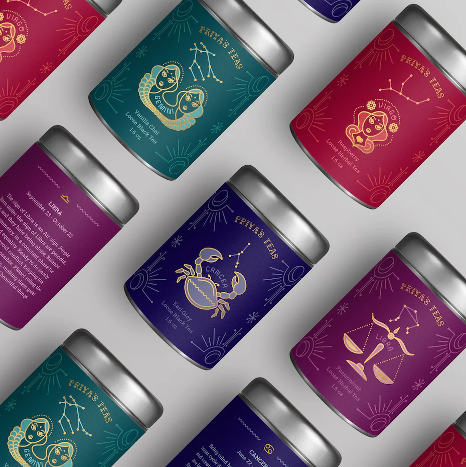
In a design context, mysticism involves iconography that relates to astrology and divination. The trend relies heavily on popular symbolism, including zodiac signs, all-seeing eyes, lotus flowers and sacred geometry. As in ages past, these symbols act as talismans, infusing the natural and celestial world with occult and deeper meaning.
Mysticism has connotations of the divine, cultural or religious significance, and can be used effectively in work that means to invoke branding themes of natural health, earth and nature, emotion or spirituality.
Risoprint27

Risograph was a mid-80s printing technique developed by the Riso Kagaku Corporation in Japan. It paved the way for cheap bulk printing by using dots and desaturated colours, with the result that images were often grainy and unintentionally stylised with double exposures.
In 2023, risograph printing is being reimagined for digital, abstract graphics. Its grainy textures add depth and noise to minimalist shapes. This has inspired many designers to create surreal valleys of abstraction with a touch of vintage flair. When depicting real characters, risograph textures and colours are combined with exaggerated caricatures and simplified features, transforming the familiar into the unfamiliar. Ultimately, this trend blurs the line between basic shapes and machine processes.
Traditionally, you need a Riso printer to create this style of design, however there are ways you can mimic the style in Photoshop. See this link for more details: 4 Ways to Mimic a Risograph Effect in Adobe Photoshop (shutterstock.com).
Bold abstract shapes28


There is currently an influx of geometric shapes in visual assets. Bold shapes will continue to dominate the backgrounds of websites, social media posts and beyond in the next few years. But rather than rigid geometrics, more abstract forms abound.
What’s great about these abstract elements is the additional layer of visual interest they add to any composition, through the design principles of variety and contrast. They pique viewers’ attention with their bold, bright hues without distracting from the main message at hand.
And it’s easy to apply the aesthetic appeal of vibrant organic forms to your own designs. Just choose no more than 2-3 colours, and make sure your main content stands out.
3D elements28

If motion graphics are the new static images, three dimensional renderings are the new two dimensional assets.
At least, that’s been the case for the last few years. Especially since recent technological advancements have made it easier than ever to produce high-quality 3D visuals.
3D elements are everywhere. But beyond easier rendering, what else is driving these design choices forward? Just factor in VR’s ever-increasing hold on the public. (Roblox, anyone?)
The growing demand for virtual experiences and graphics that blur the lines of computer-generated images and reality no doubt fuel this trend. And with the metaverse’s influence only expanding, the market for 3D elements is set to increase.
So capitalise on the current digital moment and add depth, shadows, movement and textures to your designs assets.
Surrealist maximalism28
Realism and minimalism have been replaced by surrealism and maximalism. The insulated COVID-19 era has given way to an anything-goes post-pandemic world — where people have no desire to stay confined or restricted.
Renewed possibilities for pushing boundaries are here. And designers are responding in turn with psychedelic images that aren’t afraid to make a statement, nor take up space. Given this, visual storytelling will get more imaginative than ever in the coming years. So expect the unexpected when it comes to combining elements.
So don’t be afraid to defy physics OR page space with dramatic mixed media images. Show your audience you’ve got a vision larger than life, and the creativity and ingenuity to get there. One way to do this is through your personal branding, using a business card that captivates.
Retro line art27
In 2023, many designers are turning to minimal line art to create illustrations that are humorous and fun. This is a retro style that recreates the nostalgic memory of drawing with felt-tip markers.
Expand practice using technology where required
The following video shows some of the design concepts that can be brought to life with technology.
Graphic Designers most commonly use graphic design software. Adobe Creative Suite is the most popular option in the industry, but there are also other powerful design programs available, such as Sketch. In addition to software, Graphic Designers rely on other tools such as computers, tablets, and cameras.29
Photoshop
Photoshop is a powerful tool when properly used. It works at the pixel level because it is a raster based software, and this is why your text images in Photoshop can become pixelated. Photoshop is perfect for editing photos but not for images that have text in them. Similarly, it can give you trouble designing layouts for print or web.30
Photoshop is ideal for editing and creating photos and pixel based artwork, creating banner ads, editing pictures for print, designing video graphics, and creating user interface designs. On the other hand, Photoshop is not the right program for creating logos, because you won’t be able to manipulate or enlarge your files the way you can with a file from Illustrator. And remember, don’t set type in Photoshop.
Sketch
Sketch is a vector-based tool available on Mac and focuses on web, app, and interface design. This is a great program for designing icons, ad banners, social media images, and presentation materials. It also has many UI and UX-related usages, such as icon design, prototyping, and creating user flows.29
Illustrator
Illustrator is very versatile, because you can use it to produce anything from web designs and graphics to text documents. It is a vector-based software, so it uses lines to work and doesn’t pixelate or lose detail. This vector basis means it is really intended for scalable design elements like brand marks and logos. If you resize things repeatedly in Illustrator they won’t become distorted as they do in Photoshop. Choose Illustrator for creating web graphics, full page designs, and documents, but not for working on photographs and straight images, or for large multi-page documents.30
InDesign
Like Illustrator, InDesign is a vector-based program; the primary difference is that its power is focused on the master and multiple page capabilities and loses some other capabilities such as photo editing. However, with InDesign you can customize each page while also creating a master view including page numbers, a logo, etc. The text wrap function in InDesign is far simpler than in Illustrator. Furthermore, layouts created in Illustrator tend to be needlessly large and fail in the commercial printer optimization category.
After Effects
After Effects is a motion graphics and visual effects software that is ideal for Graphic Designers who incorporate motion into their work. With After Effects, designers can create animations, movie titles, transitions, or even design in a 3D space.29
In summary, Photoshop is for editing photos, Illustrator is used for creating drawings, and InDesign is used for creating layouts of images and text. InDesign handles projects with heavier text needs better than Photoshop and it can control mass amounts of text features all at once to simplify tasks.31
All of these technologies can be used to make your life as a designer easier.
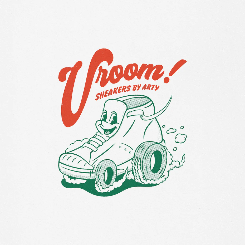
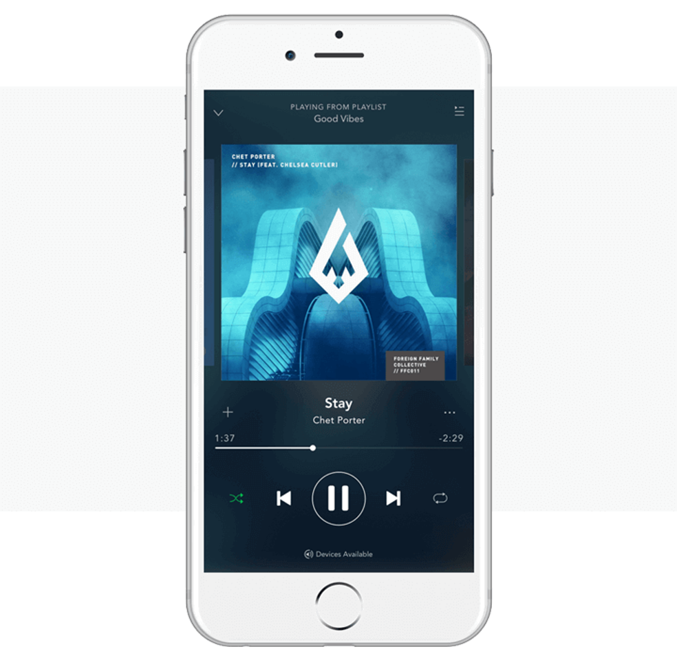
Take a guess at which software has been used to create the following graphics:
This was created using Sketch.

This was created with Photoshop.
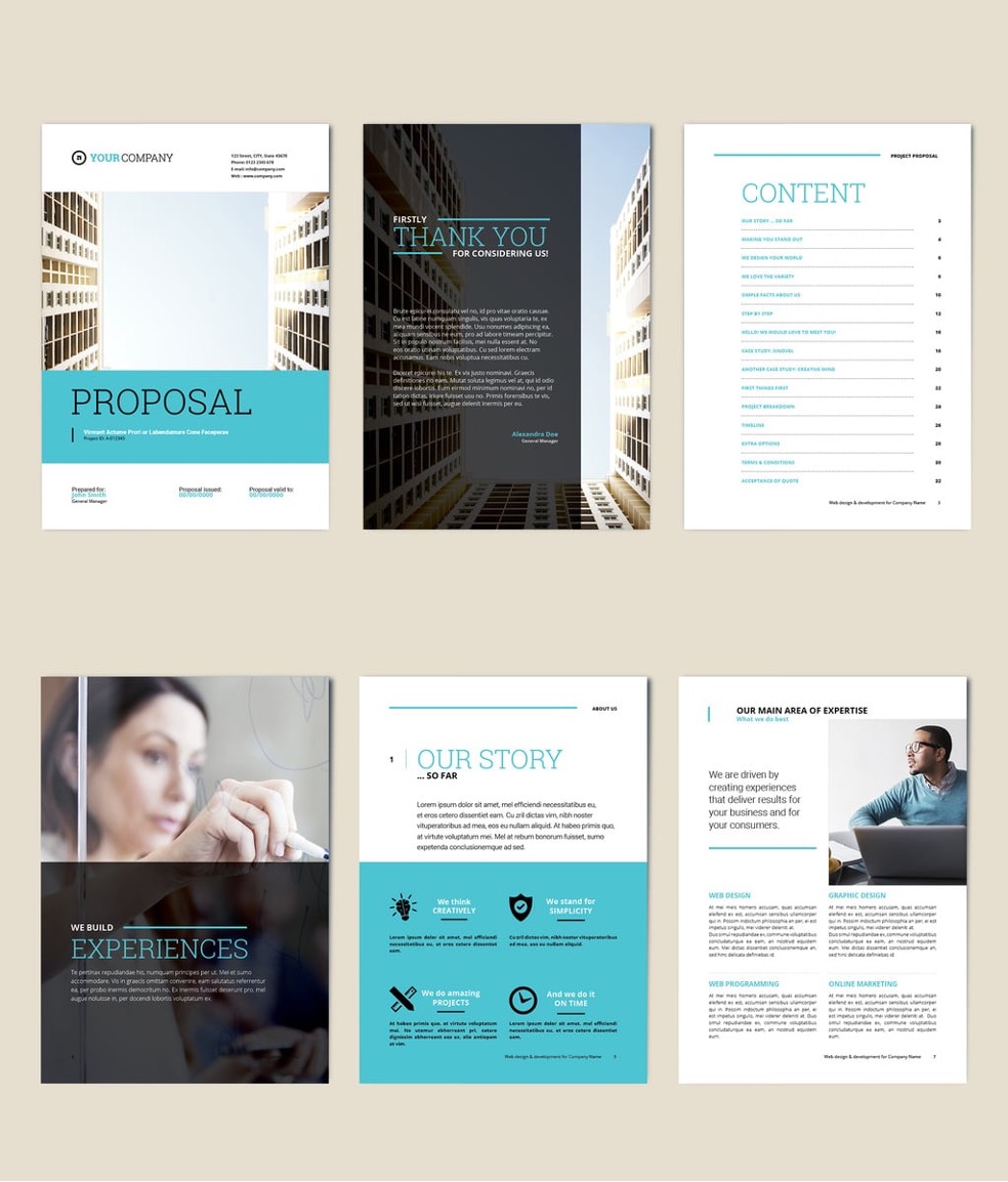
This was created with InDesign
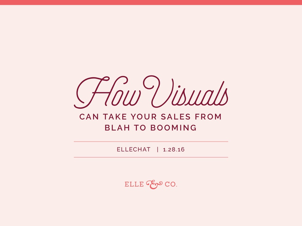
This was created with Illustrator.

Seeking constructive criticism
Constructive criticism is an incredibly valuable part of creating design work and refining your skills. By listening to feedback you can improve your work and learn more about your craft.
You can ask colleagues, managers or clients for constructive criticism on your work. Ensure you leave plenty of time on your project for you to make any changes.
You can ask for verbal feedback or written feedback on your work – whether virtually or on paper. Sometimes feedback is unsolicited – try and welcome this if you can and the feedback is appropriate.
Criticism vs constructive criticism
You must leave complaining behind if you want to provide excellent constructive criticism that is heard, valued, and taken seriously. Complaining is essentially criticism. Constructive criticism, on the other hand, is the breakfast of champions; criticism is rarely productive.32 Here is the difference:

Constructive or just criticism?
Nobody likes the way criticism makes them feel. But criticism is unavoidable, whether we like it or not, especially as we deliver presentations or take on leadership roles.33
This process identified three important requirements for negative feedback to be constructive:
- Compassionate: People should give criticism in a way that indicates care for the recipient, and it should come from someone the recipient respects.
- It is specific: Criticism should target the appropriate elements of the recipient’s performance and offer specific guidance for improvement.
- It is a match: Criticism should align with the recipient’s emotions and motivation.
You can use this list to determine if a critic is trying to help or harm you.
Applying constructive criticism
Thank them
Once you have your feedback remember to thank the person who gave it to you. They took time out of their day to help you and may have found it difficult or awkward to give feedback.
Clarify
If there are any points you don’t understand or are unsure about, clarify with the reviewer to determine what they are trying to get across.
Consider
Carefully consider every point made before making changes to your work. Not every single suggestion is the best one. If you disagree, tell them why and discuss. You need to weigh up how experienced the person is, the reasons you disagree with the suggestions, and consider your potentially different priorities. It may be that you are prioritising the design itself whilst they are considering a larger viewpoint of budget and how long it will take to create. Don’t be afraid to get a third opinion to help you decide.
It is always useful to track your changes and save previous versions of your work; you may need to demonstrate what decisions you made and why.
Evaluating your own work against a planned strategy
In order to achieve the best output of the selection process, an evaluation methodology should be considered to make sure that the selected creative or design idea is the best choice to achieve the company’s target.
Unlike evaluative business plans or marketing research which deal with statistics, numbers and/or charts, reviewing creative ideas is more complicated as it focuses on the potential success of initial starting ideas. The evaluation methods helps in reviewing a large number of ideas in order to reach the one that is most likely to succeed in the market.34
Here are three such methods:
Pass-fail evaluation method
This is the first method, which allows reviewing of a large number of ideas in a short time due to its simple decision-making process based on prime criteria. The criteria can include questions such as:
- Does the idea comply with company strategy? (Yes/No)
- Does it talk to the company target audience? (Yes/No)
- Is the idea budget acceptable? (Yes/No)
This method is great for weeding out incompatible ideas in larger numbers, before you move onto the next two methods.
Evaluation Matrix
The ideas that pass through the first method go through the evaluation matrix method. In some cases, the submitted ideas for acceptance are just a few ideas, then when submitted to the evaluation process, the reviewers can skip the first methods and transition directly to this step.35
After generating a number of concepts to satisfy a particular design problem, it’s worth pausing to identify the strengths and weaknesses of each concept – or parts of concepts. This is a powerful step leading to the creation of new concepts that combine the strengths of concepts already generated. Although evaluation matrices are primarily for this purpose, few people use them to help create these new and improved concepts. Instead, evaluation matrices are often used as decision matrices aimed at helping teams decide which one of the generated concepts to choose. When used in this way, evaluation matrices lose most of their value as a product development tool.
An evaluation matrix is a simple table with evaluation criteria listed in rows, and design concepts listed in columns. In the body of the matrix, each concept is evaluated against each criterion. Through a side-by-side evaluation, strengths and weaknesses of the different concepts emerge and room for improvement becomes more obvious.
| Concept 1 | Concept 2 | Concept 3 | |
|---|---|---|---|
| Criterion 1 | 2 | 2 | 1 |
| Criterion 2 | 0 | 2 | 2 |
| Criterion 3 | 0 | 0 | 2 |
| Criterion 4 | 2 | 1 | 0 |
In this method, the reviewers compare the ideas with a specific matrix or set of criteria. The criteria can include the following:
- The idea contribution in company’s overall strategic outcome
- The idea’s potential impact
- Expected stakeholders
- Expected budget to apply the idea
- Timelines to implement the idea
A specified score is given to each criterion. For example the idea contribution in company’s strategic outcome can include the following score set:
- Score 0: No expected contribution in the strategic outcome
- Score 1: Direct contribution in one or two strategic outcomes
- Score 2: Direct contribution in three or more strategic outcomes
The comparison factors reflect the project requirement using a score rate. This score measures the potential success of the idea based on a number of factors. After the evaluation process is accomplished, a total score number is assigned to each idea. Each evaluator provides feedback about the idea, which can also be used to improve it.
SWOT analysis
The SWOT analysis refers to the strengths, weaknesses, opportunities and threats of the idea as projected into the marketplace. This type of evaluation seeks to extend the reviewer vision to evaluate the idea based on the four factors, which predicts the potential success of the idea in the market based on the market related factors.34

This analysis stage helps evaluate the idea based on the four SWOT factors. Populate the table with strengths, weaknesses, opportunities and threats and analyse the idea thoroughly based on these factors.
The above evaluation methods help review and select the design ideas that are most suitable for market competency in order to achieve the company goals. These evaluation methods can be used all together or in sequence starting from the first method until the third one or individually based on the company’s objectives and/or requirements.
Evaluation of design ideas
When looking at your ideas; make sure you think about the following concepts and how you will actually produce the design. Some ideas may be impractical to actually create, or only suit some particular colours that aren’t on brand.
Ability
Do I have the skills to produce the design?36
Materials
Do I have the right materials and tools to create this design?
Theme
Does the design fit the theme or design brief?
Originality
Have I used original ideas?
Aesthetics
Does the design look modern? Old fashioned? Retro?
Colours
Which colour palatte have you used; do they fit with the branding specified?
Evaluating your own work in the context of work by others
In graphic design, it is important to strike the balance between finding your own creative voice and yet still drawing comparisons between your own work and that of others; learning from them, learning what not to do, and analysing and appreciating your differences.
In the creative process, it is useful to not only find inspiration from other designers, but also to look at their techniques, their use of colour, the theories they employ and the themes they express. Let’s look at an example.
You have been tasked with creating a pattern for the branding and marketing of a new skincare company. The pattern needs to be uplifting and bright, with multiple colours used. You take a look at other pattern designs to see what else fits this brief.
You take a look at geometric patterns:
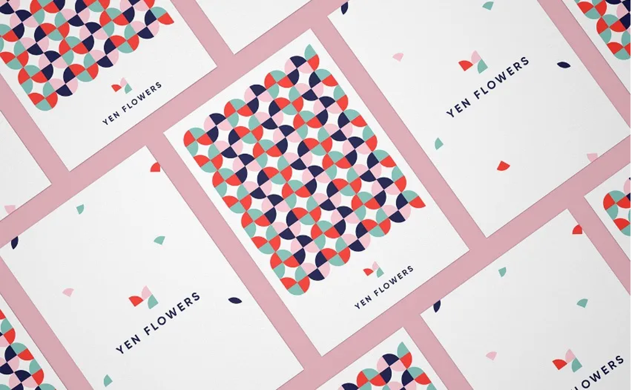
Yen Flowers brand identity created by Muhammad Ali Effendy
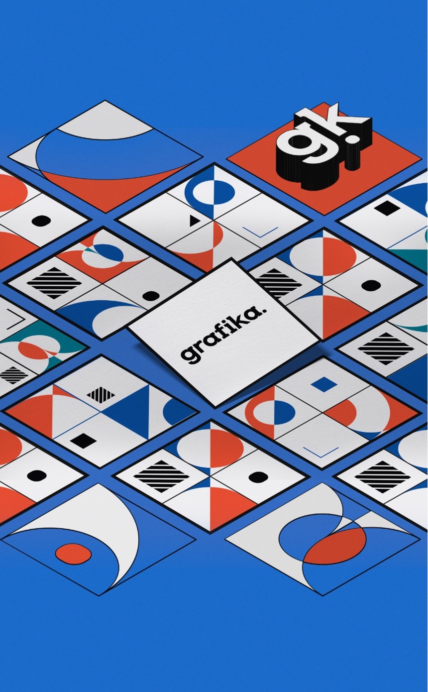
Brand identity for GRAFIKA design studio by Anna Gugutishvili
Watercolour patterns:
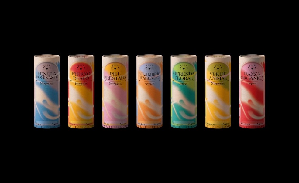
Packaging design for Carnaval Tea by Angello Torres
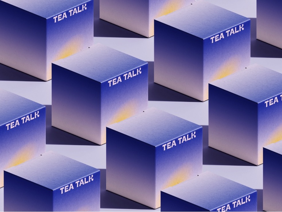
Tea Talk packaging design by DXD studio
And Illustrated patterns:
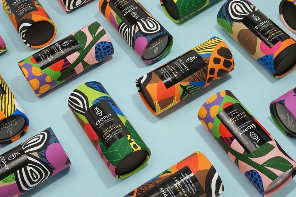
Packaging design for ÉSOPHY Crunchies by George Probonas
Note what differs and is similar between these patterns:
Similarities
They are all bright and colourful.
Differences
However they all use different styles of design which evoke different meaning. Watercolours have more of a calming effect, the bright illustrations evoke hints of nature and boldness, and the geometric print has more of a retro feel.
Have a think about what you like about each one, and don’t like. Are there some that you could see being associated with a skincare brand more than others?
Thinking about your own styles and designs, evaluate them in comparison to these styles. Think about the simplicities and complexities, the colour use, the design styles, the use of texture, form, and lines. If you were to critique your own work, you could draw comparisons between the styles of your own work compared to others that you think are effective, on brand, evoke particular feelings or aesthetically pleasing, but also to point out what you really like about other’s work, that you could think about incorporating into your own work next time.
Self-critique doesn’t need to be negative or pointing out what is wrong with your work, but simply where you could explore further and how to better achieve the brief.

It is imperative that you are able to respond to feedback constructively to improve your technical, conceptual and commercial outcomes. The essential design process is to define the problem, pose creative ideas on how to address this problem, generate ideas through design development and propose final solutions.
What constitutes feedback?
Feedback can come from:
- Managers
- Colleagues
- Clients
There are two main types of feedback; solicited and unsolicited. You may purposely seek out feedback on your designs and ask specific questions of your reviewer, or you may receive passing comments on your work. It is important that you recognise this as feedback as well.
You might receive feedback in the form of:
- An email
- An informal verbal comment
- A meeting
- Specific tools and programmes that allow others to add comments or suggestions to your work
- Survey results
- Other metrics (such as monitoring views or clicks)
How to organise and process feedback to create impactful design
It can be challenging to process information from various meetings, especially when it comes to synthesising them and using them to inform your design. It can be painful to come up with an idea, present it, and then have to constantly go back and forth between changes and possibly having it scrapped because you chose the wrong feedback to use at the wrong time.37
Meetings can be a great setting to gather design feedback and track the development process. It’s important to keep track of high-level takeaways and agree on action items during meetings so that you can use them as a reference when iterating on a design. If you didn’t keep track of feedback from critiques, you can easily get stuck designing something you think is “right” for the user, but maybe lacking in various inputs from stakeholders or users that can lead to the most impactful solution.
Here are a few tips to capture various iterations and processing inputs so that you are designing ideas that are relevant and address the needs of your users AND stakeholders.
Create a prioritisation table
This method can help you to frame inputs based on their importance and their impact, to help you determine their priority.

Prioritise feedback based on appearance and/or objectives
Whenever you get lots of feedback you won’t be able to implement all of it, especially under tight deadlines, and you shouldn’t implement all of it without a strong reason. If you see that the feedback addresses a core objective and connects to the user’s goal, then whatever feedback is related to it should be something to prioritise. If you don’t know what the feedback entails, always ask for clarification and have a point of view behind making or not making that change in relation to the product goal.
If feedback is something about purely aesthetic, such as a slight alignment change or an incorporation of something that potentially breaks the overall structure of the design, then it may not be a high priority unless it is a quick fix and you fully understand the reasoning behind making those changes. If the feedback is aesthetic and affects the user experience, as well as addressing the objective (i.e. having a solid navigation), then that is much more important, and something to change.
Think about whether or not this change is something stakeholders really need vs. want and the deadline needed
Number your priorities so that they are clear to yourself and the stakeholders, and communicate whether each change is a nice to have or a need to have.
Time stamping iterations
On Sketch, keeping iterations can easily get out of hand, especially if you don’t keep track of them. When making changes to the design, always keep multiple art boards of the same section. This means add a date to when I started working on it and when I need to make changes to it, duplicate that one and add a new date for the change. This allows you to keep track of multiple iterations and also to go back to a previous design in case you need something from it or to explain your changes.
Methodical approach to design using technical, conceptual and commercial considerations
So you’ve been given a brief from a client (in reality clients don’t generally give briefs, unless they have had experience working with graphic designers; they just tell you what they think they need). Now you have to turn it into a well-designed printed or digital object that meets their expectations and increases their sales.38
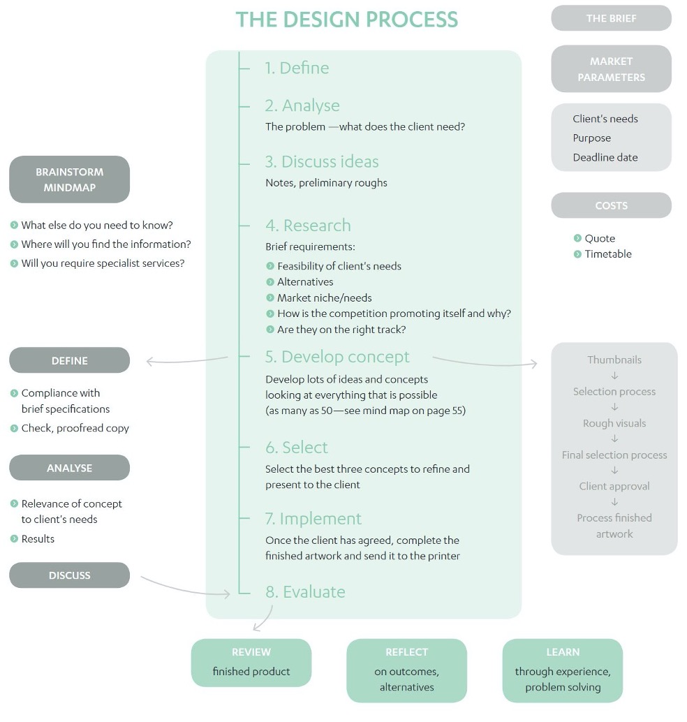
Graphic design is creative communication. It can be achieved through type and image or just one of these. Your approach to the design process will include aesthetic choices, media and material alternatives, and appropriate design solutions. These should all be focused on the parameters of the brief. Your ability to overcome obstacles, select ideas and make decisions involving critical analysis skills will be highly valued by your client and your design team.
There are many variations in the design process but this flow chart gives an idea of the sequence of events and things you may need to consider.
Conceptual considerations
Innovative (conceptual) thinking, first-rate executions, a great eye for type and a genuine passion for design are all attributes that senior designers want in more junior staff. Design studios do not need another geek who is really good at Photoshop or Illustrator and not much else—they also need you to have good communication skills. After all, that’s what design is: communicating an idea. Listening, speaking and writing are all important in all stages of the design process, from presenting your design to a client to briefing the printer. You need to communicate your passion for design, your knowledge on the subject, your ability to frame and answer the question and your ability to produce a fabulous end result.
Although those new to the design profession think that the design process is linear and straightforward—read the brief, look out the window, have an idea, turn on the computer, make something—it is usually anything but. This kind of approach to the process would ultimately be unsustainable and often won’t deliver the quality product that today’s savvy clients demand. To do justice to the problem, the client and ultimately the audience, designers need to take time to fully digest the brief, identify the true design problem and set a process of discovery in motion.
Defining the scope of the project
The first step to understanding what sort of research you need to complete is to be aware of the scope of the project. The project scope helps the designer identify the work that must be done to deliver the solution to the client’s problem. The project scope can help the designer, and the client, identify the required functions and features of the desired solution. Often, the scope cannot be completely identified until the designer’s research is finalised. This way all the constraints and assumptions and the desired result can be itemised for the client in a return brief that serves as a formal acceptance of the project terms.38
The graphic design work may be a banner ad, invitation, book design, flyer or brochure, business card, logo, poster, packaging, signage, exhibit design, annual report, advertising, corporate stationery, web design, animation or interactive graphic. The client may request a flyer because that’s what they think they need, but the designer may find, through scoping the project and completing the research, that in fact the client needs a website.
Identify the client’s problem
Thinking involves processing the information as we engage in problem solving, form concepts, reason and make decisions.

Employers are looking for young designers who portray:
- Originality
- Ingenuity
- Unusualness
- Usefulness
- Appropriateness
These five traits enable final designs that are:
- Ingenious solutions that solve problems in a surprising way or that reflect a new and different perspective and creatively link remote ideas
- Solutions that are practical and appropriate to the brief, the client, the budget and the target audience, and therefore are more creative because they have met the often tight constraints of the problem while still producing original solutions.
Next comes the moodboards, mind maps, word associations and writing down everything that will inspire your design.
Technical considerations in design development
One of the technical considerations within graphic design is composition. Composition involves everything that goes into making the image and the page design and is specifically relevant to the way the viewer’s eyes move around the page. Designers utilise compositional characteristics to align images and text but composition is also about how colours, shapes and the page format relate to each other. The same elements can be composed in an infinite variety of ways and this is often the difference between successful and unsuccessful graphic design.38
Tension between colours or shapes can create unease in the viewer. How the elements relate to each other will determine whether the design comes together as a whole or the elements look like disparate objects. It is important to look at the overall shape of different objects within the composition and not just the individual items.
Creating dynamism and impact
Cropping
By deleting (and therefore selecting) specific areas of an image, the attention of the viewer can be focused. Cropping can improve the composition of the image and enables removal of distracting or intrusive elements. It also enables relocation of the focal point. Text can also be cropped but doing this can reduce readability.
Angle
Changed viewpoints can make a huge difference to otherwise dull imagery. Because we usually view objects at our eye level, when we change the angle, we change the viewpoint and this captures the viewer’s attention.
Interactive type
Designing type at different angles as text on a page forces the viewer to interact with it in order to read it. Angled type works best when it is perpendicular to the page diagonal or at less of an angle.
Lighting and shadows
Dynamic layouts are created with light and shadow because they cause interaction with the viewer. Intrigue can be created with shadowed areas because there is ambiguity in shadow. Diffuse lighting techniques use scattered, spread out light, which doesn’t concentrate on one object.
Symbolic imagery
Our world is made of symbols that represent other things. Symbols allow designers to communicate by reducing ideas to their essence. All designs depend on what isn’t in the composition as much as what is. Understanding of symbolic references changes depending on culture, religion and language.
Perspective
As objects get further from the viewer, they look smaller. They also become foreshortened. Colours weaken as they recede into the distance, which makes objects more difficult to distinguish as they lose contrast with their surroundings. Designers can use these natural occurrences to create illusion or focus.
Distortions
Distortion is an expressive technique and can take many forms including making an image unfocused; distorting type shapes, position, general characteristics and sizes of everyday objects; and distorting facial characteristics (caricatures).
Commercial considerations
A graphic designer needs to understand brand strategy, consumer research and name generation requirements to work with companies on their logo design or corporate identity. To create a successful corporate identity you have to investigate the essence of the brand. A business’s corporate identity is more than just a symbol: it incorporates everything from how the logo looks, to what it appears on and what it appears with.38
The main difference between the terms ‘branding’ and ‘corporate identity’ relates to the consumer. The business market, or consumer, determines whether the company has any brand profile and, if so, how the brand is perceived. If no one has ever heard of the company, it has no brand profile. The corporate identity is the visualisation of a company’s goals, values and personalities and contributes to the brand profile.

Few Australians would not have been exposed to the flying kangaroo of the Qantas logo. Designed as a one-colour (red) logo, the first version appeared in 1944 and it has since been redesigned five times. The latest reworking of the Qantas corporate identity was undertaken by a Sydney design firm in 2007. The Qantas logo is applied to websites, brochures, advertisements, aeroplanes, trucks, cutlery, staff uniforms, luggage tags and so on. It is the combination of these applications of the logo that communicates the company’s corporate identity.
In other words, the corporate identity is reflected not just by one item, but in how the logo appears in all its variations. To be so flexible in many situations the design has to have a clear and logical structure that communicates to the end user the corporate philosophy of the company.
Logo design is a prime example of a brief that needs to be pared down, clean and slick. Workable in many contexts and sizes, it can communicate the attitude of the company to its business. A good logo design applied appropriately across a well-planned corporate identity can stimulate, and even revive, a failing business. The logo, or mark, can be used extensively by marketing and management and it is now widely recognised that marks often become a symbol of pride for employees. Logos have become a major component of the corporate culture.
Whichever type of corporate identity is being designed, there are a number of points to consider.
- The corporate identity should portray the essence of the company, using the right tone of voice.
If the company requiring a corporate identity is an airline or a bank, customers want to know it can be trusted. Therefore, a solid image may be more appropriate than a transparent scribble. If the company creates children’s toys, then a fun but caring corporate identity is the solution. - All the design elements need to work together in terms of line weight and shapes used.
The components of the design need to have equal strength to give the identity credibility. One line shouldn’t be thicker or thinner than another, or the design will look less credible. - If the identity has been designed in colour it will also need to work in black and white.
There are various mediums that only print in black and white or don’t provide specific logo colours for printing. Even some situations on the web may call for a black and white logo. - Consider the life of the identity.
To build equity in a company logo, it needs to become familiar to customers over a period of time. Updating to meet short-term trends can be short-sighted in terms of building trust with customers. However, not changing a logo design when it looks ‘out of touch’ with current thinking communicates that the business is also out of touch. A logo should be designed to have a life of five to ten years, but the best logo designs are those that are timeless. - There needs to be framework of consistency in the use of the logo across the company’s variety of products.
A corporate style manual is often designed at the same time as the logo so that all users understand how the logo, as a part of the corporate identity, should be applied in a variety of situations and on all the company’s products.