When it comes to data science, how can data visualisation help?
Perhaps you have a massive amount of data sitting in a data centre unused; this can become a burden, especially if you cannot use this data to gather insight. This is where data visualisation can help better understand the data gathered.
Data visualization can provide an effective way to see and understand trends, outliers, and patterns. It can communicate information effectively, derive meaningful insights and help people understand complex data sets. Data visualisation can be presented as charts, graphs, and maps.
Many benefits come with data visualisation; these include:
- We can understand trends in business operations with the aid of data visualisation techniques. By understanding the problem, effective strategies can be implemented to eliminate present and future issues.
- It is an effective data exploration method that produces presentable and easy to understand results.
- Businesses can gain insight into whether their KPIs, goals and strategies are effectively being met.
- It can support data cleaning by identifying errors or missing values in data sets.
- More engaging and user-friendly than reading through data sets.
Matplotlib is a Python library for visualisation. It provides various plotting functions that can be used to create static, animated, and interactive graphs and charts. Matplotlib can be used to render graphs on the fly in a web browser, or it can be used to create static graphs that can be used in reports or presentations.
It can also plot functions, including linear and nonlinear regression, probability distributions, and other mathematical functions. Matplotlib is available on most major platforms and has a wide range of features and support for various types of data.
Throughout this topic, we will explore the matplotlib Library in Python. The matplotlib is a plotting library for Python that allows us to create great-looking graphs from collected data.
This is used greatly in data science and areas where we need to visualise our data.
Various visualisations can be created using matplotlib; some of the basics include:
- Line
- Pie charts
- Box plots
- Scatter
- Bar graph
- Plotting - waffle, regression plots
- Geospatial data and plots
Line Chart
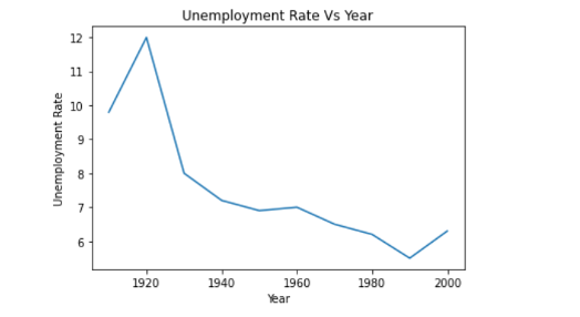
Line charts represent the relation between two data, X and Y, on the respective axis. Let’s see an example.
Say you have gathered your data in a table but would like to move them into a line graph. We will use the following two variables:
- Year
- Unemployment Rate
This is what the data looks like,
| Year | Unemployment Rate (%) |
|---|---|
| 1910 | 9.8 |
| 1920 | 8 |
| 1930 | 12 |
| 1940 | 8 |
| 1950 | 7.2 |
| 1960 | 6.9 |
| 1970 | 7.6 |
| 1980 | 6.5 |
| 1990 | 6.2 |
| 2000 | 5.5 |
Our goal is to depict the above data using a line chart.
Let’s get started!
This is the empty code without the implementation of your data.
!@#
Here is how the code would look with the current data.
If you run the code, you will then get the following line chart.
Say you want to further style this graph, you can add the following to the code
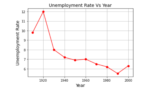
Give it a try in creating your very own line graph.
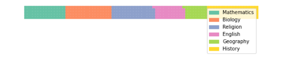
Pie charts
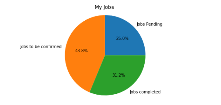
You are now looking to create a pie chart with your gathered data.
Say you have gathered your data in a table but would like to move them into a pie chart. You have gathered the following data with these three variables:
- Jobs ongoing
- Jobs to be confirmed
- Jobs completed
This is what the data looks like
| My jobs | |
|---|---|
| Jobs ongoing | 400 |
| Jobs to be confirmed | 700 |
| Jobs completed | 500 |
This is an empty Python code,
now with this code, you will need to place your current data. It will look like this,
If you run the code, you will get the following pie chart.
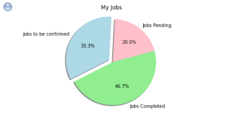
Say you want to further style the pie chart; you can add features like:
- Angles
- Shadows
- Colours
Let’s see what the pie chart will look like if we add angles and shadows and change the colours to pink, light blue and light green.
We can add this information to this code:
Give it a try in creating your very own pie graph.
Box plots

Scatter
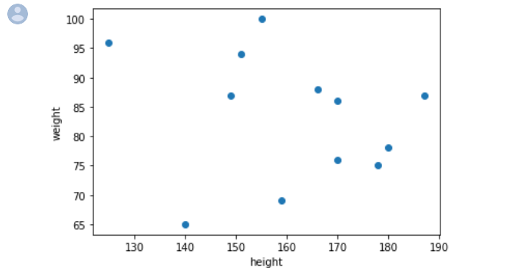
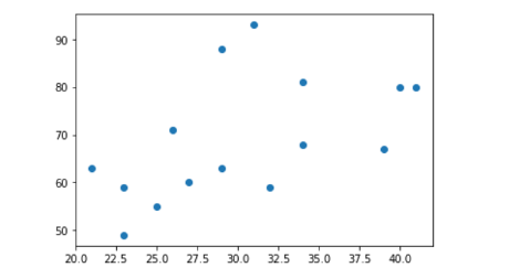
A scatter plot is a diagram where each value in the data set is represented by a dot.
The scatter plot needs two arrays of the same length, one for the values of the x-axis and one for the values of the y-axis. Let's say the x-axis represents the height of a group of people in cm, and the y-axis represents their weight in kg.
Now we need to input the current data we have into the scatter plot Python code,
The scatter plot from the above data will be created and look like the one below.
- https://datatofish.com/scatter-diagram-Python-matplotlib/
- https://www.w3schools.com/Python/tryPython.asp?filename=demo_ml_scatterplot
Bar graph
The following is the code to use in Python to create a bar graph.
You will embed your data into the above code to create your visual bar graph.
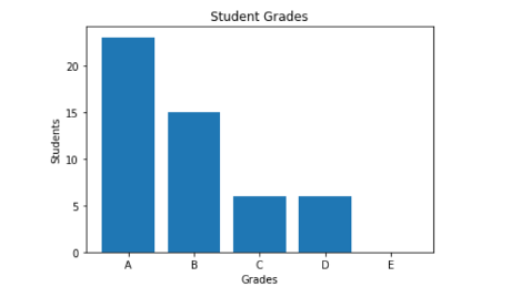
Let’s look at an example.
Say you have gathered your data into a table and would like to use this information to create a bar graph.
Out of a class of 50 students, their grades have been grouped from A-D.
| No. of Students | Student grades |
| 15 | A |
| 23 | B |
| 6 | C |
| 6 | D |
The teacher wants to depict this data into a bar graph to help visualise the performance of the class.
You will need to add the data into the following code:
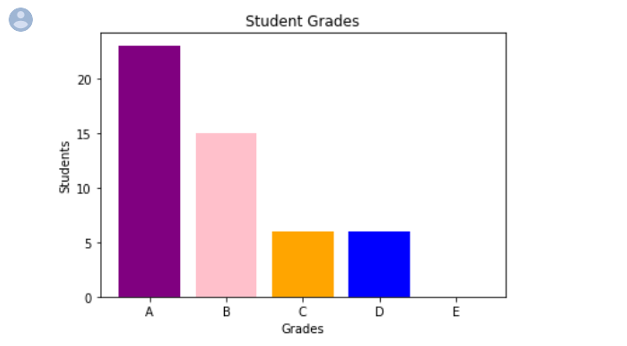
Say you are now looking to change the colours of the bars. You would like to add the colours purple, pink, orange, blue and brown. You can make it happen by adding more information into the code to apply the additional colours. You can see the bolded code that has now been added.
Now let’s look at some advanced plotting, including waffle and regression plots.
Waffle
Before you begin, you will need to run the following code to install pywaffle.
This is an easy step that will help you be able to build your waffle chart.
Once the run is complete, you can run the next code, which will create the waffle chart. As you can see, the data has been inputted into the code already.
The following waffle chart will appear:
Now say that you have forgotten to include the subject ‘History’ and the grade of ‘95’. You will then need to amend the code to the following.
The following waffle chart will appear:
https://blog.jovian.ai/waffle-plot-in-5-steps-on-Python-5e75e7740b96
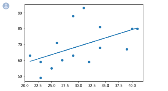
Regression plots
Regression can be used to predict the outcome of future events by finding the relationship between variables. This is heavily used in machine learning and statistical modelling.
Linear regression
Linear regression uses the relationship between the data points to draw a straight line through them. Future values can then be predicted using this line.
The term regression is utilised when attempting to determine the relationship between two variables.

So how does it work with Python?
Python has methods for finding relationships between data points and drawing a linear regression line.
We will show you how to use these methods with the following example.
The first thing we need to do is create a scatter plot. You may have practised this earlier in this topic, but for us to create a linear regression, we will first need to create a scatter plot, so let's get started!
In the example below, the x-axis represents age, and the y-axis represents weight. We have registered the age and weight of 15 students in a gym class. Let us see if the data we have can be used in linear regression:
Our following data is:
We need to transfer this data into the Python script to help create the scatter plot. This can be seen in the following example:
Once you run this script, the scatter plot will be created and will look like this:
Next, we need to input the code to create the linear regression line.
The following graph will demonstrate the relationship between the data points by drawing a straight line.

A dashboard is a terrific tool for tracking your performance in real-time. Maintaining track of KPIs on sales growth and focusing on the data that matters most is made easier by presenting a few essential metrics in data visualisations. This is extremely helpful for businesses as you can see multiple charts and graphs within one dashboard.
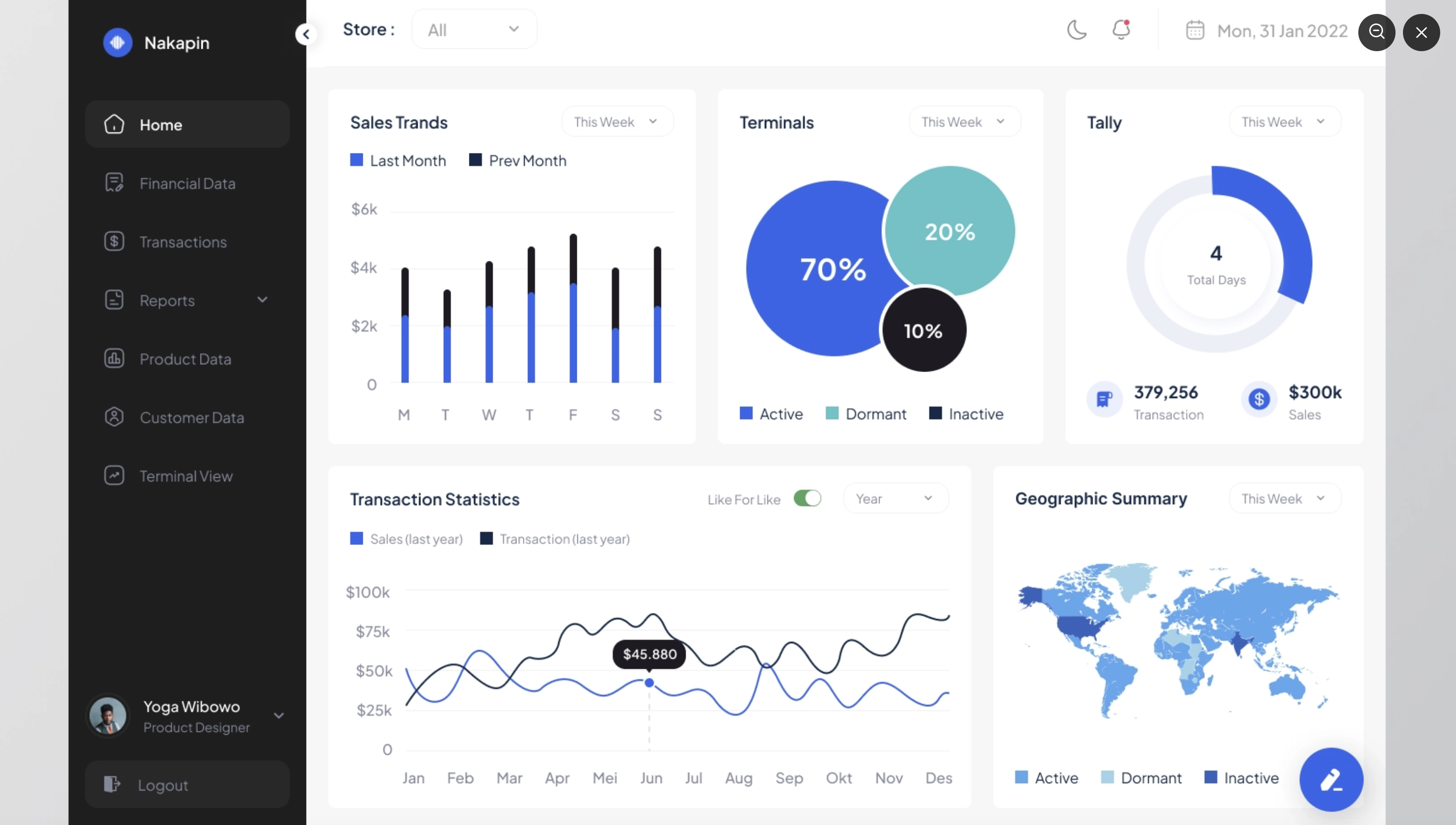
Building a business dashboard can be a complex and lengthy process. Data comes in various shapes and sizes and from several sources. where to start and how to get the most out of your data can be difficult.
Here are some tips on how to build a business dashboard:
- Define your goals before building your dashboard; you first need to decide your goals. What do you want to achieve with it?
- Do you want to track key performance indicators (KPIs)?
- Understand your business better?
- Are there any common trends?
Once you know your goals, you can start to put together a plan of action. This will include deciding which data you want to include, how you will collect it, and what you will use it for.
- Decide how you will use your data.
Once you have collected your data, you need to decide how you will use it. This will depend on your goals, but some common uses for business dashboards include:- to track performance
- to understand customer behaviour
- to identify trends
- to make better decisions
- Choose the right tools.
Once you have decided on your goals and data usage, you need to decide which tools to use. This includes deciding on a data collection platform, data analysis tools, and a dashboard builder.
Basics of Plotly (interactive graphing library)
Plotly is an interactive graphing library that enables users to create graphs and visualize data in various ways. It allows users to create graphs using a drag-and-drop interface. It provides a wide range of built-in plotting capabilities and the ability to create custom plots. Additionally, it helps move data out of the lab and into the field and execute the models that data scientists have developed.
To learn more about plotly click here to see their website.
Imagine being able to create a dashboard that demonstrates a collection of plots and images organised with a layout of your choosing.
You can experiment by using the online creator by clicking here or you learn to create Dashboards using plotlys Python API, which we will go through in the next subtopic.

| Welcome to Enterprise Data Science in Practice | |
|---|---|
| Total Tasks: | 9 Modules |
| Description: | Explore the process and tools used by a data science team to address real-world enterprise challenges in the insurance industry leveraging cutting-edge fraud analytics approaches and technologies. |
| Total Time Budget: | 10 hours |
Time budget: 10 hours
Access Task 1: Enterprise Data Science in Practice