Welcome to topic 3 – Develop and refine ideas for graphics. The purpose of this topic is to allow you to explore and analyse a range of influences that influence design proposals and ideas.
You will be introduced to the following topics:
- Visual research and analysis
- Create and refine ideas using experimentation
- Graphic techniques and technologies
- Visual representations of design proposals.
What is Visual Research and Analysis?
Visual research is a qualitative research methodology that relies on visual inputs to produce and represent new knowledge. Essentially, the type of research you undertake is a creative brief to experiment and create new design solutions. Before starting visual research, it is important to understand the project's objectives and requirements. This can help focus the research and ensure the graphics are relevant to the project.
The following infographic details the graphic design process from the client design brief through the stages to the final phase of presenting your work. Visual research, like any kind of research, is a skill that needs to be practised. The more effective you are at sourcing research to be used in a design project, the more productive you become in your role as a graphic designer.

The Design Process
For a successful design we go through a process in order to make sure the design is the best it can be.
- The Design Brief: The starting stage of the process where the client and designer meet and go through what is needed, how long it will take and quoting on prices. This is the stage where the designer and client come to an agreement.
- The Research Phase: The designer conducts research of existing and new information on the subject of the design.
- Generate Ideas: The designer then brainstorms, sketches and chooses 3 of the best concepts from many different ideas.
- The Design Stage: The designer then makes the design, presents the design to the client and reviews and finalises the product.
- The Final Phase: The designer then sends the project to be professionally printed and delivers the finished product to you!
- DONE
Familiarise yourself with it, it is the fundamental process that every designer needs to follow.
Conduct Visual Research to Inform Ideas for Graphics
Before starting visual research, it is important to understand the project's objectives and requirements. This can help focus the research and ensure the graphics are relevant to the project. Visual research can help to generate new ideas and provide a starting point for graphic design projects. It can also help ensure the graphics are relevant, up-to-date, and visually appealing to the target audience.
Understanding the basic principles of graphic design, such as composition, colour theory, typography, and appropriate images is vitally important to your knowledge of selecting the right components for each client’s needs and requirements. Creating graphics often requires creativity and problem-solving skills to develop new ideas and solutions for communicating a message or telling a story visually.
You need to make informed choices about potential design outcomes rather than rely on aesthetic considerations. Design research helps you create solutions supported by data and interaction with design prototypes. Design research methods add value to the design outcome for the audience, client, designer profile, and profession.
Important
- Gather inspiration from various sources, such as design blogs, social media, art and design books, and galleries. Collect images, colour palettes, and typography examples relevant to the project.
- Analyse the competition: Look at the graphics competitors use in the industry. This can help to identify trends and determine what works well in the industry.
- Consider the target audience for the graphics and their preferences. This can help ensure that the graphics appeal to the target audience.
- Create a mood board: Compile all the research and inspiration into a mood board, which can help to visualise the overall look and feel of the graphics.
Mood boards are vital to any design brief, as creating one sets the tone for communicating the design concept. A mood board is a collection of visual materials that evoke a particular theme, style, or idea. All types of creative professionals create mood boards to communicate their vision for a project. They can be a powerful starting point in any creative process that captures the essence of something before committing to creating refined design solutions.
Collecting images is the most fundamental step in the mood board creation process. Select a mix of photos, textures, and other visual elements that resonate with your concept and mood. Choose visuals that evoke the emotions and feelings you want to convey. The style of imagery you choose to include in your mood board will have the most significant impact, so refer to the existing material and use that to guide your selection.
Here is an excellent example of a mood board using a yellow colour palette.

Sourced from: https://www.wix.com/blog/how-to-make-a-mood-board
Explore
Read more about mood boards.
Developing and presenting graphics ideas involves brainstorming, creating, and refining design concepts and then communicating those concepts to stakeholders. By following these steps, you can develop and present effective ideas for graphics that meet the desired objectives and effectively communicate with the target audience. Here are some steps you can take to develop and present ideas for graphics.
- Gather information: Gather information about the project goals, target audience, and desired outcomes. This can include reviewing the brief, conducting research, and gathering inspiration from other designs.
- Brainstorm: Use the gathered information to brainstorm ideas for the design. This can involve sketching or creating rough drafts to explore different concepts and approaches.
- Refine ideas: Once you have generated a range of ideas, refine them to create more polished and fully formed concepts. This can involve exploring different colour schemes, typography options, and layouts.
- Create mock-ups: Use graphic design software to create mock-ups of the concepts, incorporating the refined ideas into a more finalised design.
- Seek feedback: Share the design concepts with stakeholders, such as clients or project managers, to gather feedback and make any necessary revisions.
- Present concepts: Once the design concepts have been refined and revised, present them to stakeholders clearly and professionally. This can involve creating a presentation or slideshow that showcases the design concepts and highlights their strengths and potential impact.
By following these steps, you can develop and present graphics that effectively communicate your message and engage your audience. Remember to tailor your approach based on the specific needs and preferences of your audience and the context of your presentation.

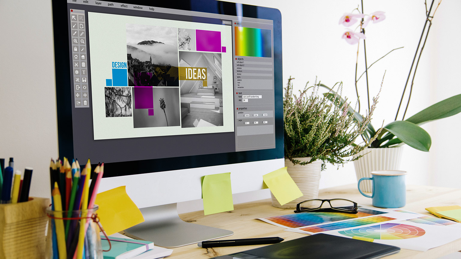
One of the most important aspects of graphic design is the process of creating your designs. The graphic design process is a series of steps that you follow to plan, research, sketch, and refine your visuals before you present them to your client or audience.
This important step of the graphic design process is to develop and refine your chosen idea or concept into a final design. You will also need to use your technical skills and tools to create a prototype that shows the details and the aesthetics of your design. You also need to use your feedback and testing skills to validate and improve your design. This step will help you to polish and perfect your design, as well as to ensure that it meets the expectations and needs of your client and audience.
For example, if you are designing a logo for a new coffee shop, you need to use software like Adobe Illustrator or Photoshop to create a vector-based logo that can be scaled and modified easily. You also need to test your logo on different media and platforms, such as print, web, and social media, and get feedback from your client and potential customers.
Once you have generated a range of ideas, refine them to create more polished and fully formed concepts. This can involve exploring different colour schemes, typography options, and layouts. This can use graphic design software to create mock-ups of the concepts, incorporating the refined ideas into a more finalised design.
Watch this video
It is how to practice your design skills (6:25)
Graphic Objects and Components
Graphic objects are an integral component of the overall design and can play a crucial role in the success of a project. It is important to assess the relationship of graphic objects to other design components to ensure they work together seamlessly and achieve the desired communication objectives.
By assessing the relationship of graphic objects to other design components, a designer can create a cohesive and effective design that communicates the desired message to the intended audience.
You can experiment with a range of elements to ensure that the objectives specified in a design brief are met. These include.
Start by generating a range of options for your design. This can include different colour schemes, typography choices, and layout variations. Make sure to document each option so that you can compare them later.
Analyse each option in detail, considering how well it meets the design brief and whether it effectively communicates the intended message. Pay attention to details such as alignment, balance, and contrast, and consider how each option might be improved.
Try combining different elements from different options to see if you can create a more effective design. For example, you might combine the typography from one option and the colour scheme from another to create a new option.
Get feedback from others, including other designers and potential design users. This can help you identify areas for improvement and refine your ideas even further.
Continue to iterate on your ideas, making small tweaks and adjustments as needed. By continually experimenting and refining your ideas, you can create a final design that effectively communicates the desired message to the intended audience.
Overall, experimentation can be a powerful tool for refining your ideas in graphic design. By generating multiple options, analysing each one, combining elements, getting feedback, and iterating on your ideas, you can arrive at a final design that is both visually appealing and effective in communicating the desired message.
These are just a few examples of graphic objects and components used in graphic design. Depending on the specific project requirements and design goals, you may combine these elements to create visually compelling and practical designs.
- When creating and refining ideas and options for composition in graphic design, you can take a few key steps to ensure that the final product is practical and visually appealing.
- Refine the composition: Once you have solid ideas, refine them by paying attention to details such as alignment, balance, and contrast. Ensure the design is visually appealing, easy to navigate, and communicates the desired message effectively.
- Get feedback: Getting feedback from others during the design process can be helpful. This can help you identify areas for improvement and refine your ideas even further.
By following these steps, you can create and refine ideas and options for composition that effectively communicate the desired message to the intended audience.

It is important to your development as a competent graphic designer that you understand and use a range of graphic design techniques and technologies that are appropriate to each design brief that you may encounter. Using an extended range of tools and features of the software with a high level of technical proficiency is the aim. By analysing different graphic techniques and technologies, a designer can decide on the most appropriate method for a project.
To date, you have primarily used a range of Adobe© Creative Cloud applications, namely Photoshop, Illustrator, and with specific reference to this module InDesign. These are all industry standards and are used extensively to create a range of outcomes. These tools allow designers to create, edit, and manipulate graphics in various formats. We will explore these further.
Adobe© Photoshop

This is the most capable editing software that now has AI effects. It has auto-selection tools and has strong support for collaboration.
Pros: It has a vast set of photo correction and manipulation tools, an exemplary user interface and many tutorials. It has mobile and web design tools, including a substantial set of drawing and typography tools. It also has the benefits of synced libraries, cloud documents, and collaboration features.
Cons: A perpetual license option is lacking, and it is hard to find the best price online. It has a steep learning curve, and it runs many processes in the background.
Reading
Discover more about the 2024 version of Photoshop.
Adobe© Illustrator

This is the best vector graphics editing program. It has text-to-vector AI integration, the ability to edit static text, and a mockup module that lets you apply vector graphics to a 2D raster object.
Pros: It has unmatched paralleled typography tools and features, with advanced features for vector brush making, tracing and complete integration with the Creative Cloud ecosystem and Adobe© Capture.
Cons: There is no perpetual license option, and there is inconsistency between key commands and processes between Illustrator and InDesign. Illustrator on the web is not supported on Safari.
Reading
Discover more about Illustrator.
Adobe© InDesign

Adobe's InDesign is the best layout and page design software and is a must-have for any professional designer.
Pros: It has a superbly balanced contextual interface, with easy, smart automatic global page adjustment. It has an interactive export for PDFs and HTML5 and can export to eBook formats.
Cons: It requires a subscription, and there is not a version for iPadOS as yet.
Reading
Discover more about InDesign.
Tip
If you have a LinkedIn account, you can access LinkedIn Learning and practice your skills in a range of Adobe courses, including the three programs detailed above.Analyse Different Graphic Techniques and Technologies
There are many ways in which you can analyse and evaluate different types of techniques and technologies for your journey in graphic design. Some of them may be familiar to you, and others, not so much. You can also evaluate your portfolio of previous work or a series of design exercises that includes composition, colour, typography, or image manipulation.
Creating and manipulating graphics involves using various tools and software to design, edit, and enhance visual images. These typically involve the following. Click on the headings to explore more.
These graphics are made up of a grid of pixels, each with its colour value, arranged in rows and columns. For example, JPEG, PNG, GIF, or BMP. They are most suitable for photographs, digital paintings, and web graphics. Editing raster graphics involves modifying individual pixels or groups of pixels using software like Adobe Photoshop or GIMP.
Data visualisation is the graphical representation of data and information to facilitate understanding and analysis. For example, charts, graphs, or maps. These are most suitable for business analytics, scientific research, and storytelling. Choosing appropriate visualisation types based on the nature of the data and using tools like Tableau, Excel, or D3.js to create interactive visualisation.
Is the art and technique of arranging type to make written language legible, readable, and visually appealing. For example, in fonts, typefaces, and lettering. This is the most suitable for graphic design, branding, and web design. Choosing appropriate fonts, adjusting letter spacing and line height, and incorporating typographic hierarchy and contrast using software like Adobe InDesign, Illustrator, or web design tools.
This involves manipulating or enhancing digital images to improve their quality or extract useful information, which includes noise reduction, image sharpening, and object detection. It is best used in medical imaging, satellite imagery, and digital photography. Using software like Adobe Photoshop, MATLAB, or OpenCV, using filtering, convolution, edge detection, and segmentation to create the optimum image possible.
These allow users to interact with and manipulate visual content in real time. For example, interactive websites, mobile apps, and touchscreen kiosks. It is best used in user interfaces, educational games, and data exploration. Incorporating user input, animation, and feedback mechanisms is best if web development frameworks like React.js, Angular, or game engines like Unity are used.
These are just some graphic technologies and techniques used in various industries and creative fields. Depending on your specific goals and projects, you may need to combine multiple techniques or specialise in one area.
Whichever area you are required to use in your field of graphic design, there are several steps to a professional design process. These are specified below in the seven (7) steps of a professional design process.


You must understand not only how colour theory works. It is a fundamental concept in design and visual communication that explores the principles of how colours interact with each other and how they can be combined effectively in several ways. A colour scheme is a predefined selection of colours used in a design or artwork, and different colour schemes can convey different themes and messages.
Watch this video
It is about what are considered the real primary colours. (17:34)
The way that colour works on a screen differs from artwork that is produced by hand which can take the form of draft ideas and thumbnail sketches. Digital colour systems are used by visual creation tools, such as apps for image editing and illustration, digital photography and video, interactive objects like games and websites, online media, 3D, and extended reality environments (XR) (including Augmented Reality and Virtual Reality). These colour systems and their terminology have become industry standards and part of the knowledge base required for any digital media creator. You need to familiarise yourself with them, as the assessments call for this understanding.
Creating and printing a digital image on paper involves converting your digital image's additive colour system (RGB colour) to a subtractive system (CMYK colour inks) that prints the correct colours onto the paper. Your image editing software or printer software is going through this conversion process, attempting to match what we see on the digital screen with what will come out of the printer. It’s a complex process, and there are many different automated and manual methods for colour conversion. The main ones used in digital images are RGB and CMYK.
Watch this video
It describes the difference between RGB and CMYK. (2:15)
How Digital Screens Display Colour
Pixels on our digital screens emit light in different colours based on how much of each primary colour is emitted from each pixel (RGB values). The number of colours we can see created from a digital RGB system depends on the ‘colour depth’ of our screens (also called monitors or displays).
The first colour computer screens had an ‘8-bit’ depth which only displayed 256 colours (you might remember old 8-bit video games with very basic colour graphics). Now we have true colour on most computers, which is 8-bit for each RGB colour – or ‘24-bit’ depth. This can display over 16.7 million colours.
Some recent high-quality computer displays have a ‘30-bit’ depth, which can display 1.07 billion different colour combinations. There is debate about the need for many colours and whether our eyes can see the difference. However, it is claimed that having over one billion colours is useful when working with bright, dark, or light colours, where a finer definition is needed.
Colour Calibration
Calibration is the process of aligning your digital screen’s colour output to the RGB standard – so what you see on your screen is an accurate representation of the RGB colours created by your computer. This process is essential for working with digital content like photography and digital-to-print processes where it’s necessary to have colour accuracy. Most computer systems will have their calibration tools, or you can find online applications to help you calibrate your screen.
Explore: Test and calibrate the colours on your digital devices.
Open this image on all your devices and see how it looks on your computer, tablet, phone, and TV screen.

Ask yourself.
- Are the colours different?
- Is the brightness different?
- Can you adjust your settings to get each device’s best colour and brightness?
Explore
Learn more about digital screen calibration from the following links.
What is a Hexadecimal Colour?
The Hexadecimal, or HEX colour system, was developed for creating colours in HTML (Hypertext Markup Language) for websites. It’s another way of describing RGB colour values – with a single number. Hexadecimal is a base-16 number system (hex means 6, and decimal means 10), which allows us to represent larger numbers with fewer digits. It uses the numbers 0 to 9 and the letters A to F to describe RGB value colours.
Explore: HEX Colour
This is an example of a HEX colour.
(The hash symbol ‘#’ denotes a HEX colour in HTML code)
#E86F1F
E8 is the red value
6F is the green value
1F is the blue value.
Here’s a swatch of the colour.
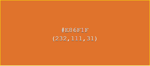
Note that the highest value is Red (E8 is a high number), the second highest is Green, and the last is Blue – which produces this shade of orange.
The same colour in RGB would have the following values: #E86F1F = RGB (232, 111, 31).
The HEX value is a more efficient way of representing RGB colour information.
This image shows various RGB colour values. White in HEX colour is #FFFFFF – the highest number – and black is #000000 – the lowest number. If you convert #FFFFFF from hexadecimal to a decimal number, you get the number 16,777,215 – which is the exact number of colours that can be displayed on 24-bit computer displays!
Explore
‘WHAT THE HEX?’ is a quiz designed to test your knowledge of colour identification skills in HEX.

Other RGB Colour Models
Within RGB colour space, there are different models for describing aspects of colours. These were originally developed for different purposes like television or computer graphics. Representations of these models are still found in many common image editing applications.
HSL represents the values of Hue, Saturation, and Lightness.
(Saturation is the intensity of that colour.)
- HSV represents Hue, Saturation, and Value (also referred to as Brightness).
- HWB represents the values of Hue, Whiteness, and Blackness.
- Hue is the colour wavelength on the visible spectrum.
- Lightness describes lighter and darker variants of a colour.
- Alpha-channel: in HSL-A colour or RGB colour, the A represents the Alpha channel, or transparency of the colour, which is used in image editing and web design contexts to allow for transparent layers of colour to be represented.
- Value/Brightness: this value is different to Lightness in HSL – it relates to how bright a colour is, not how light (pale) or dark a colour is.
- Whiteness & Blackness – used in the HWB colour model, these values are different to lightness and brightness and represent how much white or black is mixed with the Hue.
How Do Digital Images and Videos Display Colour?

Digital image and video objects record and store colour information in different ways depending on their format and encoding methods. When creating visual digital media content, we usually want the best quality image possible but with the smallest file size possible to allow for fast internet download and rendering by software applications.
Both image and video files have properties such as Resolution, Width, Height, and File size. Resolution describes how much detail the image holds. However, a pixel count measures this in digital images and video.
Pixels are tiny squares or dots of colour that form the rectangular grid of an image or video’s visible area. The more pixels in your image, the higher the resolution and the more detail or information stored in the image. This also means better quality and colour.
Tip
You might notice how many megapixels the camera can capture on your digital camera or mobile phone.
The total number of pixels (one megapixel equals 1,048,576 pixels, usually rounded to 1,000,000 pixels) can be recorded in a single image.
Higher megapixels give a higher-quality image. If your camera can capture an image that’s 12 megapixels, this image is approximately 4290 x 2800 pixels in width and height.
Image resolution is essential to understand if you’re working with screen and print media. We generally use a lower resolution image for screen media and content on the Internet because we want fast loading times, and our screens display a limited resolution. For printing, a higher resolution is better for image quality.
Printers can print at different resolutions depending on their capability. Commercial and professional printers can produce high-resolution imagery for fine art photography and publications. Your home inkjet printer can also print at different resolutions, depending on the quality of the printer.
Image resolution is measured by the number of pixels in width multiplied by height, as well as the density of those pixels – measured by dots per inch (DPI), which is how many dots/pixels are in a square inch. The higher the DPI, the better quality the image will be. The following image illustrates this well.
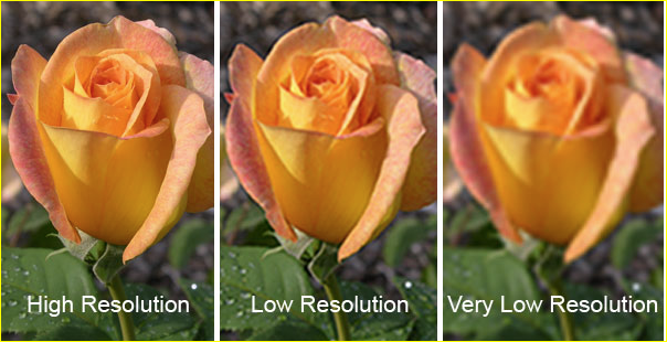
Image taken from SkyHawkStudios
Tip
Have you ever seen an image on a webpage that looked great on your computer, but when you try to print it, it looks terrible?
This is because the screen image has a low resolution – possibly 72 DPI – and low dimensions – perhaps 800 pixels width x 600 pixels height or less.
Your printer can produce images ranging from 150 to 1200 DPI (or higher, depending on the printer), so your small image doesn’t have enough pixels to create a good-quality print image.
Important
It is crucial to save your image at the right resolution and dimensions for its purpose and to use the right colour system – RGB for screens, and CMYK for print. You need to have this information at the forefront of your mind when using programs such as Adobe Photoshop or Illustrator.
Once you have reduced an image’s resolution – width/height or DPI – and saved it, that information is lost. If you try to increase the resolution, your editing software compensates by duplicating or replacing pixels and filling in the space according to its encoding system.
However, it cannot replace that lost information, so you will still see a blocky and pixelated image. It also affects the colour well – the lost colour information cannot be replaced.
Many software editing applications have processes that attempt to compensate for the loss of information, and more recently, Artificial Intelligence (AI) is increasingly used to ‘intelligently’ enhance image quality by replacing lost information or repairing damaged or blurry images. Although these tools are helpful, image enhancement is no match for retaining the original information if you work with high-resolution photos or pictures.
Compression and Encoding
More pixels result in a bigger file size – the number of bytes (kilobytes, megabytes, gigabytes, terabytes, etc.) in the file. This can be problematic with video – even a short video can have thousands of frames; in theory, each frame is an image. Video files are much more significant in file size than still images. Image and video files also store colour information in different ways.
Click on the following headings to explore more.
RAW is a raster image format (based on a fixed grid of pixels) used for unprocessed images usually captured with a camera. There are many different RAW image formats, which often depend on which camera you use. RAW images are ultimately converted to another format for media (JPEG, PNG) or print (TIFF, high-quality JPEG). Your camera or mobile device may have the settings option to save images as RAW or JPEG.
Note: RAW images will take up more file space on your device.
Think of a RAW image as a traditional physical photographic negative that can be reproduced in multiple formats (although a RAW image is not a negative image). Keeping a RAW version of an image means that you have all the original information of the image, which can then be altered using non-destructive editing techniques to achieve a particular result.
Learn more about RAW files
Learn more about non-destructive editing
GIF(Graphics Interchange Format) was one of the first raster image formats used on the Internet. It has a very limited palette of colours available – only 256 colours. This is partly because it was created when bandwidth was much lower and slower than it is today. Only the smallest of image file sizes could be used to share images across networks or display graphics on web pages. Also, screens only displayed 256 colours at that time, so there was no requirement for more colour information.
GIF images can save different minimal colour ‘palettes’ – you can save only the colours used in the image (indexed colour), making the file sizes very small. Because of GIF image colour limitations, it is a good format for simple graphics like logos but not photographic images.
Learn more about the history of the GIF
The JPEG (Joint Photographic Experts Group) raster image format became standard in the late 1980s and early 1990s. It allows for millions of colours in an image (24-bit colour), which is good for capturing photographic images. JPEG uses a lossy compression system to reduce the amount of information in an image file and therefore reduce the image file size – making it a useful image format for the Internet.
It’s called ‘lossy compression’ because visual data that the human eye can’t see is removed, and colour variation is averaged, so some image information is lost in the compression process. You might have seen low-quality images on websites or social media where the image looks blocky or has visible ‘artefacts’ (noise or aliasing on the edges) due to the JPEG format compression.
Learn more about JPEG
SVG (Scalable Vector Graphic) is a very different kind of image format. It is not a resolution-dependent raster image format, rather, it is based on vector graphics, which are mathematical statements that describe lines, curves, shapes and colours on the Cartesian plane (x, y-axis). This makes it scalable, so no matter how big or small you size the image, it will retain its quality – it redraws the geometric information at any size. Because an SVG file stores mathematical information and not pixel information, SVG files are generally very small and can also be used in websites as XML code.
This kind of graphic is generally not used for photographic images – calculating the vector math for a complex photographic image would be less efficient than using pixels and compression formats. However, vector graphics are very useful for visual materials that need to be reproduced at different sizes in both digital and print media, such as advertising graphics output like posters, banners, billboards, signage, etc. Other common vector image file formats that digital media creators may encounter include EPS, AI, and PS.
Learn more about SVG
Watch this video
It is about explaining image file formats. (14:19)

When creating design proposals, incorporating visual representation is crucial for effectively conveying your ideas and solutions. This can take the form of using either software or hand-drawn solutions or a combination of both. However, as a graphic designer should be conversant with various software, including Adobe© Photoshop, Illustrator, and InDesign, visual outcomes would be primarily digital.
The goal is to make your design proposal engaging, informative, and easy to understand. Choose the visual representations that best align with your project and effectively communicate your vision to clients. These elements are crucial in the communication process as they help to convey complex information in an easily digestible format. The choice of visual representation should align with the nature of your data and the story you want to tell.
You can use a range of visual representations to effectively communicate your concepts and proposals. These include.
- Tables and Graphs: These can be used to present quantitative data or trends.
- Infographics: These are graphic visual representations of information, data, or knowledge intended to present information quickly and clearly.
- Photos: Photos of your product or previous projects can give the client a clear idea of your capabilities.
- Team Pictures: Pictures of the team can help to personalize your proposal and build trust with the client.
- Figures and Diagrams: These can be used to explain complex concepts or processes.
- Flow Charts: Flow charts can be used to illustrate a process or workflow.
Reading
Explore more about design proposals in graphic design.
Explore
Familiarise yourself with this website that discusses impactful visual representations.
Remember, good graphic design is not just about aesthetics. It’s about finding the best way to communicate your message. It’s about the relationship between the elements and the whole. As a designer, you can evoke specific emotions and create a positive association with a brand or message. This helps to leave a lasting impression in the minds of the audience.
Through strategic use of visuals, designers can enhance the clarity and impact of a message, making it easier for viewers to understand and trust the information being presented. With every stroke of your design, you can paint a vivid picture that leaves a lasting impression. So, embrace the power of visuals, and unleash your creativity.
HERE’S TO THE CRAZY ONES. THE MISFITS. THE REBELS. THE ROUND PEGS IN THE SQUARE HOLES. THE ONES WHO SEE THINGS DIFFERENTLY…THE PEOPLE WHO ARE CRAZY ENOUGH TO THINK THEY CAN CHANGE THE WORLD ARE THE ONES WHO DO.Steve Jobs