Welcome to topic 1 – Research type as visual communication.
This topic allows you to explore typography in different contexts. You will be introduced to the following themes:
- The definition of typography
- The role of typography in communication
- Typography in graphic design
- The history, theory and practice of typography
- Trends in typography.
Typography is essential. Whether it’s on our phones, in books, or on websites, we’re constantly digesting written words. From instruction booklets to shop fronts, typography is all around us. We often reflect on the power of the written word, but we rarely consider the designer’s role in emulating the tone of the word or sentence.
Typography is arranging letters and text to make the copy legible, clear, and visually appealing to the reader. It involves font style, appearance, and structure, which aims to elicit certain emotions and convey specific messages. In short, typography is what brings the text to life. Typography is more than choosing beautiful fonts; it’s a vital component of user interface design. Good typography will establish a solid visual hierarchy, provide a graphic balance to the website, and set the product’s overall tone.
Typography should guide and inform users, optimise readability and accessibility, and ensure an excellent user experience.
- Fonts and typefaces
- Contrast
- Consistency
- White space
- Alignment
- Colour
- Hierarchy
There’s some confusion surrounding the difference between typefaces and fonts, with many treating the two as synonymous.
A typeface is a design style comprising various characters of varying sizes and weights, whereas a font is a graphical representation of a text character. A typeface is a family of related fonts, while fonts refer to the weights, widths, and styles that constitute a typeface.
There are three kinds of typeface: serif, sans-serif, and decorative.

- Serif- the extra marks identify serif typefaces at the end of letters. Adding these small strokes and elements gives serif fonts an air of tradition, history, authority, and integrity.
- Sans-serif-without the serif’s traditional strokes and dashes, the sans-serif font family is seen as much more modern and bold.
- The Decorative function of this typeface is aesthetic rather than readable. As a result, you’re far more likely to see these used in brand names, logos, and short titles.
Contrast helps to convey which ideas or messages you want to emphasise to your readers. Spending time on contrast makes your text interesting, meaningful, and attention-grabbing. Most designers create contrast by playing around with varying typefaces, colours, styles, and sizes to create impact and break up the page.
Keeping your typefaces consistent is critical to avoiding a confusing and messy interface. When conveying information, it’s essential to stick to the same font style so your readers instantly understand what they’re reading and begin to notice a pattern.
While it’s okay to play around with levels of hierarchy to some extent, it’s good practice to establish a consistent hierarchy of typefaces (one consistent font for headers, another for subheadings) and stick to it.
Often called “negative space,” white space is the space around text or graphics. It’s frequently overlooked and tends to go unnoticed by the user, but proper use of white space ensures the interface is uncluttered and the text is readable.
White space can draw attention to the text and provide an aesthetically pleasing experience. White space often takes the form of margins, padding, or just areas with no text or graphics.

Colour is one of the most exciting elements of typography. This is where designers can get creative and elevate the interface to a new level.
Text colour, however, is not to be taken lightly: getting your font colour right can make the text stand out and convey the tone of the message, but getting it wrong can result in a messy interface and text that clashes with the site colours.
Colour has three key components: value, hue, and saturation. A good designer will know how to balance these three components to make the text eye-catching and legible, even for those with visual impairments. Often, designers will test this by viewing the text in greyscale (without colour) and tweaking if the text is too dark or too light against the background colour.
Establishing a hierarchy is one of the most vital principles of typography.
Typographical hierarchy distinguishes between prominent pieces of copy that should be noticed and read first and standard text copy. In an age of short attention spans brought about by social media, designers are urged to be concise and create typefaces that allow users to consume the necessary information quickly.
The most typical example of a typographical hierarchy is size: headings should always be larger than the subheadings and standard text.

Watch this video
It poses the question, what is typography? (1:14)
The role of typography in communication
Typography is not merely about aesthetics; it profoundly impacts communication. The text's style, size, and arrangement can convey different meanings and messages. Whether it’s a book, website, or advertisement, typography sets the tone and guides the reader’s experience. It is not just about choosing a font and arranging text on a page. It goes much deeper than that. How words are presented can affect how we interpret and understand the message. It can shape our perception of the content and influence our emotional response.
Typography is a fundamental aspect of visual communication. It combines art and technique to create visually appealing and practical designs. By understanding the basics of typography and its elements, designers can create engaging and impactful visuals that effectively convey their message.
It is a powerful tool that goes beyond mere aesthetics. It can shape perception, evoke emotions, and enhance the user experience. By carefully selecting and pairing fonts, designers can create meaningful and impactful designs that leave a lasting impression.
Here are some good examples of innovative typography.
- An excellent example of hand lettering. It depicts a lyric from the band The Doors. Look at the way that the different types of font have been used. The type almost becomes illustrative!
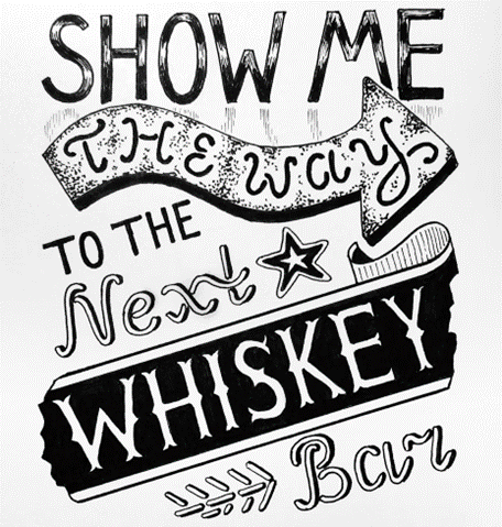
Designer: Taylor Myers
Sourced from: 99designs.com
- This typography poster design was made for The Big Issue magazine. Look at how typography creates an image of Freddie Mercury and examples of his lyrics.
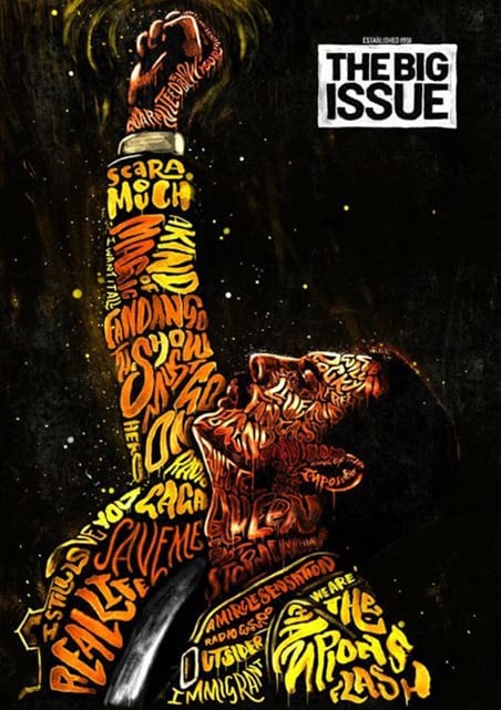
Designer: Peter Strain
Sourced from: www.creatopy.com
- Here, the artist has selected biographies from Wikipedia that define various celebrities. Then, he sets the words on a black background to create images of each figure, making a statement about how digital information defines us in the eyes of others. This example is Kurt Cobain.
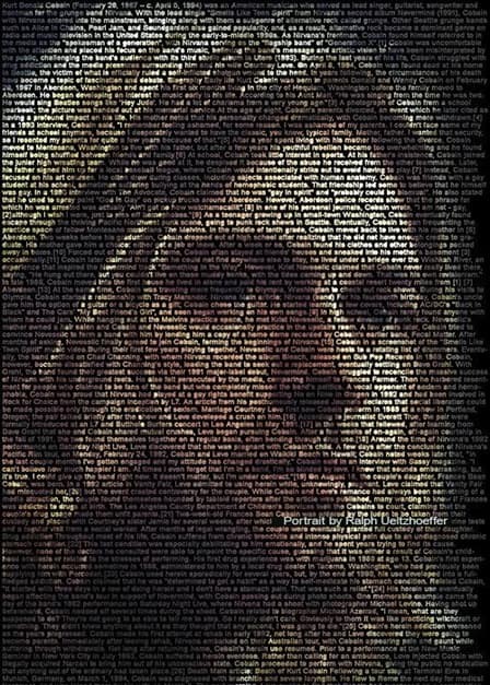
Designer: Ralph Ueltzhoeffer
Source: creatopy.com

Type and printed matter communicate information to us and influence our daily decisions. Whether we realise it or not, the kind and the way it appears affects which CD or book cover catches our eyes, which detergent we think might make the whites whiter, and which movie seems to be the scariest or most romantic.
Much of this process goes on unconsciously, which is why the art and craft of typography is so invisible to the average person. But its unseen nature by no means diminishes the importance and influence type has on the quality and substance of our daily lives.
But how did it start? What are the key developments in typography?
Type has only existed for about 560 years. Still, its beginnings are rooted in the caveman's life, as his developing needs and habits led civilisation toward the evolution of the alphabet and, subsequently, the invention of type and printing. It is certainly possible to learn to use type effectively and tastefully without knowing its roots but to fully understand and appreciate type today fully, it is essential to know something about the past. In particular, your work in graphic design will be improved by your knowledge of typography developments.
Early developments
Initially, humans communicated purely with sound and verbal language, not recorded anywhere, although cave drawings (pictograms) date back to 25,000 BC. Around 3000 BC, the Sumerians developed one of the first writing systems that read from left to right. This separated society into two groups: those that could understand this system and those that could not.
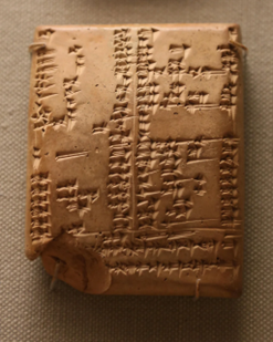
A bilingual cuneiform tablet, listing Sumerian and Akkadian words. Scribes wrote such lists to ensure the older Sumerian tablets would always be understood.
Source: bbc.com
Explore
Learn more about key developments in ancient cultural texts.
https://www.bbc.com/future/article/20220818-how-to-write-a-message-to-the-future
The critical development in 800 BC was the advent of the Greek writing system that added vowels and naming symbols, which was then taken further by the Romans, who added more letters and condensed letterforms to conserve space. It is highly recognisable and, as such, has continued to influence type designers through to modern times.
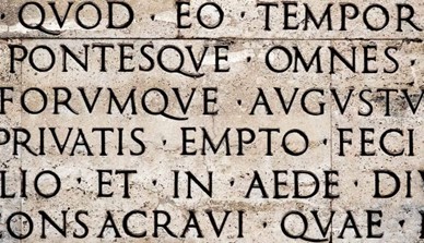
Latin text inscribed in sandstone (4th Century AD)
Source: thecollector.com
Moveable type
Until the fifteenth century, all books were hand-copied by scribes, exemplified by the many beautiful and exquisitely written and illustrated manuscripts created for religious purposes in monasteries. In 1448, that all changed with the birth of printing, after which the world would never be quite the same. Johannes Gutenberg, a goldsmith from Mainz, Germany, is credited with the invention of movable type.
Early type design imitated the pen-drawn styles of the scribes. Gutenberg’s first typeface was in the style of the heavy black letter popular in Germany then. It contained over three hundred characters, including ligatures and abbreviations. Early type design imitated the pen-drawn styles of the scribes. Gutenberg’s first typeface was in the style of the heavy black letter popular in Germany then. It contained over three hundred characters, including ligatures and abbreviations.
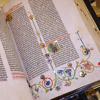
Pages from the infamous Gutenberg Bible, the first example of moveable type in 1455.
Source: huntington.org
Mechanisation
The development of new and improved presses continued slowly through the centuries. But it wasn’t until the Industrial Revolution in the late nineteenth and early twentieth centuries that groundbreaking improvements in typesetting equipment were achieved. In addition to the lack of speed and reliability of hand-set-metal-type composition (remember, every letter of every word had to be set by hand), another of its significant limitations was the inability to justify type automatically without manually inserting metal spaces between the letters.
The Linotype machine, invented by Ottmar Mergenthaler in the 1880s, as well as other typesetting machines that followed, including one from Monotype, sped up the printing process immensely (and included the ability to justify text) and finally eliminated the need to set type by hand one letter at a time.
Technology took a giant leap ahead in the mid-1950s with the development of phototypesetting. Several companies, the most prominent ones being Mergenthaler and Intertype, developed and improved a photographic process of setting type whereby typefaces were made into negatives through which light was focused onto photosensitive paper, producing an image of the type.
The improvements over hot-metal typesetting were qualitative and quantitative. Typesetting could now be done electronically rather than mechanically. Images became sharp and crisp, corrections could be made electronically, and most importantly, there was now complete flexibility about intermixing styles, weights, and sizes; letter spacing and kerning; line spacing and word spacing; hyphenation and justification; overlapping; and other photographic special effects. The elimination of so many restrictions in the typesetting process significantly impacted typography and typographic design.
Over the centuries, type designers were highly influential in shaping the printed word. Many thousands of typeface styles available today are primarily due to the originality, artistry, and craftsmanship of five centuries of talented printers and designers, a handful of which are highlighted in the following group of some of the most influential and essential type designers of all time.
Many of these names may be familiar, as fonts are named after them. See how many you can identify. Perhaps look around the fonts in Microsoft Word.
- Claude Garamond (1480–1561)
- William Caslon (1692–1766)
- John Baskerville (1706–75)
- Giambattista Bodoni (1740–1813)
- Frederic W. Goudy (1865–1947)
- Morris Fuller Benton (1872–1948)
- Oswald Bruce Cooper (1879–1940)
- William Addison Dwiggins (1880–1956)
- Eric Gill (1882–1940)
- Stanley Morison (1889–1967)
- Hermann Zapf (1918–)
- Edward Benguiat (1927–)
- Adrian Frutiger (1928–)
- Matthew Carter (1937–)
- Gerard Unger (1942–)
- Jill Bell (1950–)
- James Montalbano (1953–)
- Robert Slimbach (1956-)
- Zuzana Licko (1961–)
Watch this video
This highlights the history of typography. (8:02)
Learning Activity: Historical Type
Choose three (3) of the topics listed below. Write a quick 100-word summary of each choice, and include three (3) examples (images) of typography associated with your preferences, with captions.
- William Morris and the Kelmscott Press
- Art Deco
- Art Nouveau
- Bauhaus
- Futurism
- The New York Style
- Russian Constructivism
- Suprematism
- Swiss Style
Post your findings and images to the forum, Historical Type.
Typography and graphic design

Regarding graphic design, typography can sometimes fall into the category of an afterthought or lesser valuable element. But typography can be the very thing that will make or break your design!
Typography is an essential component of visual communication, shaping the viewer's experience and engagement with the written content. It plays a massive part in improving the aesthetic of the design and can influence the viewer's perception while communicating an underlying tone or mood. It serves as a design's 'visual voice', adding character and personality to its message.
Bad typography means unreadability. Poorly chosen fonts or incorrect typography can jar with a viewer. If the font is too traditional for a modern design or vice versa, the viewer will find it unsettling. The layout must be well thought out and have clear and accessible information. In a time when inclusivity is paramount, typography is critical in creating accessible designs for people with special needs, such as visually impaired readers.
Typography exists in almost all forms of graphic design, including web design, print design, and logo design. A website with readable and appealing text keeps visitors' attention for extended periods. Print design influences how readers interact with a page and should guide them through the content. It can also improve brand recognition in logo design, making a logo instantly identifiable. Typography can be a minefield, and designers must watch for poor kerning, insufficient contrast, overuse of fonts, and even the cultural connotations of fonts.
As a graphic designer, it is essential to remember that the terms "typeface" and "font" are often used interchangeably. When most people say "font," they refer to a typeface. As a graphic designer, it's important to understand the difference between these terms.
A typeface is a family of fonts. Some familiar examples include Times New Roman, Arial, and Brush Script. A font is a typeface variation, typically bold, italic, or a combination of the two. Examples of fonts include Times New Roman Italic and Arial Bold.
This infographic illustrates the difference.

Watch this video
It is how to choose fonts. (9:41)
There are several steps that the graphic designer can employ when using typography in their designs. Click on the headings to explore more.
Through typography, you can heighten the message of a design clearly and legibly. The typography must be strong enough to be noticed in a primarily image-based design. In a text-heavy design, you must use a typography design to differentiate different sections and call attention to important messages. Either way, there needs to be an intentional and harmonious balance between various competing elements to get the primary message across quickly and easily.
One crucial way typography is used in graphic design is to create a visual hierarchy. This is often accomplished through sizing- the largest element on the page naturally draws the eye first. In a text-heavy graphic design, such as a newspaper or brochure, the headlines stand out and draw attention because they're larger than the body text.
Another way to create a typographic hierarchy is by combining different typefaces. For instance, using a geometric sans serif typeface for headings and a classic serif for the body. Each level utilises a different font, and the hierarchy is further established through sizing.
A decisive role of typography in graphic design is to establish and grow brand recognition. This is especially true when it comes to logo design. You can easily visualise their unique logotype when considering popular brands like Coca-Cola, Harley-Davidson, and Disney.
The same concept applies to other graphic design variations, such as the simple, sans-serif typeface Instagram uses for its app user interface. Creating brand recognition through typography helps create a unique attachment and familiarity between the brand and the consumer.
Some typefaces add personality to a graphic design, particularly in the display category. The intentional use of typography can indicate whether a brand is playful, warm, mysterious, edgy, youthful, refined, and so on. Therefore, it's essential to understand a brand's or design project's traits to use typography that conveys the right personality.
Bold and rounded typography is typically used to convey playfulness and friendliness in graphic design. In contrast, thin and subtle letterforms give off an air of sophistication and sincerity. With a little practice, it's pretty easy to read the personality of a given typeface and decide whether it's a good fit for your project.
Typography can create a strong visual impact. There are many ways to get creative with typography in graphic design to make an impression on the viewer. It can even be used so that no other supporting visuals are needed to communicate the design's message effectively.
Similar to how typography conveys personality, it also helps establish the mood and tone of a graphic design piece. In this way, typography visually brings out a brand's values without needing to state what those values are explicitly. For instance, a brand that values minimalism can help convey this value by using a modern, lightweight sans serif font.
One of the most critical roles of typography is to draw attention to important messages. Typography is an easy and impactful method for making a word or phrase stand out in a design. Some ways to draw attention through typography include increasing the size, changing the colour, and changing the font or typeface to contrast with the surrounding elements.
Typography helps create harmony and consistency in a design. In brand identity design, creating visual consistency across all platforms is important. In website design, this looks like using consistent heading and body fonts throughout the site. Visual consistency creates a professional and streamlined look and promotes brand recognition.
Harmony in graphic design refers to visual balance and continuity. Harmonious designs are easy to follow and aesthetically appealing.
Ultimately, typography is a crucial element that uplifts a design and gives it a personality. For designers, typography is a way to use text as a visual to convey a brand message. This design element is essential for graphic designers not only to build personality and convey a message but also to grab the viewer’s attention, build a hierarchy, brand recognition, and harmony, and establish the value and tone of a brand.
A trend is what's hip or popular at a certain point in time. Typography trends in graphic design constantly evolve, and following design trends can help you stay updated and relevant in your field and inspire your professional practice and ability to create fresh and original work.
Design trends reflect the cultural, social, and technological changes that shape our society, and by observing them, you can learn about your audience's needs, preferences, and expectations. You can also discover new ways of solving problems, communicating messages, and expressing emotions through design.
How to find trends
Many sources are available online and offline when searching for design trends.
- Design blogs and magazines are great for discovering the most recent and upcoming design trends, such as graphics, web, UI/UX, products, or fashion.
- Design platforms and communities, like Behance, Dribbble, or Pinterest, provide an opportunity to share and discuss design work with other designers worldwide.
- Design awards and competitions celebrate the best and most innovative design work in different categories - the Awwwards, the Red Dot Design Award, and the iF Design Award are some examples.
- Finally, design events and conferences offer a chance to network, learn, and collaborate with other designers in person or virtually - some of them are Adobe MAX, the Design Indaba, or TEDx Design.
How to analyse design trends
Uncovering design trends is only the beginning. You need to analyse and comprehend what makes them attractive, practical, and pertinent to gain the most out of them. Consider questions such as.
- What is the purpose and context of the design trend?
- What elements and principles make up the trend?
- What inspirations and influences are behind it?
- What are its strengths and weaknesses?
Understanding these aspects can help you determine how the trend relates to the overall design, how it reflects current or future culture, society, or technology, and how it compares to other trends.
How to adapt design trends
Adapting design trends can help you create engaging and relevant design work but can also present some challenges and risks. For instance, you may lose your originality, identity, or consistency or follow an outdated, inappropriate, or ineffective trend.
- Analysing design trends can provide valuable insights and ideas to apply to your projects.
- However, adapting design trends does not mean simply copying them.
- Instead, it entails using them as inspiration and guidance while injecting your creativity and personality.
- To do this, you can mix and match elements from different trends to create an original design, modify and customise aspects of a trend to make it more suitable for your project or experiment and innovate with a trend by using a different medium, tool, or technique.
How to balance design trends
It is essential to balance design trends, your style, vision, and values, and your project's and audience's requirements and expectations.
- You should know your purpose, audience, limits, resources, trends, and alternatives.
- You should also clearly know what you want to achieve with your design work and who you want to reach.
- Be mindful of your skills, preferences, and resources so that you can execute the trends well and efficiently.
- Finally, stay informed about your trends and be prepared to change them or explore other options if they are not working.
There are many trends in typography, and each source defines differing trends, so how do you know what information is correct?
Explore
One site that has typography trends for 2024 is fontfabric.com.
Design trends are continuously changing, which makes them challenging to track. But, you must embrace that challenge and be constantly updated with the latest design trends.
However, clients' preferences and expectations are paramount, so your mission is to convert clients' ideas into the desired product, even if those ideas don't match your personal preferences or current trends. But, you should not ignore design trends if your clients don't want to follow them; there are still many reasons why designers should keep tracking them.
There are many reasons why you and your clients should track design trends when starting a project. They have to be informed about what is current and what people like nowadays, but that doesn't mean they must strictly follow them. Being original and unique will always be a trend.
On the other hand, following the trend or not is not that big a deal. You must be more flexible in seeing a trend because it’s a come-and-go. You can filter the existing trends to let yourself be inspired by seeing what’s happening in the world around you. Not following the recent trend to maintain your design identity is also okay if it makes it timeless and lasts for years.
Watch this video
It discusses graphic design trends in 2024. (17:09)