Welcome to topic 4 – Manipulate and integrate type. This topic allows you to explore options for type design using appropriate software. You will be introduced to the following themes:
- Explore options for type design
- Typography and software
- Integrate type and troubleshoot technical issues.
Explore options for type design
You need to be aware of certain considerations when designing typography. These theories and principles are the building blocks of good typography.
When working with typography, designers must consider certain rules and principles. These ensure that text is easy to read, aesthetically pleasing, and conveys the intended message effectively. This may involve considering things like.
- What tone do you want the text to convey?
- Who is your audience?
- What type of text content (i.e., body text, headings)?
- Where / what platforms will the text be read?
These questions can help narrow down the typefaces that may be most appropriate.
In graphic design, different elements are arranged to create a visual hierarchy—with more key features given more visual emphasis and prominence. Hierarchy also applies to typography, with each piece of text styled based on importance. Consistency is key when styling the text throughout a design project. Even if you are experimenting with playful typeface pairings or going for a more unconventional aesthetic overall, you still want to create visual harmony and keep certain typography cohesive.
Firstly, when choosing a typeface, it is important to consider the context in which your text will be used and the purpose of the communication or product it is part of.
Ensure that the text is clear and easy to read
Good typography makes every text clear, legible, and accessible to the reader. You must create sufficient colour contrast, leave plenty of white space, and adjust your text's leading, tracking, and kerning. Choosing typefaces and fonts that will be legible in the given context is also essential. For example, script typefaces are fine for one or two words (such as a headline or a logo), but sans-serif typefaces are more appropriate for large chunks of body text.
You will also need to consider where and how your text will be displayed. Are you designing typography for digital, print, or both? How versatile does your typography need to be? What materials will your text be printed on, and/or what devices might it be viewed? Your goal is to make typography choices that prioritise readability in any context.
Align with the brand identity and evoke the right tone
Good typography does not simply respect the overarching brand identity but helps shape and convey it. When choosing and styling a typeface, consider the brand values and characteristics you want to convey and the mood you want to evoke in your target audience.
Consider how a typeface like Creepster might be perfect for a poster advertising a horror movie but completely off-brand for a medical website. Likewise, Arial might be ideal for a professional ebook but would fail to convey the elegance of a luxury cosmetics brand. A typeface like Bellefaire in italic font might suit that context.
Communicate effectively with your audience
Good typography has one main job: effectively communicating a message to the target audience. You know you have achieved this when your chosen typeface is on-brand and evokes the right mood, all text is easily legible, and you have established a clear visual hierarchy of information.
Is the reader able to access all the necessary information within your design? Are they drawn to the most essential information first? Is it easy to find and read what they are looking for? If you can answer “yes” to all these questions, you have officially mastered the art of good typography!

Once you have determined your typography ideas suitable for your client's requirements, the next step is to use appropriate software to design your design solutions digitally. To do this, you will need to use Adobe Illustrator. With this program, you can use a customised font or typeface that stands out on the page and screen.
It is worth noting, however, that software doesn't replace knowledge. While software offers a powerful toolkit, a strong understanding of typographic principles is essential. Knowing how to choose appropriate fonts, create a hierarchy with type, and ensure readability is crucial for effective design.
You should either draw freehand, take inspiration from your thumbnail sketches produced earlier, or design typography using variable fonts from the font menu in Adobe Illustrator. As you have an Adobe Creative Cloud subscription, you must activate and utilise a vast library of high-quality fonts directly within Illustrator.
You can add text in diverse ways to enrich your design. You can also delete empty type objects, remove default placeholder text, fill only selected type objects with placeholder text, and wrap text.
Important
There are instructional resources about adding type on the Adobe Illustrator tutorials page.
Open Adobe Illustrator from your Adobe CC subscription and practice, practice, practice.
There is a specific order to save your work in Adobe Illustrator. This includes:
- Draw it: Sketch out the letters by hand
- Import it: Scan and vectorise the letters in Illustrator to capture the distinct line, length, ascenders, and descenders
- Tweak it: Refine and organise the letters to get the exact look, readability and kerning you want
- Save it: Save the glyph and export it using additional plug-ins
- Use it: Use that brand-new font well in future projects.
Designing different typefaces takes time and practice, but some tutorials can help you advance.
Explore
- Start with the basics. Before creating a customised font for a design, learn how to add, format and style text in Illustrator projects.
- Practice pen precision. Practice drawing with the Pen tool in Illustrator and prepare to sketch the shapes that form the basis of customised typography.
- Take the text to the next level. Hone your typographer skills with this tutorial. Learn to use classic fonts like Helvetica and Arial as a basis for new vector graphics.
Watch this video
It is how to create custom typography in Adobe Illustrator. (8:33)
Important
This website details six (6) overlooked typography tools in Adobe Illustrator.
This website details five (5) online typography games to improve your skills.
Typography and design software work hand-in-hand. Your typographic knowledge and vision are translated into reality through the capabilities of design software. Understanding both aspects allows you to create impactful, user-friendly designs that communicate your message clearly and effectively.
By mastering the tools and techniques, you can leverage the power of Adobe Illustrator to create impactful and visually compelling typography that elevates your vector graphics projects.

There are certain considerations that you must make when designing typography and fonts using software. These include.
- Font Selection: Select fonts that are aesthetically pleasing clear and legible in many sizes and on different platforms (screen vs. print). Consider licensing restrictions for your chosen fonts.
- Font Pairing: Explore pairing a main typeface for headings and body text with a secondary font for accents or specific elements. Look for fonts that complement each other stylistically (e.g., a serif with a sans-serif) or create contrast for emphasis.
- Readability & Functionality: Prioritize readability. Ensure enough contrast between text colour and background for clear visibility. Avoid overly decorative fonts that might hinder legibility, especially for large blocks of text.
- Conceptual Typography: Go beyond basic text formatting. Use typography to visually represent your message or concept. Play with letterforms, arrangements, shapes formed by letters, or negative space to create a unique visual impact.
- Integration with Visuals: Seamlessly integrate typography with other design elements like images, shapes, or illustrations. Text can flow around objects, be incorporated within shapes, or become part of the overall visual composition.
Typography is an essential element of any design, as it helps convey the message and tone of your project. When used effectively, typography can significantly impact the overall aesthetic and effectiveness of your design.
You also need to consider the importance of images that support your typography choices, especially if your client has specified it. Images have bigger roles than just featuring a nice background to your document. It creates context, emotion, tone, and sometimes a story for your document. If those qualities align with your text message, you can connect with your audience better. So, the image must communicate well with the typography of your design document.
Do not forget about a background for your design and text. Just keep in mind that the background must be commensurate with the whole idea of the document. Keep enough contrast between the background and typography to make your text stand out without compromising the readability. For example, you can achieve this contrast by using light-coloured text on a dark background and vice versa. A poor combination created with a huge dose of text and background can nip your design if you have much to convey through text.
Creating transparent shapes or blocks of colour as overlay is also a great way of designing innovative text backgrounds. They help you rely on a design that is visually more uniform. The crux of the story is you can create a document with a single image. As a result, your design solution is graphically clutter-free. You can add an opaque shape or semi-transparent overlay to balance the background and typography.
Sometimes, it works if you lighten or darken your image. You can put your text message right on top of the image background by just increasing or decreasing the brightness of your image background. This way, you save space for placing an important text message on your visual document. The theory behind this action is simple. You increase colour contrasts of text and image. Visibility increases by controlling the brightness of images.
You can incorporate shapes into your design to enhance your message uniquely and memorably. Striking a balance between shape and typography is crucial to creating engaging and visually pleasing designs. Make sure you have enough white space around your text and the shape to provide them room for breathing. You can not only use shapes as background elements but also as elements that support the image in your design in a thoughtful way.
You also need to consider how letterforms look and appear to communicate visually your client’s requirements and needs. Recognising typographic illusions is crucial. Let’s look at a few optical illusions found in typography design. Click on the headings to explore more.
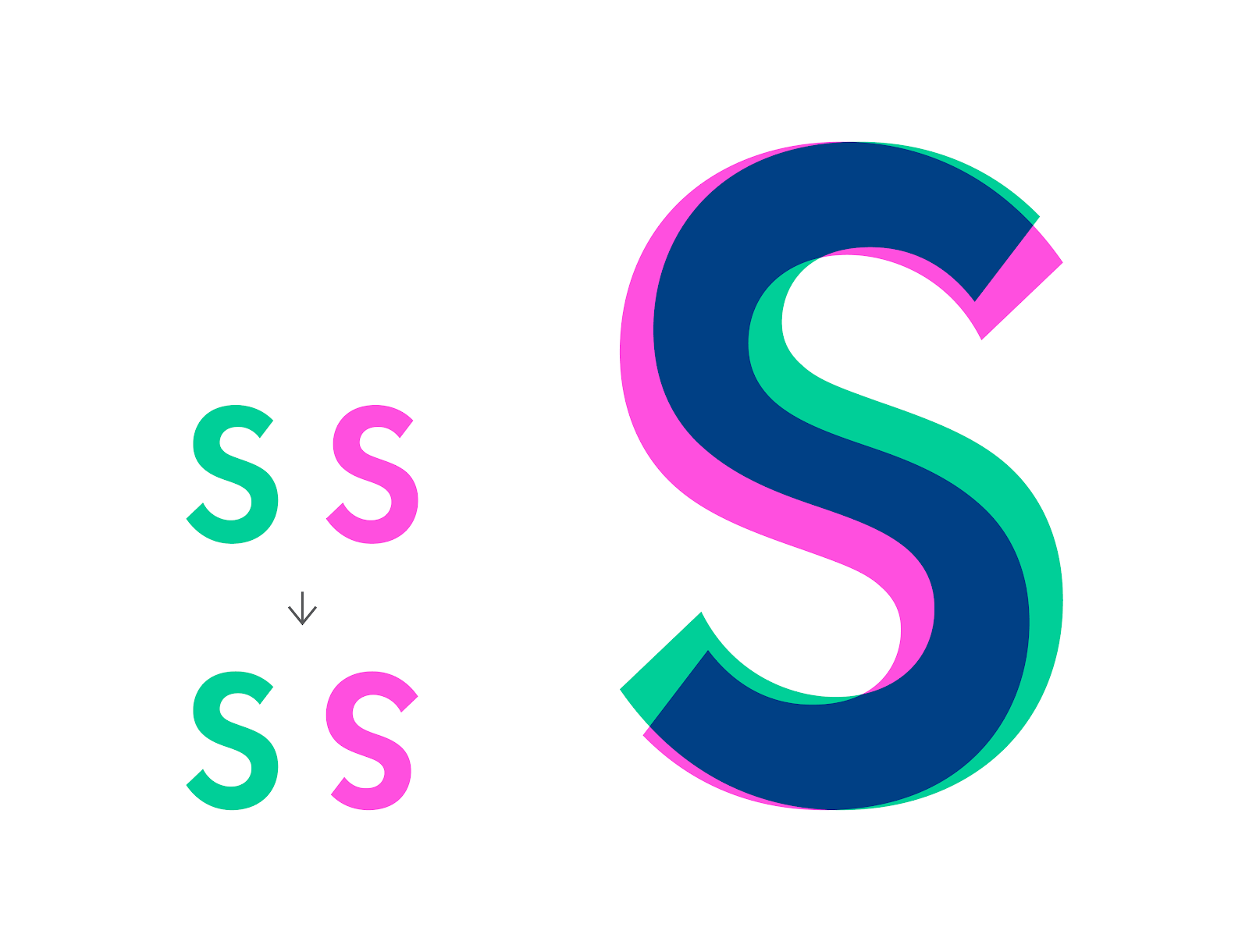
The S seems like a perfectly symmetrical letter. Well, it’s not. Just rotate it 180°, and you’ll see that the top is smaller than the bottom. This makes it look more stable and confident.
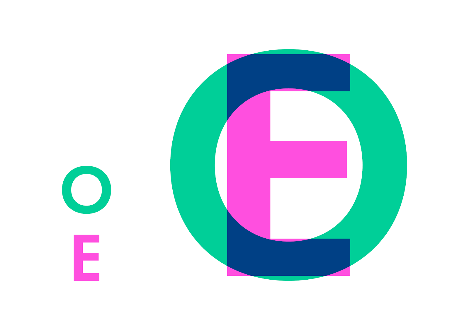
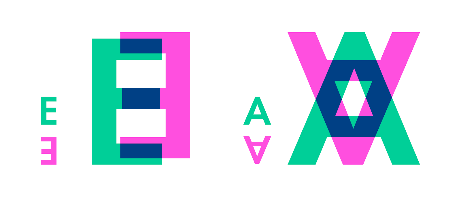
Even though all letters seem to be the same height, the round shapes are slightly bigger. For example, the intersection of the O with the baseline and cap height is just a single point. While the intersection of the letter E, for example, touches those lines with its full surface. Because both letters are technically the same size, they will seem disproportional. We need to overshoot the O a little to make them visually equal.
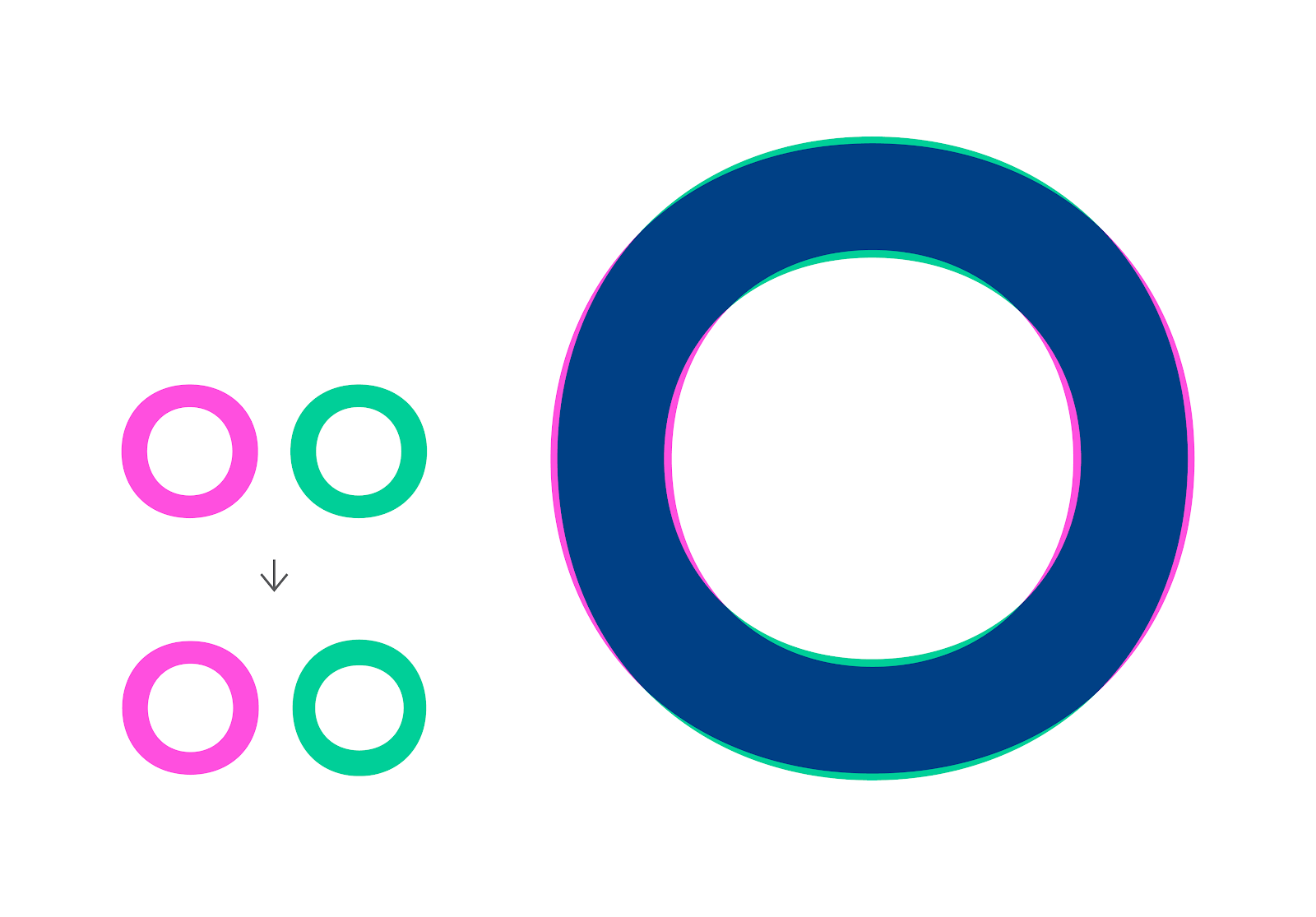
To make the letter O seem symmetrical and consistent in weight, we need to make it—not consistent in weight. Flip the letter O 90°, and you’ll realise that the sides are thicker than the top and bottom.
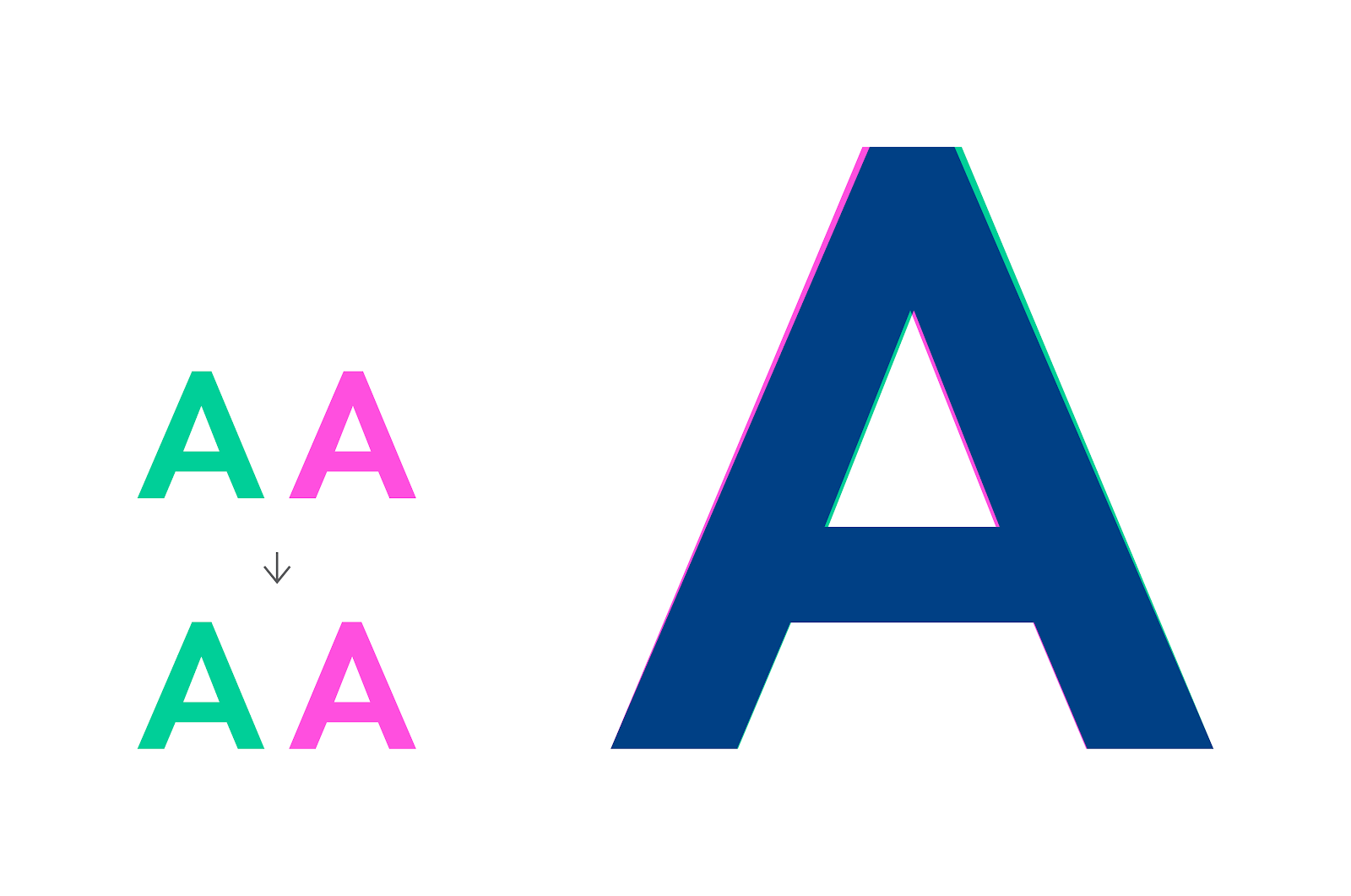
Flipping the A horizontally will reveal that this seemingly symmetrical letter is not symmetrical. To make them visually pleasing, little cheats must be applied to certain letters, even if that means going against the mathematical rule.
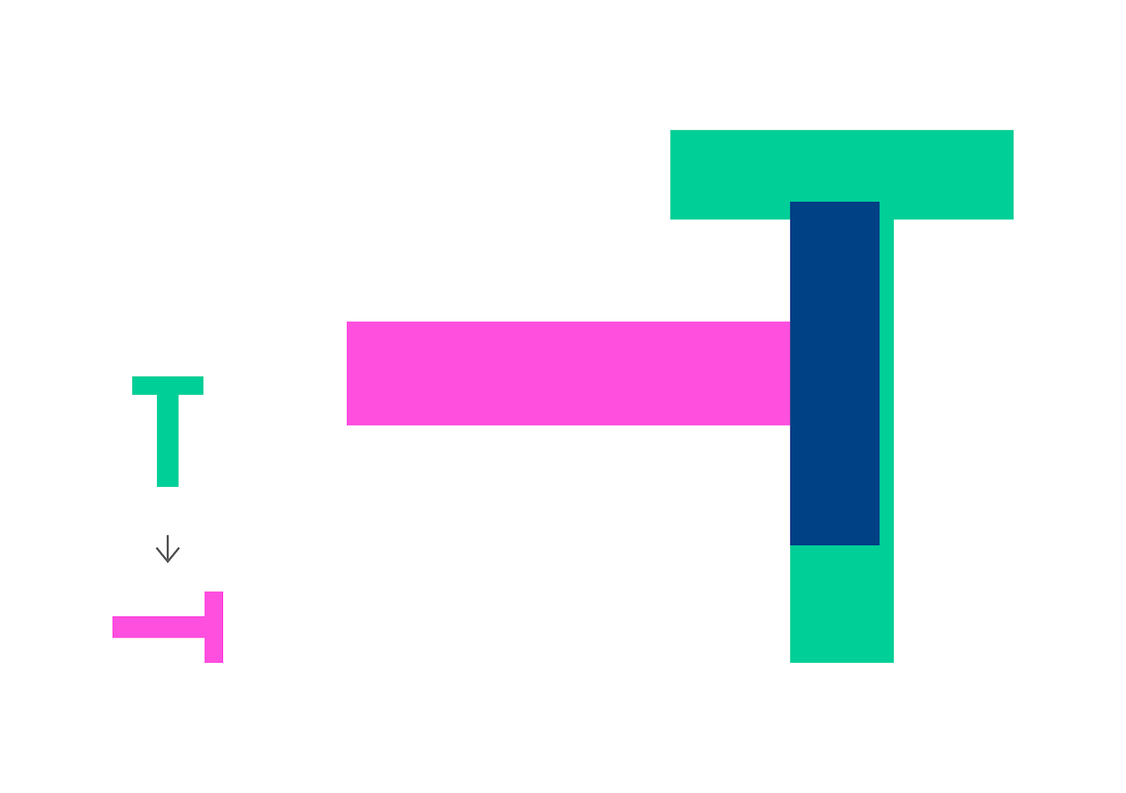
If you know anything about typography, you know that the upstrokes are thin, the downstrokes are thick, and the cross strokes are thin again. This rule needs to be applied to even the simplest and most geometric letters, like the letter T.
Theoretically, The crossbars in the letters E and A are found in the middle. For the letters to look well-balanced, they need to be moved just a bit. You can see that the crossbar is off-centred by turning the letter upside down.
One of the most important elements in working with bodies of text is the grid, which can be anywhere from simple to complex. By using grids, we are framing the information on a given page. This gives us better control over arranging the elements on our page. With the correct grids, we can create compositions that guide the viewer’s eye, making the information easy to process and understand.
As with everything, we can work with simple and plain grids or go wild and come up with intricate and complex ones.

Even the most well-planned typography can encounter technical hurdles. Here is a guide to identify and address some common issues. For example, you can experience issues as fundamental as opening or placing a file in Adobe Illustrator. These are some common issues. Click on the following headings to explore more.
System-level issues can cause errors and other unexpected behaviour. Before assuming that a document is damaged, follow these steps.
- Run the disk repair utility tool for Windows or macOS.
- Ensure that your system meets the minimum requirements to run the latest version of Illustrator.
- Ensure that Illustrator is up to date.
If you face any font activation issues, try these troubleshooting steps.
- Sign in again to Creative Cloud
- Restart your computer
- Check your network connection
- Illustrator automatically imports and loads all fonts installed on your Windows or macOS. To use a new font, you must download that font on your computer.
Issue: Error Message.
- Your design software might display an error message indicating missing fonts.
Solution
- Verify if the fonts are installed on your system. If not, install them or use alternative fonts with similar characteristics.
- Ensure you have the proper licenses for commercial use.
Issue:
- Your design might appear different when opened on another computer if the fonts you used are unavailable on that system.
Solutions
- Embed Fonts: Some design software allows embedding fonts within your project file. This ensures the fonts are displayed correctly even if not installed on the viewing device.
- Convert Text to Outlines: Convert your text elements to outlines as a last resort. This ensures the text displays exactly as designed but sacrifices the ability to edit the text later.
Issue:
- Fonts might appear blurry or pixelated on certain screens.
Solution
- Use High-Quality Fonts: Ensure you use high-quality fonts designed for screen and print.
Issue:
- Incorrect Character Spacing: Letters appear too close together or have uneven spacing, hindering readability.
Solution
- Use your design software's kerning adjustments to fine-tune the spacing between specific letter combinations.
Issue:
- Lines of text appear too close together or have uneven spacing, creating a visually unappealing and potentially difficult-to-read layout.
Solution
- Utilise the line spacing controls in your design software to set consistent leading (space between baselines) for all your text elements.
Issue:
- Fonts Not Loading Properly on Websites. The fonts you have chosen for your website might not be loading correctly on all browsers or devices.
Solutions
- Use Web Fonts: Ensure you use web fonts specifically designed for web use. Font Hosting Services: Consider using font hosting services that optimise font delivery and ensure wider browser compatibility.
- Font Fallbacks: Define fallback fonts that will be displayed if your primary web font fails to load for any reason.
- Software Updates: Maintain your design software and font management applications updated to benefit from bug fixes and compatibility improvements.
- Clear Font Cache: Clear your font cache can occasionally resolve issues caused by corrupted font data. Consult your software's documentation for specific instructions.
- Test & Preview: Always thoroughly test your typography across different platforms (desktop, mobile) and browsers to identify any display inconsistencies. Use your design software's preview features to simulate how your typography will render in various settings.
Understanding these common technical issues and their solutions ensures your typography displays as intended and delivers a seamless user experience across different platforms.