To understand how to present big data in analytics, one should have a basic understanding of mathematical and statistical concepts.
In this topic, you will learn:
- basic mathematical concepts required for data representation
- basic statistical concepts and descriptive statistics for summarising data
- various techniques and tools for presenting summarised data.
How much math is required in data analytics?
You will only need to understand basic mathematical and statistical concepts for this unit. You will also use software tools to perform the necessary calculations using the basic concepts and mathematical formulas you will learn in this topic.
The following video discusses what types of math and statistics are typically used in a data analyst job.
Learning Activity
Indicate whether the following six(6) statements on using mathematics and statistics in data analytics are ‘True’ or ‘False’. Click the arrows to navigate between each statement.
Basic concepts
You may already know basic mathematic concepts such as addition, subtraction, division and multiplication. Refresh your skills by going through the following YouTube playlist from GCFLearnFree.org.
Additionally, refer to the article on Basic Math Skills: Definitions, Examples and Improving Them by indeed.com to learn how basic math skills are used in day-to-day business activities.
Representing data
Percentages, fractions and decimals often represent data in reports.
The following video explains the basics of percentages, decimals and fractions and how they can be represented in visual models.
Check your understanding
Answer the following six (6) questions. Click the arrows to navigate between the questions.
Statistics: an introduction
Statistics are the methods that allow you to work with data effectively. Specifically, business statistics provide you with a formal basis to:17
- summarise and visualise business data
- reach conclusions about that data
- make reliable predictions about business activities
- improve business processes
- analyse and explore data that can uncover previously unknown or unforeseen relationships.
It is vital that analysts understand conceptually what a statistical method does so that they can correctly statistics and effectively carry out statistical analysis on datasets.
The following video will introduce you to ‘statistics’ and how it is used to organise and interpret information to make better decisions.
Check your understanding
Complete the following activity.
Basic terms
Statistics has its own vocabulary. Therefore, learning the precise meanings of basic terms provides the basis for understanding the statistical methods discussed in this topic. 17
- Variable – defines a characteristic or property of an item that can vary among the occurrences of those items.
- Descriptive statistics – defines methods that primarily help summarise and present data.
- A statistic – refers to a value that summarises the data of a particular variable.
- Population – consists of all items of interest in a dataset
- A sample – is a subset of a population.
Types of variables
The following video further explains the use of different types of variables used in statistics.
Check your understanding
Answer the following four (4) questions. Click the arrows to navigate between each question.
Descriptive Statistics
The following video summarises what descriptive statistics is and introduces some of the important parameters.18
Check your understanding
Indicate whether the following three (3) statements regarding descriptive statistics are ‘True’ or ‘False’. Click the arrows to navigate between each statement.
The symbols used in the equations or formulas in this section can be defined as follows:
$$\textit{X}i=i^{th}\;\text{value of the variable} \;\textit{X}$$
$$\textit{N}=\text{number of values in the population}$$
$$\sum_{i=1}^NX_i = \text{summation of all} \;X_i\;\text{values in the population}$$
In this module, our focus is more on descriptive statistics. Therefore, let us further explore the important numerical measures of descriptive statistics.
Measures of location (central tendency)
Measures of location provides estimates of a single value that in some fashion represents the 'centering' of a set of data. 19
Measures of location are also commonly known as ‘measures of central tendency’.
Several statistical measures that characterise measures of location are as follows.
| Arithmetic Mean |
The average is formally called the arithmetic mean (or simply mean), which is the sum of the observations divided by the number of observations. Mathematically, the mean of a population is denoted by the Greek letter µ. If a population consists of N observations, the population mean is calculated as follows. $$\text{Arithmetic Mean}\;( \mu) = \frac{ \sum_{i=1}^NX_i}{N}$$ |
| Median | The measure of location specifies the middle value when the data are arranged from least to greatest. Half the data are below the median and half the data are above it. |
| Mode |
|
| Outliers |
|
The following video discusses these measures of central tendency in detail. When watching the video, pay close attention to how these measures are:
- calculated
- used to compare datasets
- affected by outliers (extreme values)
- used together to derive conclusions about the distribution of a dataset.
Check your understanding
Answer the following three (3) questions. Click the arrows to navigate between each question.
Measures of dispersion (spread or variation)
Dispersion refers to the degree of variation in the data that is the numerical spread (or compactness) of the data. 19
Measures of dispersion are also commonly known as ‘measures of variation’ or 'measures of spread'.
Several statistical measures used to characterise dispersion are as follows.
| Measures | Description | Formula |
|---|---|---|
| Range | This is the difference between the maximum and minimum values in the data set. The range can be computed easily by using the following formula. | $$\text{Range}=X_{Largest}-X_{Smallest}$$ |
| Interquartile range (IQR) |
This is the difference between the first quartile (Q1) and the third quartile (Q3). IQR is also known as the midspread. As the IQR only includes the middle 50% of the data, it is not influenced by extreme values. If a population consists of N observations, Q1, Q3 and IQR can be calculated using the given formulas. |
$$\text{First Quartile (Q}_1)= \frac{(N+1)}{4}$$ $$\text{Third Quartile (Q}_3)= \frac{3(N+1)}{4}$$ $$\text{IQR}= \text{Q}_3-\text{Q}_1$$ |
| Variance | This is a more commonly used measure of dispersion, whose computation depends on all the data. The larger the variance, the more the data are spread out from the mean and the more variability one can expect in the observations. | $$\sigma^2= \frac{ \sum_{i=1}^N (X_i- \mu)^2 }{N}$$ |
| Standard deviation | This is the square root of the variance. Standard deviation is generally easier to interpret than the variance because its units of measure are the same as the units of the data. This is also a popular measure of risk, particularly in financial analysis because many people associate it with volatility in stock prices. | $$\sigma= \sqrt{\frac{ \sum_{i=1}^N (X_i- \mu)^2 }{N}}$$ |
| Coefficient of variation | This provides a relative measure of the dispersion of data in relation to the mean. | $$\text{CV}= \frac{Standard \;deviation}{Mean}$$ |
The following video explains the measures of dispersion (variation) in detail.
Check your understanding
Answer the following two (2) questions. Click the arrows to navigate between each question.
Measures of shape
Calculating and examining the average and standard deviation helps describe the data, but the shape of the distribution of the data can yield further insights.
Several statistical measures used to characterise the shape of a distribution are as follows.
| Symmetry (Normal distribution) |
In a symmetrical distribution, data values are spread equally in the upper and lower parts. Therefore the portion of the curve below the mean is a mirror image of the portion above the mean. This type of distribution is often termed ‘normal distribution’. Because of its shape, it is sometimes known as a ‘bell curve’. In a normal distribution: Mean = Median = Mode |
|
 |
||
| Skewness |
Skewness is a measure used to describe the degree of asymmetry observed in a set of data. This value can be positive or negative according to the following criteria.
If this value is ‘0’, that means that the dataset is normally distributed. 17  The skewness is calculated using the following equation. $$\frac{3(\text{Mean-Median)}}{\sigma}$$ |
|
| Kurtosis |
A measure used to describe the shape of the distribution in terms of its ‘peakedness’ or ‘flatness’ and compares the shape of the peak to that of a bell-shaped normal distribution. 17 If this value is ‘0’, that means the dataset is normally distributed. This value can be positive or negative according to the following criteria:
|
|

To understand more about the shape of the data (symmetry, skewness and kurtosis) watch the following video.
Check your understanding
Answer the following three (3) questions. Click the arrows to navigate between each question.
Standardised values (Z-score)
Another important measure that analysts need to be familiar is ‘Z-score’.
The Z-score is a standardised value that provides a relative measure of the distance an observation is from the mean, which is independent of the unit of measurement.
$$\text{Z-score}= \frac{(X_1-\mu)}{ \sigma}$$
The following video discusses how z-score values can be calculated.
Check your understanding
Answer the following eight (8) questions. Click the arrows to navigate between the questions.
Difference between reporting vs. analytics
Reporting is the process of organising data into formal summaries.
Analytics, on the other hand, is a process of exploring data to extract meaningful insights. These insights are used for optimising the performance of businesses and making better decisions.
The following video discusses the difference between data reports and analytics.
Check your understanding
Indicate whether the following three (3) statements regarding reporting and analytics are ‘True’ or ‘False’. Click the arrows to navigate between each statement.
Now that you understand what is required in data analytics, let us explore some techniques for presenting data analytics.
Techniques for presenting data in analytics
There are various techniques for presenting big data analytics for operational decision-making. These can be generally grouped into three categories; visual, tabular and textual.
| Visual | Tabular | Textual |
|---|---|---|
|
These techniques present data using:
|
These techniques present data in the form of:
|
These techniques involve presenting data in written summaries that include a combination of text and numerical information. |
| Useful for highlighting trends and patterns in large datasets and can help decision makers quickly identify areas of concern or opportunity. | These can effectively present large amounts of data in a structured, easy-to-read format. | These are useful for providing the context of analysis and explaining the significance of the data. |
The choice of presentation technique will depend on:
- the specific needs of the business
- requirements for operational decision-making
- the nature of the data being analysed.
Let us explore some of the commonly used representation types.
Charts
There are a variety of chart types that can be used to present data in analytics. Choosing the correct chart type for the data being analysed is an important task. Every chart has a specific use case and there may be rules and guidelines around it based on the business's needs.
The following video discusses various chart types and the type of data they are suitable for.
Complete the following learning activity to check your understanding of different chart types and what types of data representations they are suitable for.
Learning Activity
Answer the following eight (8) questions. Click the arrows to navigate between each question.
Heat maps
Heat maps are a two-dimensional visual representation of data using colours, where the colours all represent different values. This visual helps replace numbers with colours when visualising data because the human brain understands visuals better than numbers, text, or written data.
Complete the following learning activity to check your understanding of heat maps and what they are used for.
Learning Activity
Answer the following three (3) questions. Click the arrows to navigate between each question.
Dashboards
Dashboards are interactive pages that use visualisations to tell a story about the underlying data. Because these are limited to only one page (per context), they must be well-designed and should only contain the most important business metrics required for making operational decisions.
The following video discusses the difference between a dashboard and a report. When watching the video, pay close attention to how reports and dashboards differ in the way they are displayed, performance and usability.
Check your understanding
Indicate whether the following four (4) statements regarding dashboards are ‘True’ or ‘False’. Click the arrows to navigate between each statement.
Examples of dashboard demos
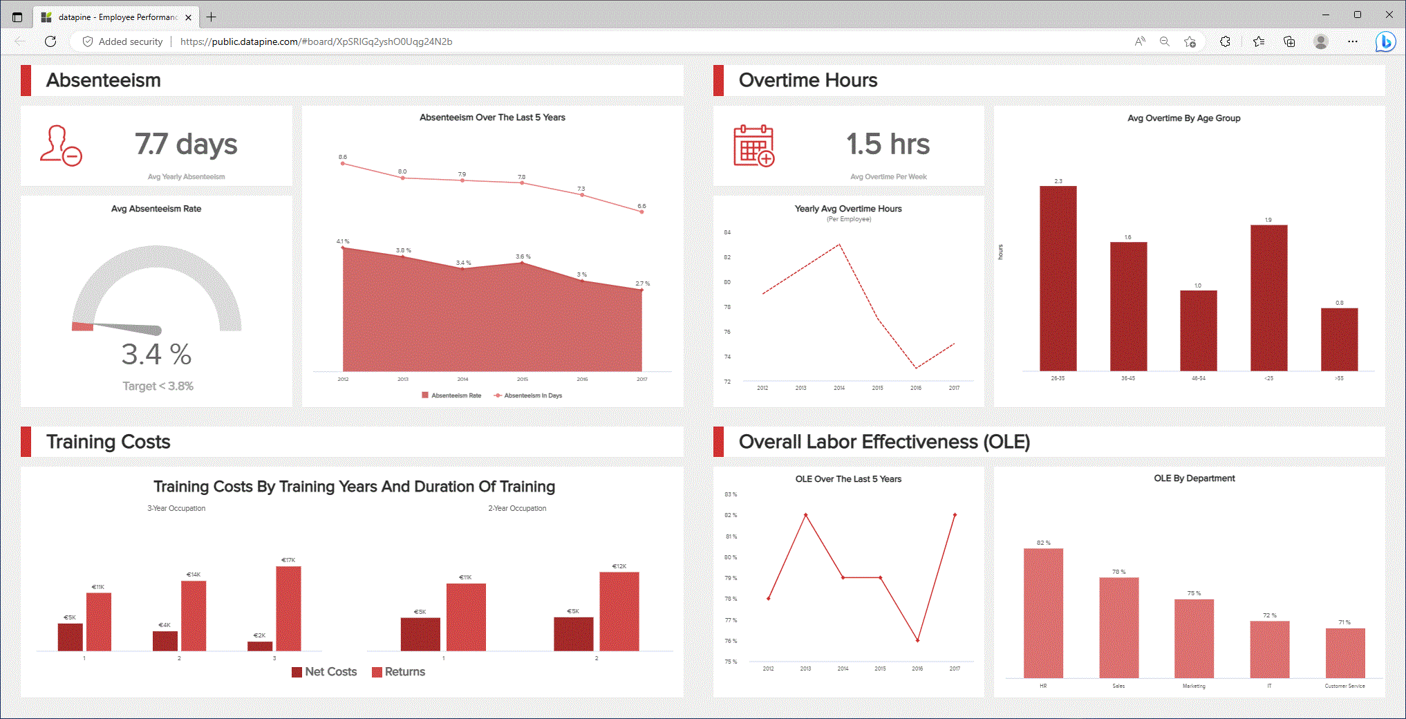
Refer to the Real Time Dashboards - Explore 90+ Live Dashboard Examples from datapine.com to find a variety of live dashboards. Notice how these dashboards display information on business performance metrics using various types of visualisation techniques.
Following is an example of a dashboard that provides information on employee performance.
Statistical tools
Five-number summary using 'box and whisker plot'
The box and whisker plot is a graphical representation of the spread of data which shows five key statistical measures, minimum, maximum, median, first quartile (Q1) and third quartile (Q3).
This diagram shows how the data spread can be grouped and described from the minimum to maximum values, grouped in quartiles containing 25% of the data points. Notice that the IQR includes data points between the first and third quartiles (Q1 and Q3).

The following video demonstrates how the box and whisker plot is used and how it represents the five-number summary. Pay close attention to outliers and how to identify them in a dataset.
Complete the following learning activity to check your understanding of box and whisker plots and what information about the data it conveys.
Learning Activity
Answer the following three (3) questions. Click the arrows to navigate between each question.
Frequency distributions, histograms and scatterplots
The first step in using descriptive statistics is to describe the characteristics of one variable. Both the frequency distribution and histogram summarise the basic characteristics of data in numerical variables, such as where the data are centred and how broadly data are dispersed.
- A frequency distribution is a tabular form of representing a data summary. It shows the number of observations in each of the several non-overlapping groups as a table. 19
- The frequency distribution, when graphically represented in the form of a column chart is called a ‘histogram’. 19
The second step in using descriptive statistics is to describe the relationship between two (2) variables. Considering numerical variables, this can be done by using scatterplots.
Scatterplots also known as ‘Scatter Charts’, are used to graphically represent the relationship between two numerical variables. To create a scatterplot, you will need observations that consist of pairs of variables.
The following video further explains the statistical tools we’ve covered so far. When watching the video, try to understand why certain statistical tools are used and what type of data they are suitable for.
Complete the following learning activity to check your understanding of statistical tools.
Learning Activity
Answer the following three (3) questions. Click the arrows to navigate between each question.
Data summaries
Data summaries use descriptive statistics to present collected data meaningfully, logically and efficiently.20 Therefore, they are also commonly known as ‘Statistical Summaries’ and are often used in big data analytics to quickly provide the gist of the information about a dataset.21
What does it include?
Data summaries usually present the dataset’s:
- central tendency - mean, median, mode
- spread - standard deviation from mean or interquartile range
- shape - how the data is distributed across the range of data (for example, is it skewed to one side of the range)
- statistical dependence - if more than one variable was captured in the dataset.
Data summaries are prepared by data analysts to present insights, relationships, trends and other outputs of interest to the business in a summary format. Data summaries may present information as numerical text and/or in tables, graphs or diagrams. 20

What can it identify?
Data summaries can be used to identify:
- patterns and trends in customer behaviour and product demand, which can inform marketing to direct their analysis to get specific desired results. For example, data summaries can be used to identify which products are selling well, which customer segments are most profitable, and which marketing campaigns are most effective. 22
- anomalies or extreme values that may require further investigation. For example, if a data summary shows a sudden increase in customer complaints, this may indicate a problem with a product or service that requires further investigation.
However, it is important to note that data summaries do not provide conclusions about the data in its current form and cannot be used for making any operational decisions. For example, data summaries can be used to identify which products are selling well, but they cannot help a business to decide on how much of those products need to sell next year or which product categories they must specifically focus on to reach a future sales target.
Exploring data summaries
The following are screenshots from the Australian Bureau of Statistics (ABS) official website showcasing different data summaries representations.
Example 1

- Statistical information is summarised (usually under a topic heading ‘Key statistics’).
- Information is presented visually using a ‘Table’ format.
- Values are represented in summarised currency ($) figures.
- Values are represented as percentage (%) figures.
Refer to the Example 1 screenshot and do the following.
- Find the lowest value in the ($) values column.
- Find the lowest value from the % values column.
- Think about the readability of the currency ($) and percentage (%) values displayed in the two columns.
- In which column did you find it was easier to spot the high/low values compared to the other?
Example 2

- Information is presented visually using a ‘Graph’ format.
- Summarised statistical information is presented in plain text below the graph.
Refer to the Example 2 screenshot and do the following.
- From the graph, find the top three (3) categories with the overall highest increases in values each month.
- Check this information with what is provided in the statistical summary
- Think about the readability of the information presented graphically and as summarised text.
- Did you find one easier to read than the other? Or do you think both these forms of representation helped you understand the data?
Example 3

- Information is presented visually using a ‘Table’ format.
- Summarised statistical information is presented in plain text below the table.
Refer to the Example 3 screenshot and do the following.
- From the table, find the top three (3) categories with the overall highest increases in values each month.
- Check this information with what is provided in the statistical summary
- Think about the readability of the information presented graphically and as summarised text.
- Did you find one easier to read than the other? Or do you think both these forms of representation helped you understand the data?
Compare the Example 2 and Example 3 screenshots and think about the following.
- Which data representations did you find was more readable compared to the other? Table? Or Graph?
- Why?
- How were the data summaries helpful in finding information and understanding the information presented?
Practical Activity
- Visit the Australian Bureau of Statistics (abs.gov.au) website and select a research area of your interest.
- Scroll through the information presented to you on the web page. Pay close attention to the types of information and their presentation methods.
- Use the ‘Download’ option to download a data table as a ‘CSV’ of ‘XLSX’ format.
- Open the downloaded file and investigate how the data is represented.
- Think about the following:
- What can you say about the type of data that is included in the downloaded file?
- Observe whether data is represented in percentage values? Or exact values?
Industry insights:
Management at XYZ Manufacturing often prefers to compare and check values against percentages instead of the actual figures in their reports.
Based on this statement, consider the following questions and review the answers to learn why different approaches are used when presenting data summaries.
Question 1: Why do you think percentage values are sometimes preferred over actual report figures?
- Percentages are easier to read and compare than actual values of long numerical figures.
- Percentages help to identify the high and low values easily.
Question 2: Is presenting data as percentages better than presenting exact values in data summaries?
There is no rule specifying the best approach. However, it may depend on the following.
- Stakeholder preference - Although percentages provide readability to find high-level information, management often prefers to see the actual values. Note: Generally, the decision to present information in certain formats depends on the audience or key stakeholder’s preference. Some individuals can read through lists of numerical data and can understand the data easily. However, most would prefer the data to be summarised so they can understand it better or will require data to be graphically represented.
- The closeness of the actual numbers – Sometimes, the data with only slight variations when summarised may display the same percentage value, making comparisons difficult. In such situations, it is better to present information in their actual values (perhaps up to several decimal numbers depending on the relevance) to make these variations visible and comparable. Therefore, stakeholders who are focused on the fluctuation of a specific value or have been tracking a specific value would prefer actual values instead of percentages.
The following video will recap the concepts covered so far in this module and show how they are applied to real-world business scenarios. The video discusses:
- how data can empower our decisions, big and small
- the difference between quantitative and qualitative analysis and when to use them
- the pros and cons of different data visualization tools
- what metrics are and how analysts use them
- how to use mathematical thinking to connect the dots.
Topic summary
Congratulations on completing your learning for this topic Presenting big data analytics.
In this topic you learnt the following:
- Basic mathematical concepts required for big data analytics.
- Basic statistical concepts and descriptive statistics.
- Various data presentation techniques and statistical tools.
- Data summaries and their interpretation.
Check your learning
The final activity for this topic is a set of questions that will help you prepare for your formal assessment.
Knowledge check
Complete the following seven (7) questions. Click the arrows to navigate between the question.
Assessments
Now that you have learnt some of the basic knowledge required for this module, you are ready to complete the following assessment event:
- Assessment 1 (Short Answer Questions)
What’s next?
Next, we will learn how use programming protocols and techniques for conducting data analysis tasks.