Graphical User Interfaces are an integral part of modern software applications, and they play a crucial role in enhancing user experience and increasing productivity. A well-designed GUI can significantly improve the user experience by providing an intuitive interface that is easy to navigate and can make the code more maintainable and easier to update in the future.
If you want to have an interactive and user-friendly solution or application, you will need a decent GUI. You can customize your app GUI to suit the specific needs of your clients or users. So, your focus in your assignment 2 or project would not be limited to backend functionalities but also, you will need to think about user experience, and ask questions like “Would this widget or feature increase the overall satisfaction of the user with the application?”
In addition, you may require integration of your application with other tools, such as web services, databases, or other software applications. The knowledge of GUI programming can make it easier for you to integrate different components of the software system. Therefore, having at least moderate GUI programming skills is essential for any software project especially when you have to integrate different components of your software application.
Python, being a versatile programming language, offers a variety of GUI frameworks and tools that can be used to build highly functional and aesthetically pleasing graphical interfaces. In this topic, you will be introduced to two different Python GUIs: TKinter and DearPyGUI. We will build on the examples discussed in topic 6.7, particularly the simple library management application. We will learn how to design and build graphical interfaces for desktop applications and web applications using these frameworks. We will also cover topics such as event handling, layout management, and data visualization.
Python's simplicity and ease of use make it an ideal choice for beginners in GUI programming. At the same time, its powerful libraries and frameworks like TKinter make it a popular choice for professional software engineers who need to build complex and feature-rich applications. By the end of this class, you will have a solid understanding of Python GUI programming and be able to build your own GUI applications from scratch. So, let's get started!
While this topic is not about UX or UI Design, it is important you know what is expected of you when you design your UIs. This section will give you some tips on how to design your app UIs and achieve a better User experience.
User Interface Design Basics:

The goal of user interface (UI) design is to anticipate what users would need to do and make sure that the interface has elements that are simple to use, access, and comprehend. UI brings together concepts from interaction design, visual design, and information architecture.
Best Practices for Designing an Interface
Consider the following when designing your interfaces:
- Create consistency and use common UI elements: Consistency is key to creating a successful user interface. Users should be able to predict how different elements will behave and interact with each other. Common interface elements include but are not limited to:
- Input Controls: buttons, text fields, radio buttons, checkboxes, list boxes, dropdown lists, toggles, and date fields
- Informational Components: tooltips, icons, progress bar, notifications, message boxes, modal window
- Navigational Components: breadcrumb, slider, search field, pagination, slider, tags, icons
- Containers
So, when selecting these elements, try to be consistent and predictable in your choices and their layout because users have become used to specific interface components behaving in a certain way. You can read more about effective visual communication for GUIs here.
- Keep the interface simple: Best interfaces usually avoid unnecessary elements. A simple and clear UI design is easier for users to navigate and understand. Avoid cluttering the interface with too many elements or features.
- Accessibility: Your interface should be accessible to all users, including those with disabilities. This can include using a colour scheme that is easy to read for users with colour blindness or providing alternative text for images.
- Be purposeful in page layout: Consider the spatial relationships between items on the page and structure the page based on importance. Careful placement of items can help draw attention to the most important pieces of information and can aid scanning and readability.
- Colour and typography: Colour and typography play a crucial role in UI design as they help create a visual hierarchy and communicate information to the user. Strategically use colour and texture. You can direct attention toward or redirect attention away from items using colour, light, contrast, and texture to your advantage. Use typography to create hierarchy and clarity. Carefully consider how you use the typeface. Different sizes, fonts, and arrangements of the text to help increase legibility and readability. To read more about Color effectiveness in UI design follow the link below:
- Navigation: Navigation should be intuitive and easy to use. Users should be able to find what they are looking for quickly and easily.
- Think about the defaults: By carefully thinking about and anticipating the goals people bring to your site, you can create defaults that reduce the burden on the user. This becomes particularly important when it comes to form design where you might have an opportunity to have some fields pre-chosen or filled out.
- Feedback: The interface should provide feedback to the user when they interact with it. This can include visual or audio cues to indicate that an action has been performed. Make sure that the system communicates what’s happening. Always inform your users of the location, actions, changes in state, or errors. The use of various UI elements to communicate status and, if necessary, the next steps can reduce frustration for your user.
- Perform usability testing: Usability testing involves getting feedback from users on the interface design. This can help identify areas for improvement and ensure that the design meets the needs of the target audience.
User Experience Basics:

The goal of user experience (UX) is to have a thorough awareness and deep understanding of users, their needs, values, abilities, and constraints so as produce software products that can give positive user experiences. At the core of UX is ensuring that users find value in what you are providing to them. It also considers the project management team's corporate goals and objectives. UX best practices encourage enhancing the user's experience with and impressions of your product and any associated services.
The following article provides some insights into factors that influence UX:
Consider the following practices when carrying out your UX processes:
- Carry out user research for a better understanding of users: Conduct user research to gain insights into their preferences and expectations. User research generally involves gathering information about the users, their needs, and their behaviours. This can be done through surveys, interviews, or usability testing. UX design should be based on an understanding of the needs, goals, and behaviours of the users.
- Create user personas: User personas are fictional characters that represent different types of users. They are used to help designers understand the needs and goals of the users.
- Design for accessibility: Design the interface so that it is accessible to all users, including those with disabilities. This can include using alternative text for images or designing for colour blindness.
- Use clear and concise language: Use language that is easy to understand and free of jargon or technical terms. This can help ensure that users can easily navigate the interface and understand the features.
- Create a consistent design: Use consistent design elements, such as colour and typography, throughout the interface. This can help users predict how different elements will behave and interact with each other.
- Prioritize simplicity: Keep the interface simple and avoid cluttering it with too many elements or features. This can help users focus on the most important tasks and reduce cognitive load.
- Information architecture: Information architecture involves organizing information in a way that is easy to understand and navigate. This can include creating a clear hierarchy of information or using labels and categories to group related content.
- Wireframing: Wireframing is the process of creating a basic visual representation of the user interface. This can help designers test different layouts and get feedback from users.
- Prototyping: Prototyping involves creating a working model of the product or system. This can help designers test the usability and functionality of the interface.
- Test and iterate: Test the design with real users and iterate based on their feedback. This can help identify areas for improvement and ensure that the design meets the needs of the users.
- Stay up to date with trends: Stay current with design trends and best practices to ensure that the interface is modern and relevant to the users.

There are many GUI frameworks for Python, but Tkinter is the only framework that is built into the Python standard library.
Tkinter has a number of strengths. First is that Tkinter is cross-platform, you can run the same code on Windows, macOS, and Linux. This is because visual elements are rendered using native operating system elements, hence, applications built with Tkinter appear as if they belong on the platform where they are run.
Despite being the de facto Python GUI framework, Tkinter is not without its criticism. One noteworthy criticism is that GUIs created using Tkinter appear antiquated. Tkinter might not be what you are searching for if you want a sleek, contemporary interface. So, why are we considering Tkinter?
Compared to other frameworks, Tkinter is light and fairly simple to use. This makes it an appealing option for those who want to create GUI programmes in Python, especially for applications where a modern sheen is unnecessary, and the top priority is to quickly build something that is functional and cross-platform.
In this topic, you will learn how to work with common Tkinter UI elements like buttons and text boxes. You will learn how to control your application layout with geometry managers, and also how to make your application responsive and interactive by associating clicks with Python functions. Some of these we have done in topic 6.7 and 6.8, but we have not explained how they actually work.
Install Tkinter
To start building your application Tkinter, the first step is to install the Tkinter module in the Python shell. If you installed Python yourself, you already have Tkinter.
If you are using Linux, you probably don't, but you can install Tkinter with your distribution package manager. For example, you can use this command on Debian-based distributions, like Ubuntu and Mint:
- Run sudo apt-get install python3-tk
- Once installed, the user can import the Tkinter library in the notebook using the following command: from Tkinter import*
- To check if tkinter is installed in the system or not, we can use the following command: import tkinter as tk
- To check your Tkinter version, open an interactive Python prompt and type the following: import tkinter tkinter.TkVersion
- Installing Tkinter on Windows is as simple as installing Python 3.x since Tkinter is included in the Python 3 core. However, if you want to take advantage of the latest version of Tkinter, you will need to install a version of Python that supports Tcl/Tk 8.5 or greater, as well as Ttk (Tile extension integrated into Tk), which is required in order to run the current Tk widget set.
- Python 3.7 or greater for Windows comes with everything you need to run Tk fully configured out-of-the-box.
- If you have Python 3.6 or an earlier version, you can simply upgrade to a newer Python version that includes the latest version of Tkinter.
- You can create and activate a Conda environment with Python 3.7 or greater that is integrated with the latest version of Tkinter
- To create a new Conda Python environment named <env_name> and install python 3.8, open an Anaconda Prompt or terminal and run: conda create --name <env_name> python=3.8
- To activate the new environment that has Python 3.8, and switch to it, enter: source activate <env_name>
Before we start coding with Tkinter, let us take a quick look at what we can do with Tkinter by inspecting the features of some Tkinter UIs, including the one for the simple library management application.
Consider the components of Figure 1 and Figure 2 Tkinter UIs.
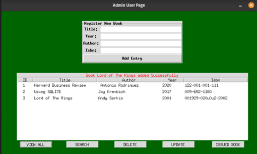
Figure 1
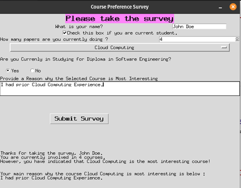
Figure 2
- Both figures have many push buttons that you can click on to execute actions
- Both have text windows that can display text with colours
- Both have labelled frames that contain a group of components
- In Figure 2, the radio buttons allow the user to select between different options
Each component is known as a widget; Tkinter generally exposes many classes. These are known as widgets. A widget is typically any part of the application that needs to be drawn onto the screen, including the main window. A Tkinter application always needs to have a main window. This is what will be drawn on the screen for the user to see.

To understand the basic structure and syntaxes of Tkinter, let’s consider two simple examples:
Example 1- Simple Hello World:
Copy the code and save it in a file called helloworld.py.
If you run the above code, a tiny window below would appear:
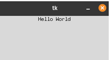
So, let’s dissect the code line by line:
- We first imported Tkinter Library using
import tkinter as tkto be able to use Tkinter in our code.- You can also use
from tkinter import *, and instead of having widgets liketk.Label, you use justLabel. - As mentioned in topic 6.7, please avoid using
from tkinter import *. This is because it imports the Tkinter library into the global namespace, it fills your namespace with a lot of classes, which you might accidentally overwrite. - It's also possible to do
from tkinter import Label, Button.
- You can also use
root = tk.Tk()creates the root or main window of our program. In this case, it's the only window that our program creates. Tkinter starts Tcl when you create the root window. Every Tkinter program must have exactly one root window, which represents both the top-level window of the application.label = tk.Label(root, text="Hello World"). As mentioned before, Tkinter uses widgets just like most other GUI toolkits. A widget is simply any element that can be displayed on the GUI window. Our program has two widgets. The root window is a widget, and this label is a widget. A label is a widget that just displays text.- Note that most widgets take a parent widget as the first argument. When we do,
tk.Label(root)the root window becomes the parent so the label will be displayed in the root window. We have also passed in a keyword argument,text. This argument, of course, defines the text that will be placed on the widget. For most Tkinter widgets, the majority of configuration is done using keyword arguments like this.
- Note that most widgets take a parent widget as the first argument. When we do,
label.pack(): This adds the label to the root window so we can see it. Thepack()method of the Label widget is called a geometry manager method (used in Tkinter to control application layout). Its job is to determine how the widget will be attached to its parent widget and to draw it there. Without this call, your widget would exist, but you wouldn't see it anywhere on the window.pack()is one of three geometry managers. Other geometry managers includegrid()andplace().root.mainloop(): This line starts our application's event loop. The event loop is an infinite loop that continually processes any events that happen during the execution of the program. Events can be things like keystrokes, mouse clicks, or other user-generated activity. This loop runs until the program exits, so any code after this line will not be run until the main window is closed. For this reason, this line is usually the last one in any Tkinter program.
Example 2: Common Tkinter Widgets:
We will use the second example to introduce common widgets in Tkinter and how to use them. Create another file and call it course_survey.py. Save the following code in the file and run:
The code generates a GUI for course surveys to collect feedback from students studying Diploma in Software Engineering. For this example, there is no database to collect or save the actual feedback, so we just display it on the GUI.
The code has 3 main components:
- The widget component: where the widgets are created.
- The geometry management component: where we use some geometric manager methods to arrange and place widgets on their parent widgets.
- The App Behaviour or Functionality component: A callback function to make the GUI respond to an event or action triggered by a button click action.
Upon execution of the code, input some data into the survey form and click submit button, you should see a window similar to the one below:
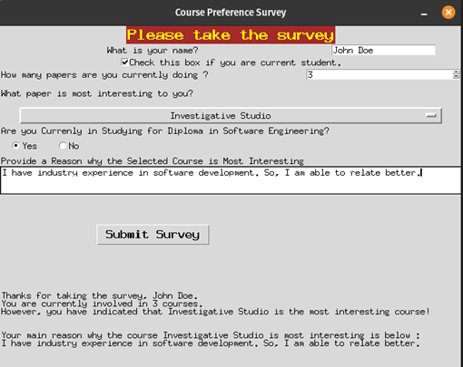
Let's review the code
- In lines 1 – 5, we did the usual, we import the necessary library and create a root window with root = tk.Tk() (We will add all the widgets to this window). We set the title for the window and use root.geometry('640x480+300+300') to set the window size. In this instance, 640 by 480 pixels is the specification for the root window. The +300+300 specifies the window's left and top positions on the screen (the position portion is unnecessary if all you care about is the size).
- In line 6, we added the first widget (a label) to the parent widget (root window). Just like we did in the Hello_world example, always remember that the first argument passed to any Tkinter widget is the parent widget on which the new widget will be placed. The remaining arguments are self-explanatory – bg & fg is for the background and foreground (text) colours for the widget respectively.
- We use the label to show the title of the frame.
- In lines 7 – 9, we added another widget for data entry – the Entry widget.
First, in line 7, we use a value holder for string variables to hold the user’s data. The Tkinter.StringVar() method allows you to perform setter and getter operations on the object (See https://tkdocs.com/pyref/stringvar.html for more details.). Line 8, we added a label for the input entry widget. Line 9, we create the entry widget – this is just a simple text-input box designed for a single line of text. The entry widget takes 2 arguments in this case – the parent widget and the string value holder.
- In lines 10 – 11, we created a checkbox button widget to confirm the student status and pass it a Boolean value holder. Unlike the Entry widget, the checkbox widget allows us to include labels as arguments, so, we do not need to create a separate label object for this.
- Adding other widgets follows a similar structure with slight differences. Lines 12 - 14, we added a spinbox, which is an Entry like widget but includes arrow buttons that can increment and decrement the number in the box.
- Arguments such as from_ and to are used to set the minimum and maximum values that the buttons will decrement and increment to, respectively.
- Tkinter has several widgets that allow you to choose from preset selection values; this includes:
- Scrollbar – See an example of how to use it here: https://www.educba.com/tkinter-scrollbar/
- Listbox - see example here https://www.educba.com/tkinter-listbox/
- We used Tkinter OptionMenu for a similar purpose to this in lines 15 - 18. You can implement this OptionMenu in your application where you have some fixed type of options which need to be displayed and out of which you want the end-user to select one. This is similar to the drop-down functionality available in many languages.
- Another way to let a user select between a small number of options is the Radiobutton widget. Lines 20 -23 show how we used this to select a Boolean value if a student is studying Diploma in Software Engineering or not ( yes or no).
We created a Frame object named course_frame = tk.Frame(root) and used it as the parent widget for each of the radio button widgets. A Frame is simply a blank panel with nothing on it, and it's useful for organizing our layout hierarchically.
- In lines 24 – 25, we added a text box for students to add additional information regarding why they considered the selected course as the most interesting. Unlike the Entry widget which only works best for single-line string input, the Text widget is capable of handling multi-line inputs and much more. We can define how both the height and width of the Text box. See more information here:
https://www.educba.com/tkinter-text/
- In line 26, we added a button to submit our survey/feedback and display some output.
- To display the output, we can use Label Objects. We added the output line display label in lines 27 – 28.
First, we created an empty string value holder, and give this to the Label widget as a text variable argument. The anchor argument of the label determines which side of the widget the text will be stuck to if the widget is wider than the text. Tkinter sometimes uses cardinal directions (North, South, East, and West) abbreviated to their first letter whenever it needs to specify a side of a widget; in this case, the string 'w' indicates the West (or left) side of the widget. justify determines which side the text will align to when there are multiple lines of code. Unlike anchor, it uses conventional 'left’, 'right’, and 'centre' options. If there are multiple lines of text, the text may be aligned to the centre of each line, but the entire group of lines may be anchored, for instance, to the west side of the widget. In other words, anchor affects the entire block of text in relation to the widget it is contained in, whereas justify affects the individual lines of text with respect to the other lines.
In the HelloWorld example, we described geometry managers as methods used in Tkinter to control application layout. We used one of the methods packs() to place a label widget on its parent widget. And we mentioned that pack() is one of three geometry managers. Other geometry manager methods include grid() and place(). Below are the descriptions of each of the methods and when you can use them:
- pack() is used to add widgets to one of the four sides of a window sequentially. Pack() works great for small layouts with a few widgets, but it doesn't scale well to more complex layouts without a lot of Frame widget nesting.
- grid() is used to place widgets within a 2-dimensional grid table. grid() geometry manager is used by the majority of Tkinter programmers. Grid() lets you arrange widgets on a two-dimensional grid, much like a spreadsheet or an HTML table.
- Place() is used to place widgets at specific pixel coordinates. The major downside of the place() method is that it responds poorly to changes in window sizes, font sizes, and screen resolution. Hence, it is not recommended.
Let’s quickly walk through the geometry management component of the code.
-
By default, a call to
grid()will place the widget in the first column (column 0) of the next empty row, so callinggrid()on the next widget, it would end up directly under the first, in this case, on the title object.However, we can also be explicit about this using the
rowandcolumnarguments, like so:name_label.grid(row=1, column=0). Rows and columns count from the top-left corner of the widget, starting with 0. Thus,row=1, column=0places the widget in the second row in the first column. We place the survey responder’s name input label in this position and then added a data Entry widget for the responder’s name in the second row and second column (name_inp.grid(row=1, column=1)).By setting the
columnspanorrowspanarguments of thegrid()method, we can specify that a widget spans multiple columns or rows, respectively.By default, the widgets do not expand along with the columns and rows. The
stickyargument must be used if we want them to expand. This is done in lines 32-37.stickyinstructs Tkinter to stick the widget's sides to the sides of the cell it is contained in, causing the widget to extend as the cell grows. Similar to theanchorargument we discussed earlier,stickyhas four cardinal directions: n, s, e, and w. Given that West and East have been given in this instance, any further expansion of the column will result in the widget extending horizontally.The method
grid()allows us to add padding to our widgets as well.padxandpadyindicate external padding – that is, they will expand the containing cell, but not the widget.ipadxandipady, on the other hand, indicate internal padding. See the illustration of padding in Figure 3.
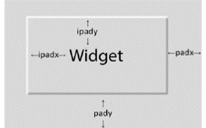
Figure 3
- Note that Tkinter prohibits the use of multiple geometry managers on the same parent widget; if grid() is called on any child widget, calling pack() or place() on a sibling widget will result in an error, and vice versa. However, different geometry managers can be used on the sibling widget’s children. An example of this is shown in lines 37 – 41. You should be able to follow the rest of the geometry management component of the code if you understand all these elements.
Remember how we used the button as on click event trigger in topic 6.7 where we used Tkinter to perform some SQL query action on our Blog DB and Library management app, the same would be done here to make the survey form do something. We will create a call-back function that would enable the app to respond to an event or click action.
There are two common ways to bind events to call back functions in Tkinter using the button:
- One way is to configure the button command attribute e.g.
submit_btn.configure(command=on_submit). The command argument can be specified when creating a widget for example,submit_btn = Button(root, command=on_submit), We did this in the LMS app in topic 6.7 . - Another way is after the creation of the widget using it
configure()method.configure()allows you to change a widget's configuration after it's created, by passing in arguments just as you would when creating the widget. Line 49 shows how we did this in the survey app. Note that in either method, the command specifies a reference to a callback function to be called when the button is clicked. - In the
on_submit()method, we are able to use get and set methods on the data holder variables, just like we explained at the beginning of this process. if you struggle to understand this part, please refer to following examples: https://tkdocs.com/pyref/stringvar.html https://www.pythontutorial.net/tkinter/tkinter-stringvar/

Now that we have some understanding of how Tkinter works, let’s complete the implementation of the library management system that we started in topic 6.7. To continue, download the first admin.py from the previous topic here and the database code called backend.py from here. Put both files in the same folder called LMS. You will need to remove .txt from the end of the files names.
The following functionalities would be added to the LMS app:
- A login backend for both admin and student to sign up, and get authenticated during login into their respective pages.
- A signup page for a new student to register login credentials.
- A student page, with view, search, and requests functionalities.
1 Login Backend:
Download the file name authentication.py here
- Our focus here is more on the frontend than the backend. So only a few functionalities are discussed here. In general, five functions are defined in the file. The functions are easy to follow, and you should be able to read and understand what they do at this point:
- connect() – The connect function is used to create a new DB called login.db. Two tables called user and admin tables are created and added to this database. The user table will be used to store the login credentials of the students, while the admin table will be used to store the library administrator’s credentials (login information).
- insert() – As you may have guessed, we need to insert records of users and admin into both tables that we created. This function is used to insert records into the user’s table.
- run_query() – This function could be used to execute any query with parameters. So, instead of duplicate code as we did in the backend.py, we can call this function every time we need to execute a query. The function takes SQL query, parameter and db_name.
- authorize_admin() – the function takes the credentials (password and username) of the LMS administrator, and checks if there is a match in the login database. If there is a match, it allows the admin user to access the admin page (figure 1).
- authorize_student() – This function does the same thing as authorize_admin() but in this case for the student. The default page is the admin page. To control the behaviour of various widgets of the admin page and the student page. When the admin process is complete by admin user action, we need to destroy the GUI components to free the memory as well as clear the screen. So, we use the destroy() method to achieve all this. Read more about destroy() method here: https://www.tutorialspoint.com/destroy-method-in-tkinter-python
2 Signup and Login Page:
Download the file named login_register.py here
This file contains the login and sign-up page. Figures 4 and 5 show the login pages for both the admin and the student. Figure 6 shows the signup or registration page.
We have used the same widgets as we used in the course_survey app. So, it should be easy for you to follow the code. One important thing to note is the geometry manager method we used in this case – place(). We mentioned the problem with using this method (it responds poorly to changes in window sizes, font sizes, and screen resolution). You might notice this when you use place(). We recommend that you grid(). We will see an example of a multipage app that used grid() method as the geometry manager in the next section.
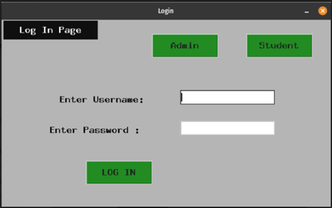
FIGURE 4
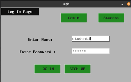
FIGURE 5
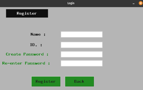
FIGURE 6
3. Student User Page:
We designed and implemented the UI and some backend functionalities for the admin user in the previous topic. Here, we will do the same for the student user. Download the file named student.py and study it. Figure 7 shows the GUI of the student user. A new widget called TKinter Listbox was introduced here. A Listbox widget displays a list of single-line text items. A Listbox allows you to browse through the items and select one or multiple items at once. To know more about Tkinter Listbox read the following:
https://www.pythontutorial.net/tkinter/tkinter-listbox/
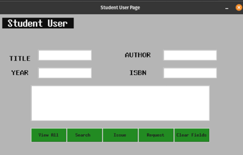
FIGURE 7
Each button in the GUI above (Figure 7), is used to trigger some actions or events when clicked by the user. As mentioned before, to make the program respond to a student event, which could be either searching for a book in the LMS or Requesting a book of Viewing books available in the system, you need to bind the event to a function which we call a callback.
The student.py file includes 5 callback functions for this purpose:
- a request_command() method which calls the backend.py request_insert() method. This method simply runs an insert query on the book.db based on the book inputs in the GUI. The requests are inserted as list items into the Tkinter Listbox.
- a view_command() method which calls the backend.py view() method. The method is used to view or retrieve book information in the book.db based on the information entered by user in the GUI.
- a search_command() method which calls the backend.py search() method. This method simply runs a select query on the book.db based on the input of the user in the GUI.
- a clear_command() is used to clear the Tkinter entry widget data. We simply do this by calling the delete method on each of the widgets.
- an issue_command() is also included. It calls the backend issue method.
The functions retrieve values from some of the inputs get() method. get() method is used to retrieve the current value of the widget. Note that the values will be returned as a string. Some of the functions also used the delete() method to delete entries for a user to be able to enter new entries.
The command attributes of the buttons related to the callback functions specify a reference to the respective function to be called when the buttons are clicked. In this case, we have specified the command argument when creating the button widgets: e.g. button_request = tk.Button(self.frame, text = ‘Request’, command=self.request_command) ),
The biggest issue with the place() geometry manager method is that it responds poorly to changes in window sizes, font sizes, and screen resolution. In this example, you will see how to build a more efficient TKinter multipage GUI using the grid() method.
Download the file multipage_tkinter_app.py here.
In the example, you will not only learn how to use the grid() method, but you will also learn how to work with classes in Tkinter.
Run the code and play around with the interface.
To help you understand the code, please make sure you complete the tutorial below on how to work with classes when using Tkinter:
- Advanced Tkinter: Working with Classes:
https://www.digitalocean.com/community/tutorials/tkinter-working-with-classes#working-on-the-code
The example is simple and easy to follow. In the example, we have a root window class called MyApp on top of which we place a single frame.
In order to make it seem like an application with different windows, we will also create a function that switches from one frame to another. This gives the user an illusion that they are being redirected to a different window/tab but are just switching between frames.
The frames we will be working with are LoginPage, SignupPage, SomeWidgets and OpenNewWindow. The method that we will use for switching between them is the show_frame() method.

Another GUI toolkit that you can explore especially if you are building a more complex and dynamic GUI is Dear PyGui. It is an easy-to-use, dynamic, GPU-Acelerated, cross-platform graphical user interface toolkit(GUI) for Python. It is “built with” the C++ Dear ImGui.
Features include traditional GUI elements such as buttons, radio buttons, menus and various methods to create a functional layout. Additionally, DPG has an incredible assortment of dynamic plots, tables, drawings, debuggers, and multiple resource viewers. DPG is well suited for creating simple user interfaces as well as developing complex and demanding graphical interfaces.
DPG offers a solid framework for developing scientific, engineering, gaming, data science and other applications that require fast and interactive interfaces.
See some demo and code examples here:
https://github.com/hoffstadt/DearPyGui
There are a lot of online Python tutorials and resources to get you started with DearPyGUI:
- https://dearpygui.readthedocs.io/en/latest/
- https://github.com/hoffstadt/DearPyGui
- https://dearpygui.readthedocs.io/en/latest/tutorials/first-steps.html
- https://github.com/yet-another-alex/dearpygui-examples
Explore the resources and examples, if you have any question, feel free to contact your online facilitator.