
Texture in UX design has lost its meaning somewhere. While one side is, yes, using images that appear textured to create depth. The other side creates depth with colour, buttons, font, and effect elements.
Creating texture requires you, the designer, to understand UX components, including:
- Accessibility
- Navigation
- Form behaviour
- Patterns and grids
The focus when creating a UX solution needs to be:
- The business goals
- User needs
And how these can be met with a focused and effective content hierarchy.
It is essential to consider how best to structure rich content pages, such as landing pages and the homepage, to ensure users can find what they came for to accomplish their desired task.
As well as understanding what is going on those core pages, a clear visual hierarchy of prioritised content is necessary.
- Content should be logical and easy to understand.
- Check for spelling errors.
- Limit the use of dark colours in the site theme.
There are several requirements and expectations set by Industry best practices and standards on all website developers.
A number of these best practices and standards are listed below:
- Content is arranged logically
Content should be organised logically, and the flow of information should be appropriate and fitting. - Fast Loading
No one wants to wait (and wait and wait) for your site to load. Design sites with prompt loading times for all users on all devices, even the ones with slower Internet connections. You can use Pingdom or Pagespeed Insights by Google to check your website speed and see how you can improve. - Mobile Ready
Virtually everyone uses smart devices daily. Create an engaging, mobile-friendly design that your audience can access whenever they want, wherever they roam. - Tracking Enabled
Analytics matter. It is the best way to determine that your website is doing its job. The final design should include functionality to gauge key indicators such as traffic, goals, and conversions. - SEO Savvy
Don’t underestimate the power of optimizing your site for both browsers and humans. Develop compelling, readable content for your followers. The search engines always include all important on-page SEO tags and elements, including schema and XML sitemaps. - Enabled CMS
We aren’t entirely done with the power of the written word just yet. Consistently publishing fresh, original content not only captivates your audience it can deliver invaluable, long-term digital marketing momentum. Include a back-end Content Management System in the design so clients can post and edit content as needed. - Conversion Optimized
Have a conversion-centric client? Implement tools for creating campaign landing pages into your design. These designated pages can keep your readers moving through your site and direct them to schedule an appointment, request a product demonstration, and even make a purchase. - Email Marketing
Yes, email marketing is still a thing - and a highly effective thing at that. A site’s email capture forms should sync with the client’s email marketing system for seamless access and connection. - Social Media
Never miss an opportunity to leverage the power of social media. Integrate all relevant social media platforms within your design. Allowing users to access social media pages from the website instantly quickly broadens a brand’s reach and helps increase visibility and traffic. - Strong Security
Never compromise on-site security. Every design should include fundamental security and privacy protocols, such as basic security checks, to protect client and user data. - Progressive Web Apps
Savvy web designers, intrigued by the impact apps have on mobile media platforms, have successfully blended the very best web and app features into a hybrid known as Progressive Web Apps. Expect to see Progressive Web Apps out in full force throughout 2018. As a developer, consider including various features into your design, such as splash screens, push notifications, and animated page transitions to elevate overall UX. - Machine Learning and Artificial Intelligence
Yes, really. Artificial intelligence is no longer a futuristic, high-tech term and has successfully worked its way into our everyday vernacular and online experience.1
Adobe’s Sensei delivers AI tools to various web design platforms worldwide, making it a more accessible, available resource.
Below is an interesting discussion provided with the NNgroup. They discuss how accessibility is included in UX.
Menu navigation exists to help us find content, and it should be intuitive and straightforward.
We expect to navigate with ease and have a great experience when looking at a website. Still, unfortunately, not every site is designed as well as it should be.
Part of your role as a web designer is to ensure that the user knows where they are, where they have been and where they are going! Designing a solid navigation system is without question one of the most critical aspects of designing a website.
-
Navigation planning
In the case of web design and particularly menu navigation, the starting point is figuring out what features the website offers and the hierarchy in which information should be displayed. A website menu in its early stages is typically referred to as a 'sitemap', and this is usually put together as a diagram or spread sheet to show the different levels of information. There is no right or wrong when it comes to creating a sitemap.
-
User-friendly language
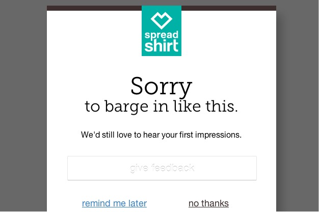
It is also important to consider menu navigation language and labelling. With so much competition on the web, it's no surprise that we try to get creative with our copywriting, but sometimes this is at the expense of clarity. Your site may be industry-specific. However, it's essential not to forget about the user and how they would interpret or understand what you do. For example, suppose you labelled a shop area 'Marketplace'. In that case, this is not a term that users are familiar with and leaves an opening for interpretation. Any link that takes more than a second to figure out or language that forces the user to click to discover what is available compromises user experience. If you are keen to see which wording will perform better for your primary navigation, you can put some A/B testing into place.More often than not, it is best to keep your primary navigation simple and easy to understand. Why not try this with pop-ups and notifications if you want to add personalisation? The example below from Spread Shirt exemplifies clever copywriting to encourage users to provide feedback.
-
Do not re-invent the wheel (use web conventions)
The reason conventions exist is that they are based on ideas that work. Once an idea is known to work, it usually results in such a large following that it becomes a common language. Design conventions work so well that you can look at a website in a completely different language and still partially navigate your way around. The only time you should ever break from conventions is if you have a better way of doing something. For example, if you have a campaign site, it might be more appropriate to do something non-conventional with the menu. Take a look at this example below. This works because it encourages users to play and interact with the campaign.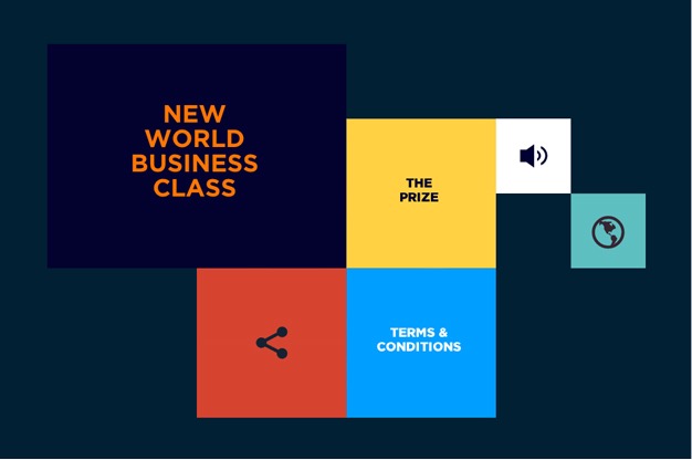
-
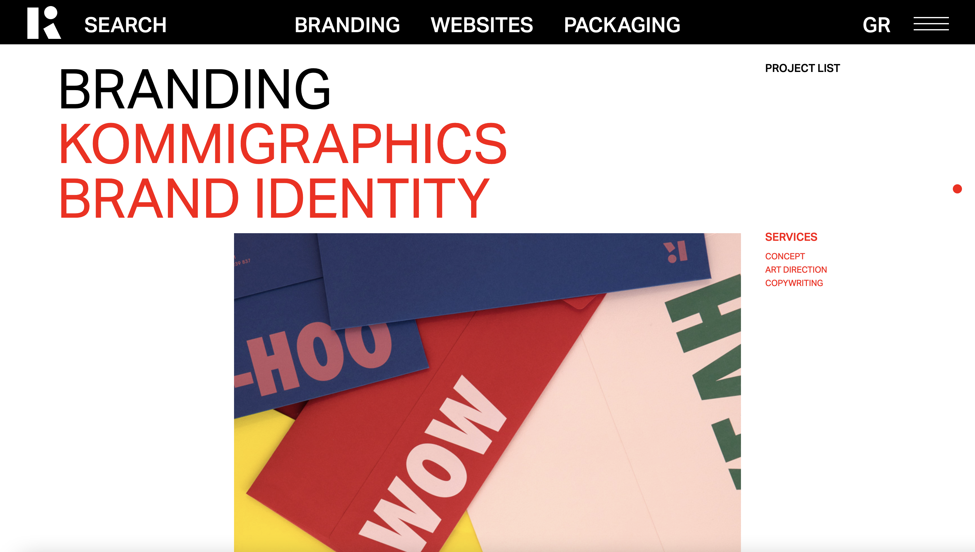
Primary navigation
Primary navigation should stand out and be consistent throughout the site. Typically, the main menu will sit along the top of the page, in the centre, or aligned to the left or right of the page. Another way of identifying the main menu is how it is treated: the main menu is usually designed to contrast against everything else so that your eye is easily drawn to it.2 Here is an excellent example of primary navigation design: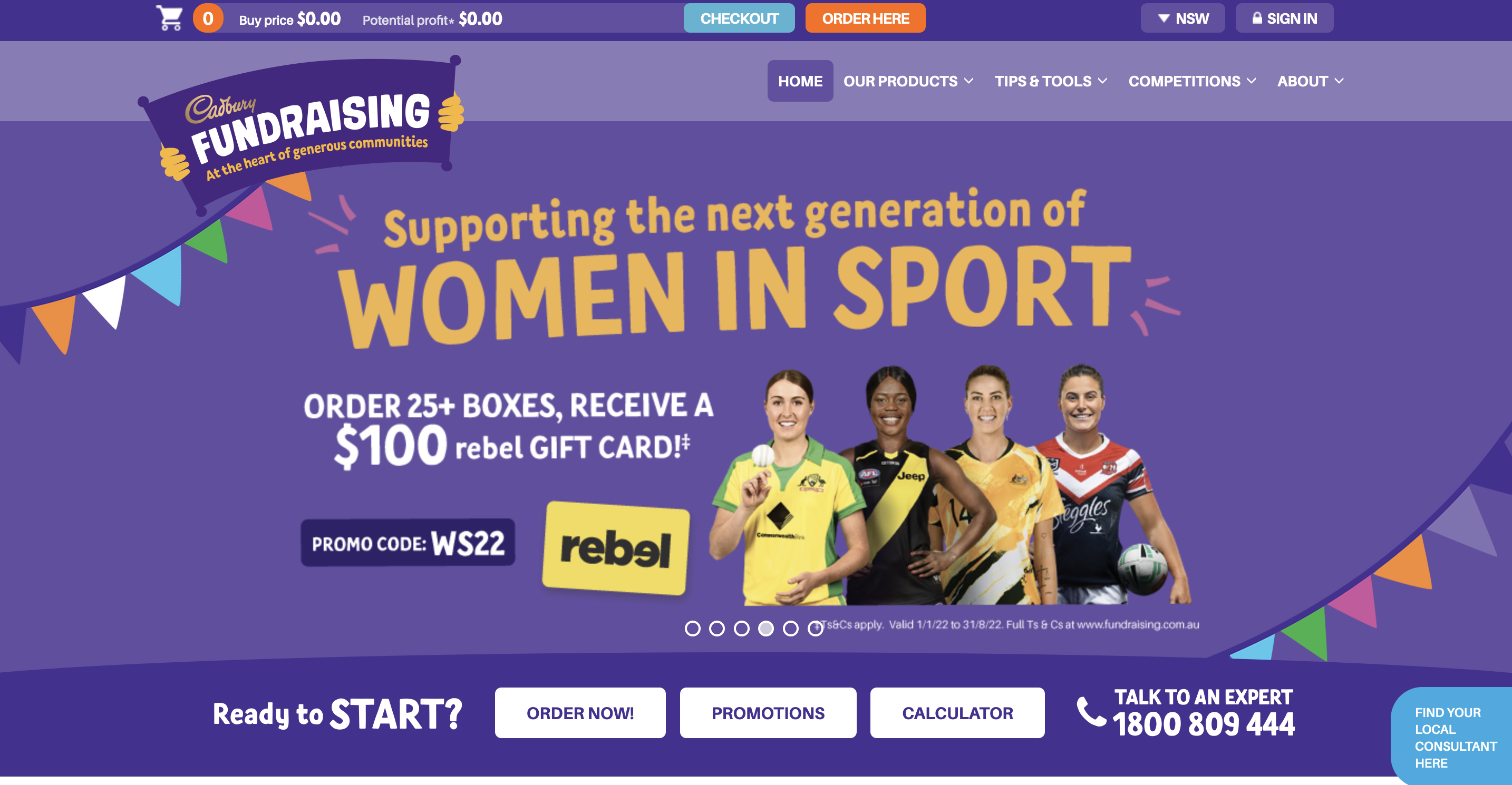
Cadbury is known for its purple colour, so it's nice to see this swatch applied to the primary top navigation. Simplicity works well for this campaign site, and when you scroll down the page, the menu converts to a slim, sticky menu. This left-hand menu design is striking because of the custom font treatment and the overall size allocation. The bold typography and strokes capture your attention with high contrast against the navy blue side panel.
-
Link the logo back to the home page
This might seem obvious, but it is not uncommon to find sites that fail to implement this function. The standard convention for logo placement is the top left-hand corner or centred along the top, and the logo is also known as a link back to the homepage. This convention is implemented widely. -
Responsive navigation
Responsive design is considered one of the best ways to make your website look great on any device. Part of this trend is using a compact navigation style called the 'hamburger menu'. This icon comprises of three slightly separated horizontal lines and has been likened to a hamburger because when you deconstruct the main elements, you are left with two slices of a bun and the meat in the middle. The whole reason the hamburger menu came to be was that there needed to be a way to navigate on mobile devices without taking up too much space. Thanks to its compact size and ability to be tucked away in the top right- or left-hand corner, the hamburger icon became the solution. The functionality of a hamburger menu can vary from site to site, but essentially it functions by sliding in, sliding down or popping up. As the hamburger icon has become a well-known convention, you may notice some sites that do not bother to change this style on a desktop.You would not find this on content-heavy sites, but you may start to see this across boutique agencies or campaign sites.2 Below are some examples of sites that use the hamburger menu across all screen sizes:
-
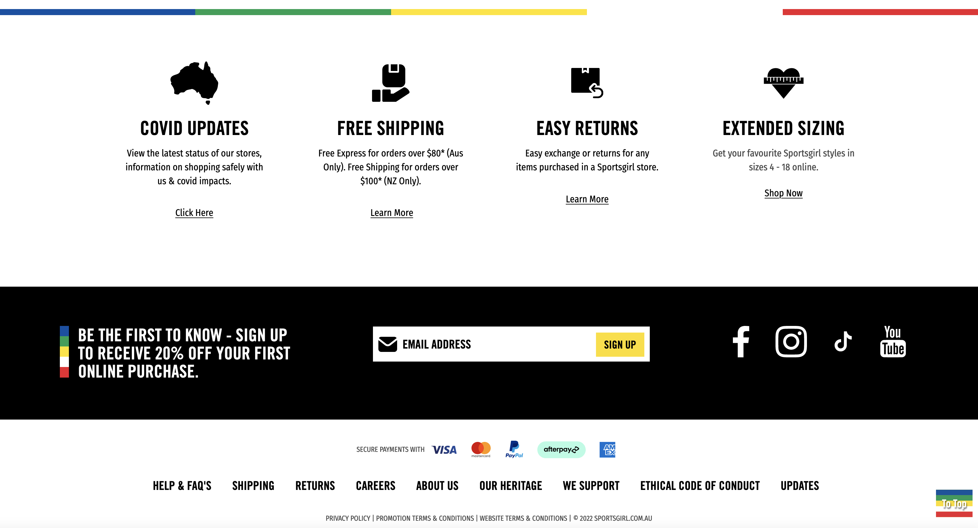
Fat footers
Generally, this space is reserved for privacy and legal links; however, it has also become relatively standard to display email sign up fields, address details and social links. Most people want to know whether having a full sitemap on display in the footer is a good idea or not. If the user has to scan through the footer links to find what they are looking for, perhaps the AI is not working the way it should. The footer is typically the last port of call for many visitors. Plenty of websites still use this method, and it tends to be used for sites that are quite content-heavy or retail sites where displaying the security icons and payment methods is quite crucial.Not only can a large footer serve up helpful links for those who like to navigate at the bottom, but it can also work as a design element to frame your layout. Butterfly has designed a few sites that utilise large footers. This approach was appropriate mainly because the content and the large footer complimented the design layout. Here is the example of larger footers below:
-
Sticky navigation
Sticky or fixed navigation is essentially a website menu that is locked into place not to disappear when the user scrolls down the page. You can implement a sticky menu for any website. It just comes down to whether or not it is suitable for both design and navigation purposes. ING Direct integrated a sticky menu into their website design.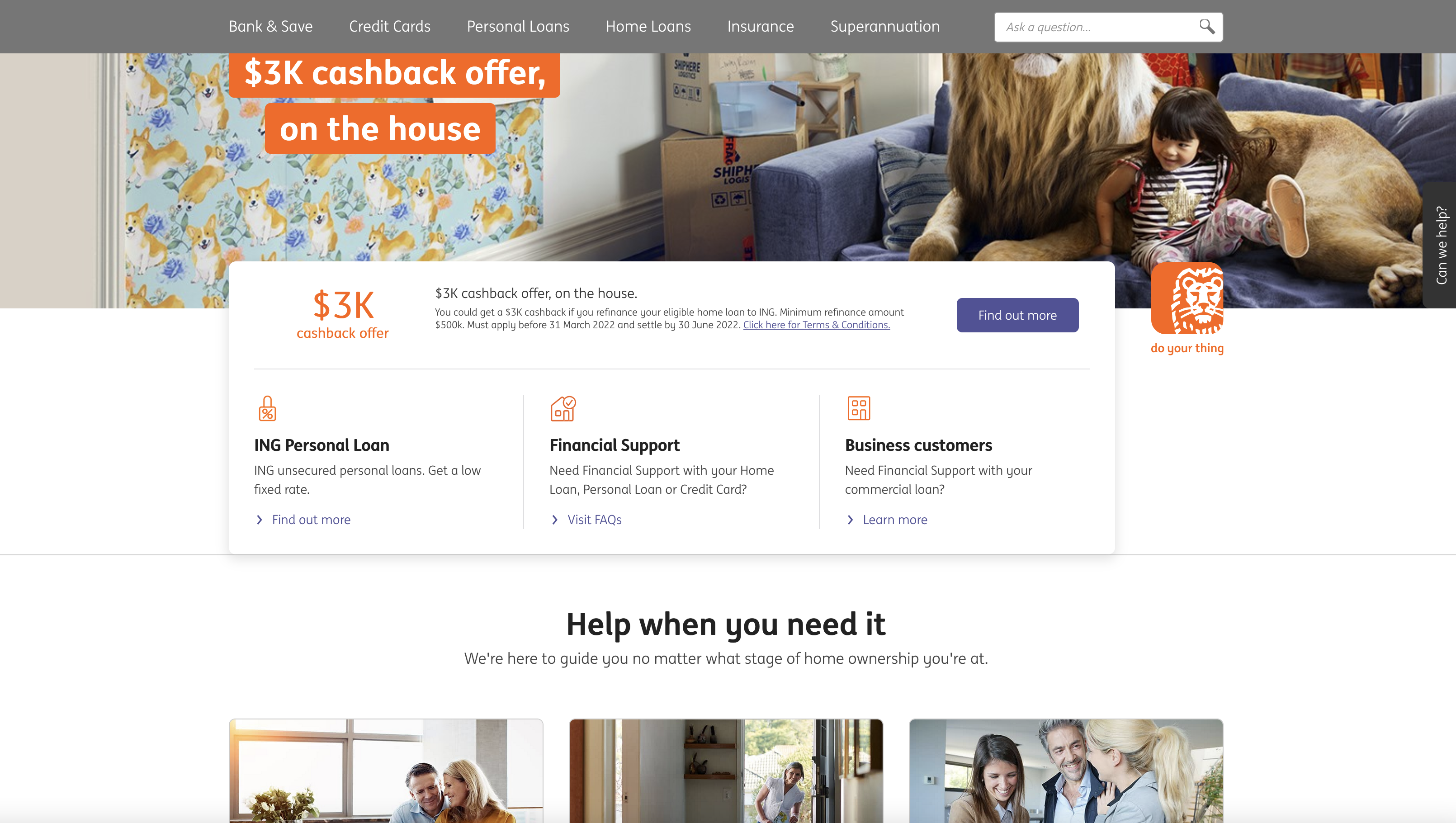
-
Indicate where you are
It's always an excellent experience to see where you are within a site, whether the menu is highlighted, breadcrumbs are visible, or the main banner image displays the page title. A highlighted menu treatment is simple and obvious, leaving no room for confusion. Here is the example of sites that clearly show where you are: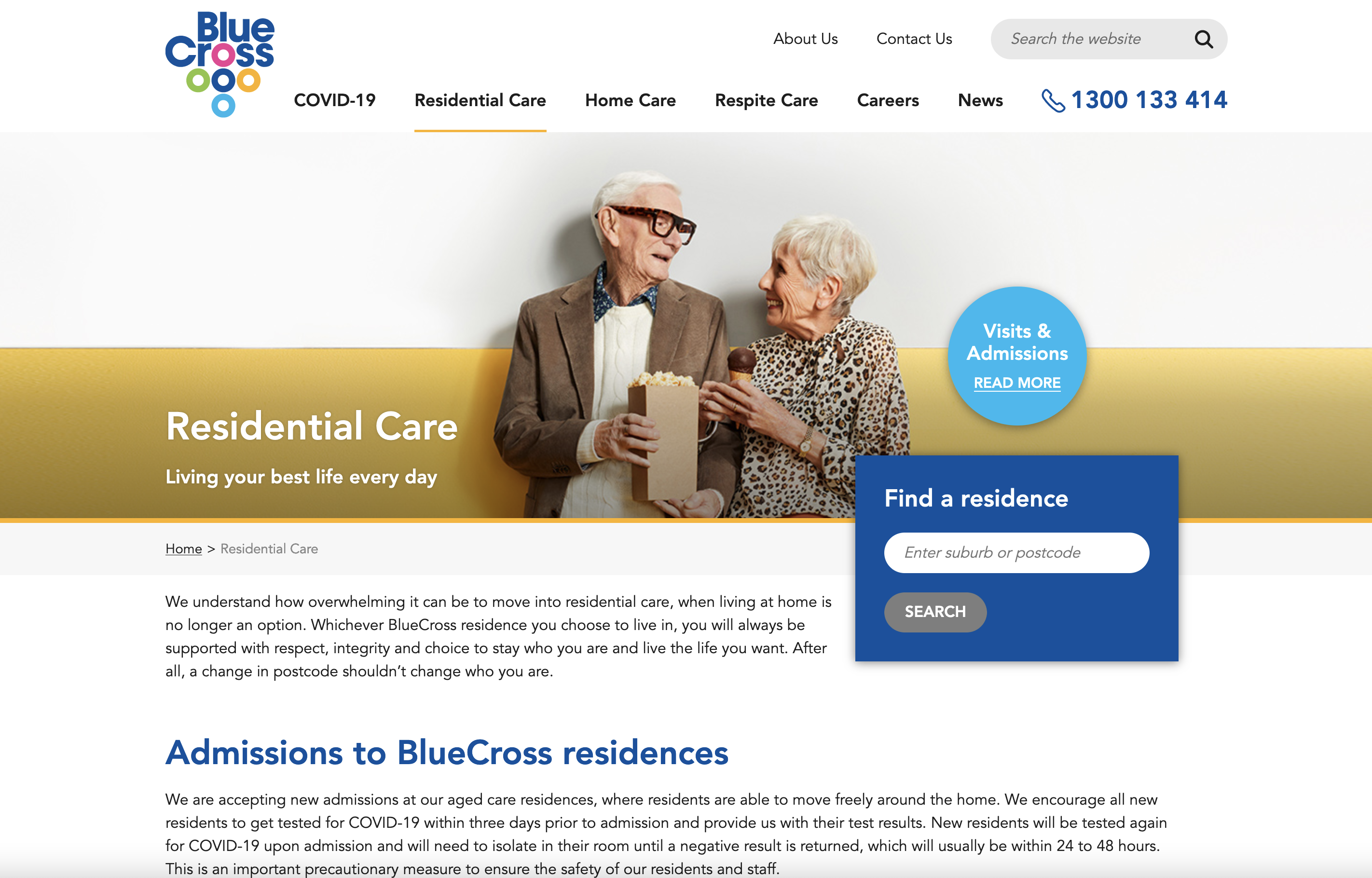
A beautiful looking website that shows you where you are with a simple underline stroke on the primary navigation.
-
When to use mega menus
Mega menus are large navigation panels that typically drop down or fly out from a global nav bar. While they are not appropriate for every site, mega menus can create a great navigation experience for a user when done well. The main benefit of a mega menu is that they facilitate the display of many options at once. Mega menus can use icons and pictures and typographical hierarchy to make scanning easier. So when are they useful? Mega menus work well for retail sites where the category lists are quite large and do not look great in a standard dropdown menu. They also work well for sites with a large list of services like Virgin Australia or ING. Butterfly has designed a couple of sites that utilise mega menus; however, this approach has only been carried out when deemed appropriate. Below are some examples of some striking mega menu designs.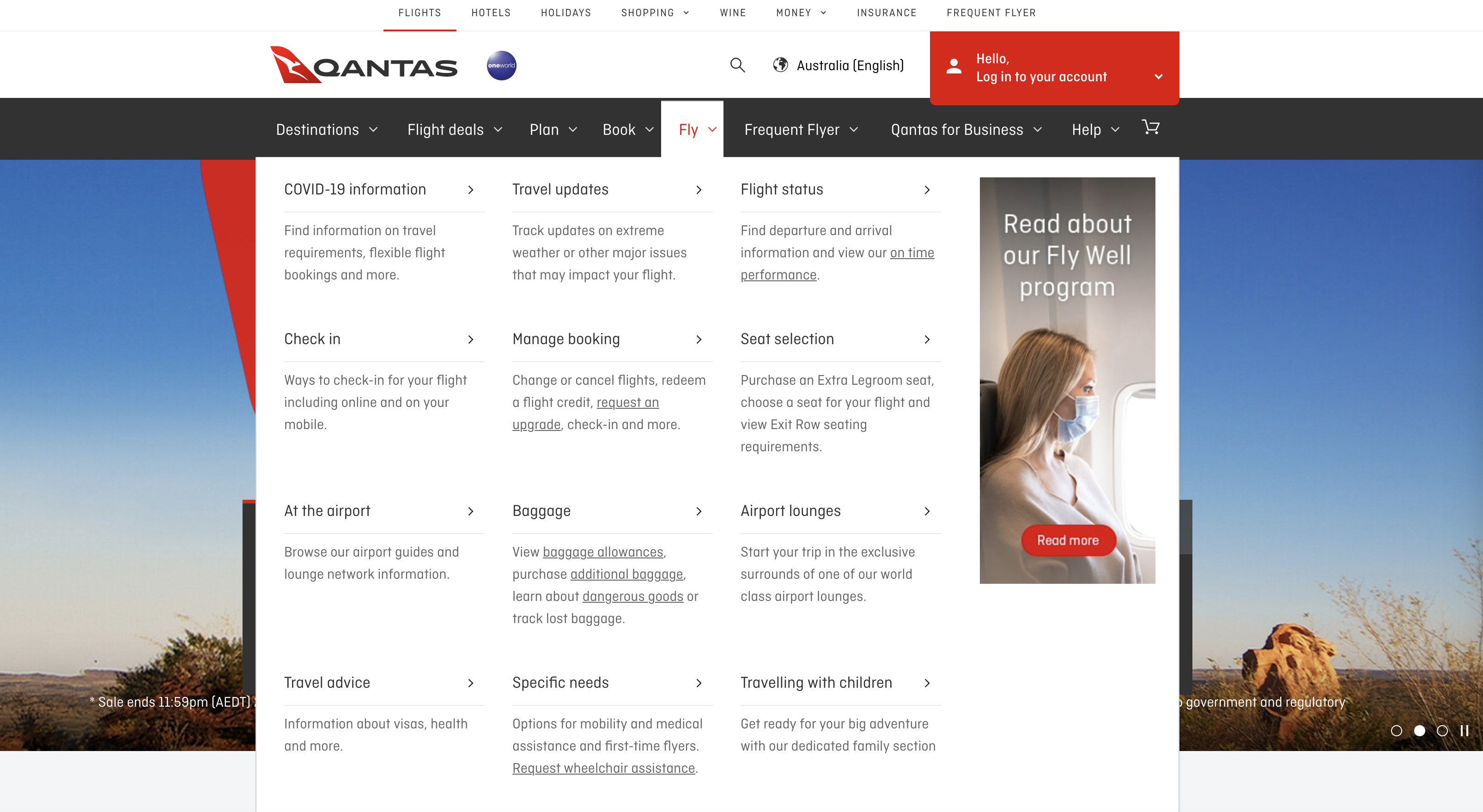
Menu navigation is an integral part of web design. It is important to create well-thought-out solutions based on your clients' needs.
To summarise:
- Plan your sitemap thoroughly at the start of a project
- Over-arching rule - users should know where they are, where they are going and where they have been!
- Provide a variety of navigation options
- Follow web conventions
- Don't be afraid to keep a hamburger menu display on desktop sites if appropriate
- Use simple, user-friendly terms2
| Texture | Pattern |
|---|---|
|
|
Below are examples of texture and patterns from a visual perspective.
Using visual textures and patterns like the images below creates a visual depth to your site. These types of textures and patterns can draw the users eyes to a certain area.
UX has a different use for patterns and textures that we will explore below.
Patterns function
Patterns are a common solution to solve usability issues.
Because they are commonly known, users already know how to use them.
For example, when you open a gallery of pictures, you expect a right-left arrow to scroll through the images.
Some common UX/UI patterns are:
- Lazy registration
- Breadcrumbs
- Forgiving format
- Clear primary actions
- Progressive disclosure
- Hover controls
- Subscription plans
- Dark patterns.
Patterns are solutions to problems that happen during human-computer interaction. Therefore the intention behind using a pattern can make or break your design.
Using a pattern in a format without considering your user is lazy. It can impact the usability of your web page.
However, sourcing the correct pattern to solve your usability problem and customising this for your website is a good design decision.
Textures function
Having texture on a page is based on satisfying a function. The common purpose of texture is to enhance the level and vision of a web page.
Includes elements such as:
- Icons
- Buttons
- Titles
- Highlighting.
The use of texture is popular to attract users to click. When it is applied to elements, the element is then distinguished from other elements on the page. This guide’s the users' sight into the next step – usually, the goal, based on the user flow.3
Textures should be used with other visual rules. Since it directs the users’ line of sight, consideration needs to be made for contrast, lines, shading etc.
Textures are classified into two categories.
- Realism
Realism refers to how closely a texture resembles an actual surface.
Abstract designs – colour gradient or geometric patterns.
Real-world – grass, carpet or linen. - Prominence
Prominence refers to how much texture stands out against other elements. Subtle textures are hardly visible yet still creates an effect. Loud textures bring immediate attention to that area of a page.4
Below is a demonstration of how to create texture using Adobe Xd.

Texture vs Pattern
Instructions
Your ability to understand and apply patterns and texture to designs will develop with practice.
The best way to begin this development is by researching common websites with a UX design lens.
Your task is to:
Research popular websites and collect screenshots of:
- Common UX/UI patterns.
- Creative use of texturing.
Share the websites and your feedback in the forum.