Spreadsheets are a powerful tool for analysing and presenting data. This can be achieved easily through various formulas and functions and the inclusion of charts.
In this topic, we explore how to do this.
By the end of this topic, you will understand:
- how to use parentheses to create an order of operations
- how to use arithmetic operators to create formulas
- how to create charts to display data visually.
As we explored in the previous topic, Microsoft Excel allows for customising data through basic formatting and design. However, Microsoft Excel goes far beyond this basic formatting and can allow for extremely complex formulas and functions to be accessed to create large and complex projects. This makes Microsoft Excel a useful tool for all small or large businesses.
A spreadsheet can assist with simple transactions or complex data analysis and programming.
In this topic, we will explore basic formulas and functions to assist you in performing basic business tasks; however, almost any function you require to achieve can be performed in Microsoft Excel with the right expertise and training. There are various arithmetic operators that you can use in Microsoft Excel to create basic formulas.
Watch the following short video from GCFLearnFree.org for an Intro to Formulas in spreadsheets (3.39)
We will explore the most commonly used operators and how to create formulas below.
| Arithmetic operator | Meaning | Example | Result |
|---|---|---|---|
| + (plus sign) | Addition | =3+3 | 6 |
| - (minus sign) |
Subtraction Negation |
=3-1 =-1 |
2 -1 |
| * (asterisk) | Multiplication | =3*3 | 9 |
| / (forward slash) | Division | =15/3 | 5 |
| % (per cent sign) | Per cent | =20%*20 | 4 |
| ^ (caret) | Exponentiation | =3^2 | 9 |
Note
Excel is a powerful tool for extracting meaning from vast amounts of data. But it also works well for simple calculations and tracking almost any kind of information. The key to unlocking all that potential is the grid of cells. Cells can contain numbers, text, or formulas. You put data in your cells and group them in rows and columns. That allows you to add up your data, sort and filter it, put it in tables, and build great-looking charts.
Addition
One of the most basic and useful features of spreadsheets is their ability to sum or add large volumes of numbers quickly and accurately. A spreadsheet may be useful as a simple alternative to a calculator or for adding large volumes of information that would otherwise be too onerous to add by another means. Customer information, financial reports and lists of data from database exports are just some of the common uses for the addition feature in a spreadsheet.
Note
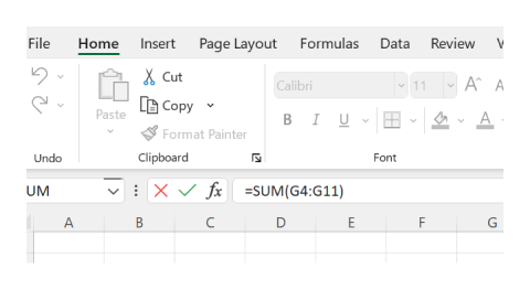
To start creating a formula in Microsoft Excel, click inside the relevant cell where you want the formula to appear (or use the Formula Bar at the top of the spreadsheet) and press the equals key = first. This tells the application that you are ready to start a formula.
Example
The formula for addition in Microsoft Excel is as follows: = click relevant cell + click relevant cell enter. Another way to apply addition to Microsoft Excel is to use the AutoSum feature. Microsoft provides the following information on an easy way to use this feature: When you've entered numbers in your sheet, you might want to add them up. A fast way to do that is by using Autosome.
-
Select the cell to the right or below the numbers you want to add.
-
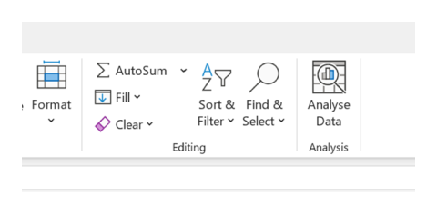
Click the Home tab, and click AutoSum in the Editing group. 2


Read more
Read more on the use of the AutoSum function to add numbers at the following link: Use AutoSum to sum numbers 2021 by Microsoft.com.4
Note
Note that by pressing the arrow next to the AutoSum button, you can also perform many other sum functions, including the following calculations:
- Average (calculates the average value of a selected range of numbers)
- Count numbers
- Max (finds the maximum/largest value in a selected range of numbers)
- Min (finds the minimum/smallest value in a selected range of numbers)

Subtraction
Just as useful as addition, the subtraction feature in Microsoft Excel is easy to use.
Example
The formula for subtraction in Microsoft Excel is as follows: = click relevant cell - click relevant cell enter.
Division
To create a division formula, follow the same steps as above, but use the asterisk forward slash key / as the indicator that you want to use division.
Multiplication
To multiply in Microsoft Excel, follow the same steps as above, but use the asterisk key * as the indicator that you want to use multiplication.
Example
The formula for division in Microsoft Excel is as follows:
= click relevant cell / click relevant cell enter
Read more
For step-by-step instructions, read more on creating simple formulas in Excel at the following link:
Create a simple formula in Excel 2021, Microsoft.com
Brackets
Brackets, or parentheses, may be used in Microsoft Excel to determine the order in which you want a formula to be calculated. You may recall learning about the 'order of operations (sometimes referred to as BODMAS) required to calculate a sum correctly. Microsoft Excel uses the same method when calculating formulas.
Read more
Read more on the 'order of operations,' or BODMAS, at the following links:
- Order of Operations - BODMAS 2022.6
- Calculation operators and precedence 2021.7
Note
Microsoft provides the following information on using brackets to create formulas:
Use of parentheses
To change the order of evaluation, enclose the part of the formula to be calculated first in parentheses. For example, the following formula produces 11 because Excel calculates multiplication before addition. Therefore, the formula multiplies 2 by 3 and then adds 5 to the result.
=5+2*3
In contrast, if you use parentheses to change the syntax, Excel adds 5 and 2 together and then multiplies the result by 3 to produce 21.
=(5+2)*3
In the following example, the parentheses around the first part of the formula forces Excel to calculate B4+25 first and then divide the result by the sum of the values in cells D5, E5 and F5.
=(B4+25)/SUM(D5:F5)
The following short video from GCFLearnFree.org explains working with functions in Excel (5.15)
Creating and modifying a chart to analyse a dataset
Watch the following short video for a Quick and Simple Charts Tutorial from Technology for Teachers and Students (9.18)
Read more
Read more on creating a chart from start to finish at the following link:
Imagine your supervisor has asked you to provide a breakdown of the length of time monies have been outstanding for each account. A simple way to do this is to find the information at the data source and present it in a chart. Providing the information in a chart will make it easier for your manager to understand at a glance.
- Download a copy of the Aged Debtor Report A-6
- Open your' BSBTEC302 – Design and produce spreadsheets – Learning activities' spreadsheet, created in Activity 1C and go to worksheet 2
- Copy the entire table from the Aged Debtor Report into Worksheet 2
- Highlight the entire spreadsheet by clicking the arrow at the right angle between column A and row 1
- Double-click the right-hand side of one of the column headers to make all contents of the table fit into the cells
- Click and drag the right-hand side of the column A header to fit the words neatly. Your table should now look similar to this:
| Name | Total Due | 0–30 | 31–60 | 61–90 | 91–180 | > 181 |
|---|---|---|---|---|---|---|
| ABC Pty Ltd | $39,700.00 | $17,650.00 | $22,050.00 | |||
| Shaw & Shaw | $52,000.00 | $52,000.00 | ||||
| McKay Services | $44,950.00 | $26,050.00 | $18,900.00 | |||
| Simply Strategic | $26,250.00 | $26,250.00 | ||||
| Building Solutions Pty Ltd | $32,650.00 | $32,650.00 | ||||
| Document Geniuses | $7,250.00 | $7,250.00 | ||||
| Fix Yourself Pty Ltd | $25,080.00 | $8,750.00 | $9,230.00 | $7,100.00 | ||
| Dynamic Design | $28,900.00 | $28,900.00 | ||||
| Timely Transactions Pty Ltd | $27,700.00 | $15,200.00 | $12,500.00 | |||
| Totals | $284,480.00 | $94,250.00 | $81,830.00 | $41,200.00 | $34,550.00 | $32,650.00 |
Highlight the contents of the table
- Click on the 'Insert' tab
- Insert a stacked column chart
- Edit the chart title by right-clicking it and renaming it 'Accounts outstanding by timeframe.'
Now, we want to remove the 'totals' from the dataset.
- Right-click on the section of the chart where the stacked columns appear
- Click 'Select data.'
- Remove (Untick) 'Total Due' from the Legend Entries Series
- Remove (Untick) ‘Totals’ from the Horizontal Axis Labels

Now, we want to colour-code the segments.
- Adjust the colour of monies owed between 0–30 days by right-clicking on the relevant segment in the chart and changing the colour to green.
- Adjust the colour of monies owed between 31–60 days by right-clicking on the relevant segment in the chart and changing the colour to yellow.
- Adjust the colour of monies owed between 61–90 days by right-clicking on the relevant segment in the chart and changing the colour to orange.
- Adjust the colour of monies owed between 91–180 days by right-clicking on the relevant segment in the chart and changing the colour to red.
- Adjust the colour of monies owed for greater than 181 days by right-clicking on the relevant segment in the chart and changing the colour to black.
Now, we want to insert labels to show the monies outstanding for each segment.
- Right-click on each segment
- Click 'Add data labels'
- Then, expand your chart by clicking a corner and dragging it until it is a suitable size for the best readability.
You should now have a chart that clearly shows, at a glance, how much money is owed per account holder and how long it has been outstanding.
- Right-click on the worksheet tab at the bottom of the document titled 'Sheet 2' and rename the tab 'Accounts outstanding by timeframe'.
- Now save your work (remember, it is good practice to do this as you go)
- Exit the Microsoft Excel application.
Your chart should look like this:

Charts
Charts are a useful way to analyse and compare data in Microsoft Excel. Charts are often used to provide a visual representation or a story about a particular dataset, which is more meaningful than viewing the data alone.
Note
Microsoft also provides the following information for creating charts:
Create a chart
Select the data for which you want to create a chart. Click INSERT > Recommended Charts. On the Recommended Charts tab, scroll through the list of charts that Excel recommends for your data and click any chart to see how your data will look.
If you do not see a chart you like, click All Charts to see all the available chart types. When you find the chart you like, click it > OK.
Use the Chart Elements, Chart Styles, and Chart Filters buttons next to the upper-right corner of the chart to add chart elements like axis titles or data labels, to customise the look of your chart or to change the data that is shown in the chart.
To access additional design and formatting features, click anywhere in the chart to add the CHART TOOLS to the ribbon and click the options you want on the DESIGN and FORMAT tabs.
Different Types of Charts
In Microsoft Excel or your spreadsheet program of choice, explore the different types of charts available and consider their most appropriate application.
Reflect on which chart type would be most useful for displaying different data types.
Then, answer the following questions for your future reference. This information will support your assessment and professional practice.
- When would you use a pie chart?
- When would you use a line chart?
- When would you use a stacked bar chart?
- When would you use a combo chart?
- Compare data with different units.
- Show trends and relationships between different datasets.
- Highlight significant differences between categories.
Try to complete the following five (5) quiz questions to test your understanding of this topic: